Best Friends for Frances

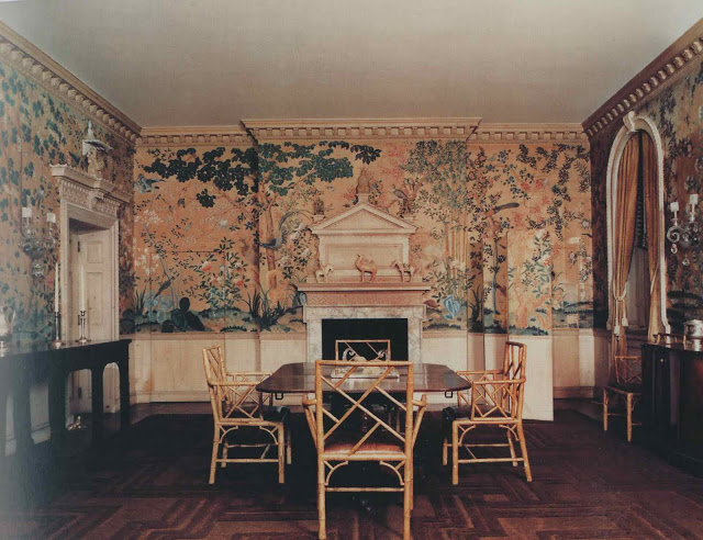
Frances Elkins arrived by post on Monday, swaddled in brown paper, and promptly changed my life.  It may be a week, a month, a year of Elkins, but for now, here is the dining room of Mr. and Mrs. Kersey Coates Reed, Lake Forest, Illinois, 1929.  This room came up last week (and you can see the later version of the room here) and many readers referred to the room as Elkins originally designed it.

The hidden door and the camouflage screen are both there, but indeed, no chandelier (and certainly not two) and then there are the wonderful bamboo chairs.  And, yes, if Mrs. Elkins sat next to me on a plane, I do think we would be friends.

Image from Frances Elkins Interior Design by Stephen M. Salny; photography by Luis Medina.

rssrss      FacebooktwitterpinterestlinkedinmailFacebooktwitterpinterestlinkedinmail

Paper Dolls

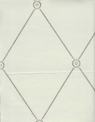
Cole & Son Georgian Trellis may be the paper for the front hall.  The color looks remarkably not like this at all, but is a creamy background with a bronze design.

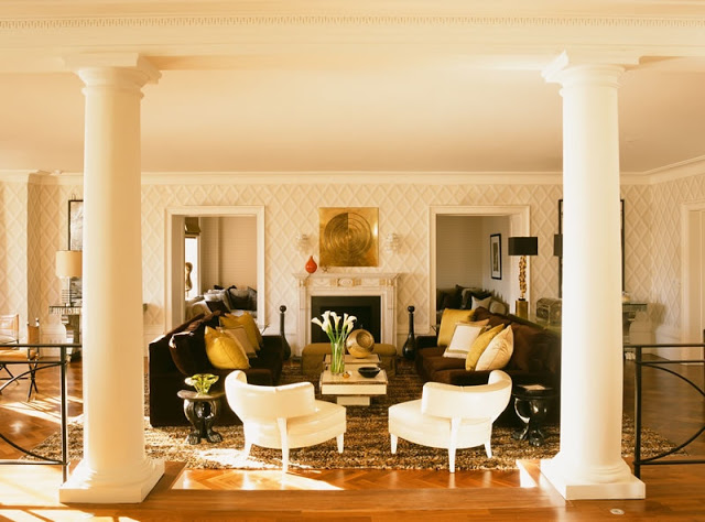
I’ve had Rooms to Inspire in the City open to Tamara Mellon’s London apartment, designed by Martyn Lawrence-Bullard, for about a week.  This paper is Cole & Son as well, Pompeian in Beige and White, I am pretty sure.  It’s such a striking room, but what caught my eye was the lovely shade on the ceiling.  Nowhere near “ceiling white” and making a humongous difference to the room.  Which is leading to more ceiling paint here at The House with No Name.

Image from Martyn Lawrence-Bullard’s site, used without permission – please, please forgive me.

rssrss      FacebooktwitterpinterestlinkedinmailFacebooktwitterpinterestlinkedinmail

Too Much is Never Enough

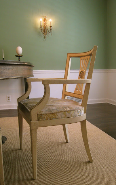
In other dining room news, I bought more chairs.

At first I wondered if they were better than, or just different from, my current chairs.  Also, there is the issue of my chair addiction.  Further, I am now captivated by the idea of the bamboo dining chairs in the Reed house.  Still, the long and short of it is, I am usually long on ideas and short on funds and it is likely that it would take me a while to a) find better chairs and b) afford better chairs.

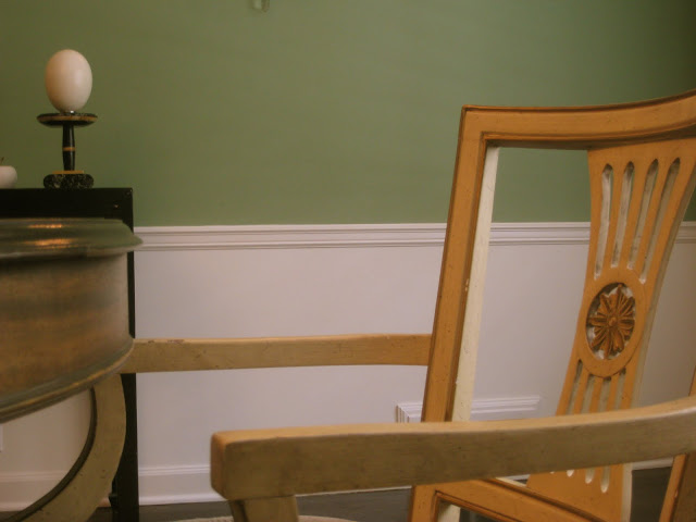
So when these literally landed in my lap it seemed wise to snap them up.  (I have two pieces of art on my wish list as well and they are taking priority.)  I was originally thinking I would paint these black, but this pale yellow is so cheerful I wonder if it should be the “new” color as well as the old.  They have, literally, lifted the spirit of the room.
I haven’t the heart to count my chairs again, but whatever the last horrendous number was, it is now that + 6.  Sakes.
The wall color is Farrow & Ball Folly Green.
rssrss      FacebooktwitterpinterestlinkedinmailFacebooktwitterpinterestlinkedinmail

Design Therapy

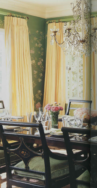
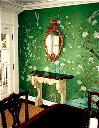
I hadn’t realized that I was unconsciously mining this image for inspiration until last week’s episode of Million Dollar Decorators. When Mary McDonald walked through (by? I can’t remember) this dining room, my conscious mind went, “Oh, yes, of course.  That has been it all along.”

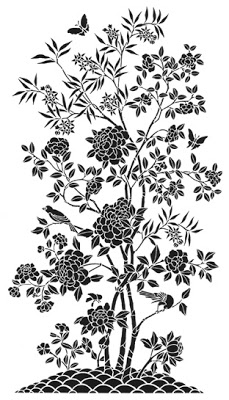
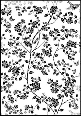
I wish this little nugget had slid into the conscious side of my brain a little sooner.   I’d been holding off on ordering the stencil for my dining room project as something about it seemed not quite right.  It wasn’t working with the rest of the house and I couldn’t put my finger on why.

When I saw the dining room (again, fully conscious) I realized that the stencil, above, was too bold for my space.  Too heavy.  Too much.

So, I’m ordering this all-over pattern instead and am going to use it in pieces to create an airier silhouette similar to the wall above.  It wasn’t my first foray into analysis, but it was most certainly the most fun. 
Top two images, Mary McDonald Interiors, Rizzoli, photography by Melanie Acevedo.  Remaining images via Stencil Library.
rssrss      FacebooktwitterpinterestlinkedinmailFacebooktwitterpinterestlinkedinmail

Emerald City

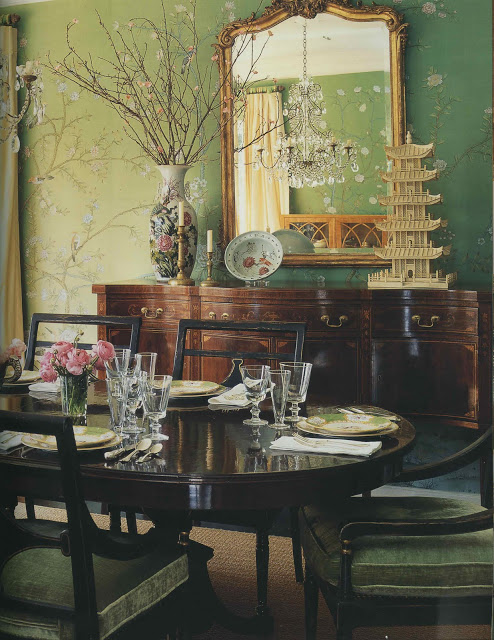
The paint has arrived for my dining room.  The final two choices still remain, side-by-side, on the East wall and occasionally I wonder if I selected well.  Selected best, I suppose, as they are both fine shades of green.  The universe keeps handing me gumdrops of reassurance, not the least of which was this wonderful image from Matthew White and Frank Webb.  They are partners in the firm White Webb and produce a lovely design log which you can find here.  This issue they are exploring the glory of green and make reference to Oz in the nicest way; I couldn’t resist.

Today the electrician comes to scoot the sconces out a bit.  I think Mr. Blandings would advise to play it where it lays, but he is keeping it to himself.  By the weekend I am hoping the room will be ready for the wizard himself.

Image courtesy of White Webb and is used with their permission.

rssrss      FacebooktwitterpinterestlinkedinmailFacebooktwitterpinterestlinkedinmail