2 for 2

If you have not seen Miles Redd’s project in this month’s Town & Country you should make a point to pick it up on your lunch hour. One of the things that caught my eye about this room was not one, but two – two! – pairs of Christopher Spitzmiller lamps. This doubles my regular lamp envy.
That being said, Chris is having a seconds sale and you can pick up one or two or four of his beauties at a discount. He will happily work with out of town customers, but it’s helpful, necessary really, if you have an idea of what you need when you call. You can see styles and glaze samples at his site here.

Image, top, is Miles Redd for Danielle and Glen Rollins. This is my image of a much better photo by Francesco Lagnese.
rssrss      FacebooktwitterpinterestlinkedinmailFacebooktwitterpinterestlinkedinmail

Scanning the Horizon

The boys’ swim season has just ended and this year was the first time the youngest participated. As he sat at clerk of the course (don’t ask) preparing for his first event my mother-in-law said, “He looks nervous.” “You think? Why?” “He’s swinging his feet.” I looked closer at his lean frame, his forearms resting lightly on the arms of the chair. He was already wearing his googles, their mirrored lenses gleaming in the sunlight, though he would not need their protection for another five minutes or so. “He’s not nervous. He’s happy.”

He’s pretty much always happy unless his older brothers are being older brothers and even then his bother is brief. He inspires me.

As Megan Arquette has inspired me with her post of an image of Charlotte Perriand (you must) in a moment that is joy personified.

As does Diane Dorrans Saeks who featured Bellamont House in Ireland and its beautiful white walls. I’m having a flirtation with white walls and am fantasizing about their crisp, clean freshness.

Which is why I pulled this spread. No other reason than it confirmed my attraction to green and black and white. And happy. Just scrapbooking and playing connect the dots.
All images Veranda, July/August 2001, photography by Casey Sills.
rssrss      FacebooktwitterpinterestlinkedinmailFacebooktwitterpinterestlinkedinmail

Marija Stephens

You might have seen this elsewhere, but a fellow blogger, Marija Stephens of Holding Court was killed in a car accident last week. I found Marija’s blog originally through a comment she made here. I can’t remember what it was, but it was smart, and likely funny, and it made me click through to see what she was doing on her own site; I never missed a post after that.
I had planned a trip to Chicago, where Marija lived, to see Thomas O’Brien speak and meet long-time blog friend Magnaverde, and felt incredibly fortunate that Marija could join us for the day. We had exchanged several emails and had hit it off. We both have children of similar ages and a passion for design and had discovered an affinity for talking about it on-line. She wasn’t striving for anything, she didn’t need to be a part of any perceived group, she was just creating really interesting content. She had a great point of view. Even though she was a designer I never felt like she was “building her business” through blogging. She just liked it.
You never know how things are going to go when you meet someone you’ve known only on-line. It would be easy for someone to pretend to be something she’s not. Of course she hadn’t. And even Magna, who was unfamiliar with her blog when they met, found her smart and funny and engaging. Instant connection.
Blogging is funny sport. You can use it for profit and you can use it for ill, but I started and have stayed with it for community. Marija wasn’t the only friend who I have met via this screen, but I will remember her as one of the bright spots.
Marija’s camera wasn’t working or she forgot it or the battery died or something so I snapped this picture for her. Typical. Unfocused. I am so glad I have it.
rssrss      FacebooktwitterpinterestlinkedinmailFacebooktwitterpinterestlinkedinmail

Newell Post

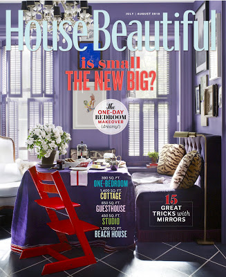
The recent round of editor musical chairs made the magazine junkies excited, but maybe a little jumpy and twitchy. No one likes anyone messing with one of her favorites. Such a relief, though not a surprise, to find Newell Turner’s first issue of House Beautiful such a delight.

Not a surprise as Turner has been Style Director at House Beautiful for quite a while; the magazine has felt his influence already. “I worked so closely with Stephen Drucker over the last four years here that I feel like it’s already my House Beautiful. But, great magazines are alive and dynamic – meaning there’s always some evolution in progress. Especially today, no one wants exactly the same thing over and over again,” says Turner.

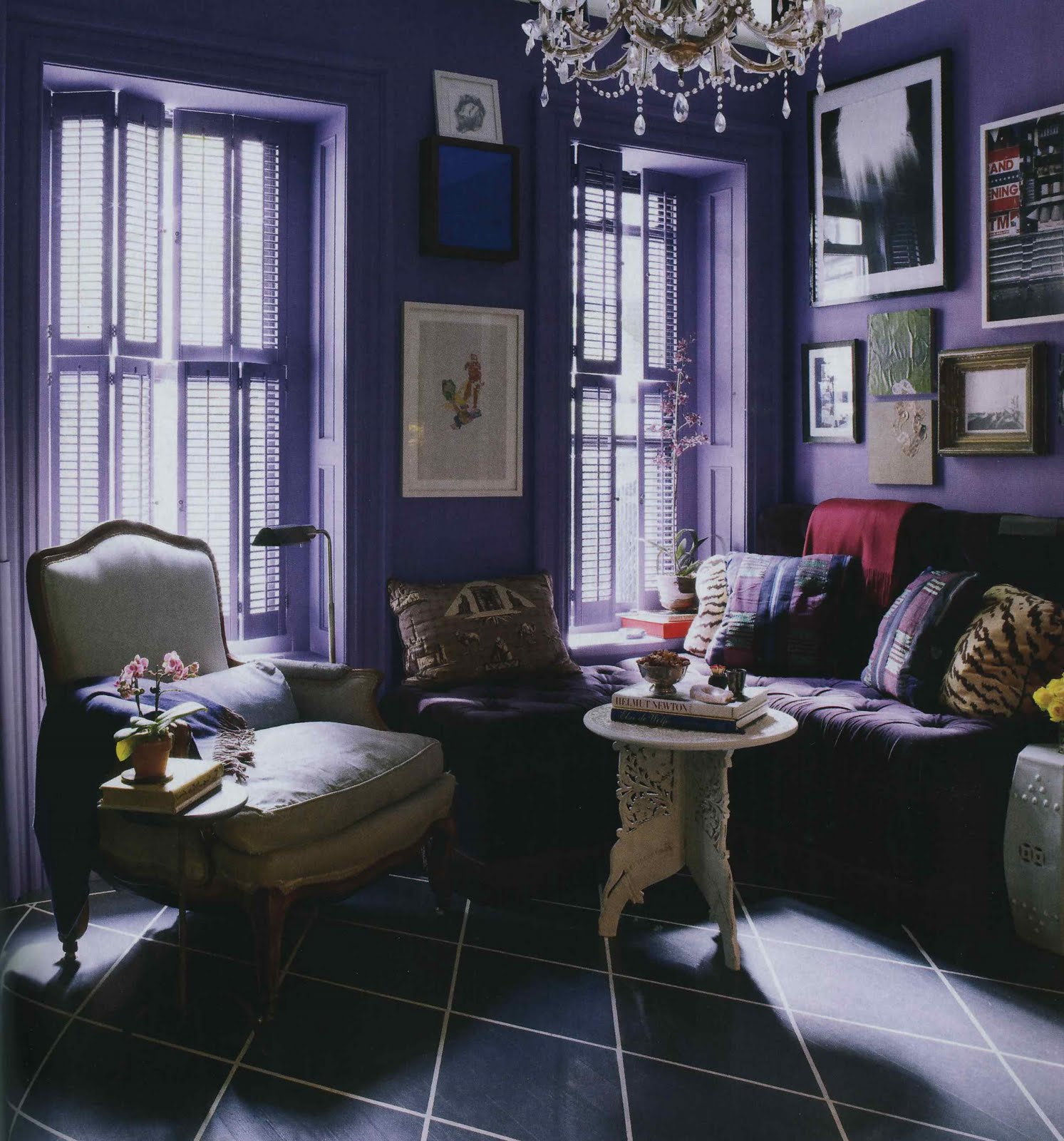
I wondered if he had a moment of giddy pleasure being able to feature David Kaihoi’s distinctly beautiful apartment in his debut issue. “I did! This may sound a little crazy, but that purple color spoke to me.” No, no that doesn’t sound crazy at all. That sounds normal. That’s normal, right?
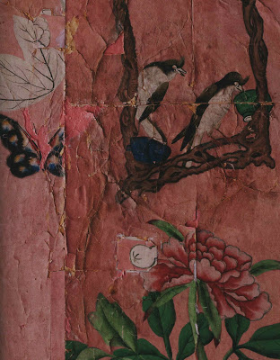
Turner was quick to give credit to his team, “Of course, I have one of the best design directors, Scot Schy , in publishing. I loved what David did with the salvaged wallpaper in the bedroom. And, when Scot showed me the layouts for the story including a full page detail of the wallpaper…how much more evocative does it get? Every time I look at that spread in the magazine I want to reach out and touch the wallpaper. I hope it does the same thing to our readers!”
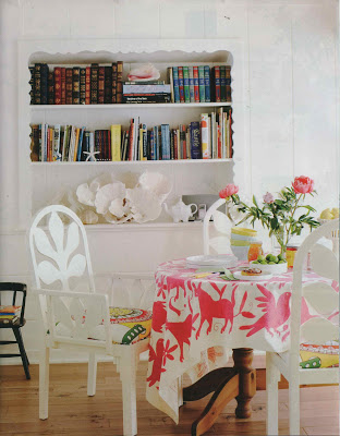
If you haven’t had a chance to pick up the July/August issue you should make it a point. That sunny beach house, top, can put a spring in any one’s step. And Kaihoi’s apartment? Tear Sheet Hall of Fame.
All images House Beautiful, July/August 2010. Photography, second from top, Victoria Pearson; design, Krista Ewart; remain photos by Ngoc Minh Ngo.
rssrss      FacebooktwitterpinterestlinkedinmailFacebooktwitterpinterestlinkedinmail

Full Court Press

I receive a lot of press releases. A lot. The number of posts that result from the aforementioned press releases? Almost none.

Then, about a week ago, I received a release on a new line of bath products from Axor, the designer brand of Hansgrohe. While I don’t feature most products pitched through press releases, I usually take a look. Unless it’s addressed to “Mrs.” “Dear Mrs.” doesn’t inspire a click very often.

But this product line is truly remarkable. Designed by Ronan and Erwan Bouroullec, the collection is comprised of over seventy pieces that you can configure in just about any way you can imagine.

He wants counter mount and she wants wall mount? He’d prefer a lever while he’d prefer a button? Slow blink and a small shrug. Fine. Yes. Why not?

You can have just about anything. The designers began mulling their assignment in 2004; the collection was launched in Paris last month. C’est magnifique. You can see the line here and learn more about the designers here.
All images courtesy of Axor Hansgrohe.
rssrss      FacebooktwitterpinterestlinkedinmailFacebooktwitterpinterestlinkedinmail