Many of us are experiencing a little
Downton withdrawal. For me the series has been fast and furious. Like many love affairs, it came on suddenly then seemed over just as it began.
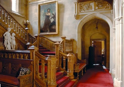
Part of the appeal, of course, are the homes, Highclere Castle being somewhat the star of the show, though, naturally, I prefer the cottage. I never seem to be able to just sit and enjoy this sort of thing, always my brain is click, click, click. What was the process of production design? How much was the house altered? Could it be that most are sets?
So I rang
Donal Woods, the production designer for the show, and asked. (That’s normal, right? You would have done that, maybe?) “We moved out a lot of the furniture – about fifty-percent. We added palms and personal affects, removed the modern portraits and things,” said Woods.
“It was time to do a piece for the twentieth century; we’ve done Austen. We’ve done Georgian and the 18th century to death. We started looking for a house in 2009. We looked at about thirty houses; some were too big and some were too small,” he paused, “It’s a great job, really.” I’d say. Wood said they made a point of providing stark contrast between the family’s rooms and the servants’ spaces, “We only used three-to-four colors downstairs; we wanted the contrast to be dazzling.”
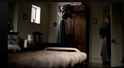
Woods said that screenwriter, Julian Fellowes, provided notes, character outlines and the first script to inspire the set. I’d assumed that the public rooms of the house were authentic, but that the bedrooms were likely sets, though this is not the case. A few of the rooms are sets, but mostly the series was filmed in the house. The girls’ rooms are particularly telling. Sybil’s room is a sunny yellow with wonderful floral curtains. Fresh and vibrant like its mistress.
“Edith,” says Wood, “is a plain girl. She has a plain room.” Indeed, though its paint is particularly lovely with her coloring.
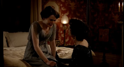
But it was Mary’s wallpaper that sent me down this path. In every scene that it appears I can barely keep my eyes on the actors (except for that dashing Kemal Pamuk – on him, I focused.) Blood red with a creamy floral pattern, it seemed perfectly fitting for Mary, but an unlikely choice for a young lady of her day. The team considered other options, but “It’s pushy, strong, passionate. Like Mary.”
Downton Abbey has just finished running on PBS’s Masterpiece, but you can see the series on-line at PBS.org or purchase it on iTunes. More information on
Highclere Castle here. Woods reports that season two has just begun filming.
All images via PBS.org.


 Unfortunately, the paper used in Mary’s bedroom was Zoffany’s Bergere in Red from the French Prints Collection. Unfortunate as it is discontinued. The St. Antoine paper from Farrow & Ball has a similar feel.