Tag Archives: design books

After the Party

In the last two weeks we felt the loss of both a cultural icon and a long-time friend.

Both deaths caused me to pause and consider.  Lucky, and aware of it, I was relieved and reassured that  I am doing what I want to be doing.  What I think I should be doing.

You might have seen Steve Jobs’s Stanford commencement speech and while it acted like heated oil to several kernels of ideas, most significantly it made me wonder what I would do if one of my boys wanted to quit college and start some crazy business in my garage.  Or be a fisherman, as one claims he will.

Sharing this with a friend at dinner he wondered, “If he’s happy, what difference would it make?”  “It’s important to live up to your potential,” I replied and he asked further, “But how do you know if you are?”

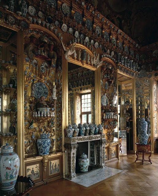
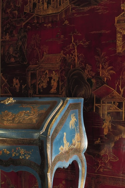
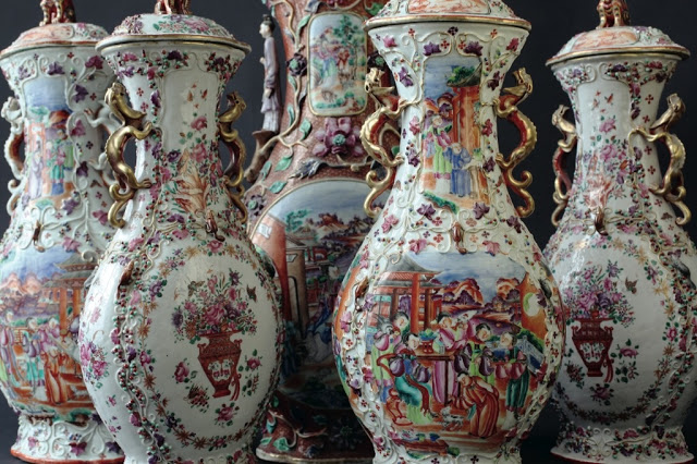
Then he rose to pull the chicken from the oven leaving me with a mental party favor that I’ve carried around since – setting it on the counter here, loading it in the car there.  We won’t know, I suppose, any more than these artists knew their work would live for centuries.  At the time they were just making brushstrokes on wood or silk or porcelain.

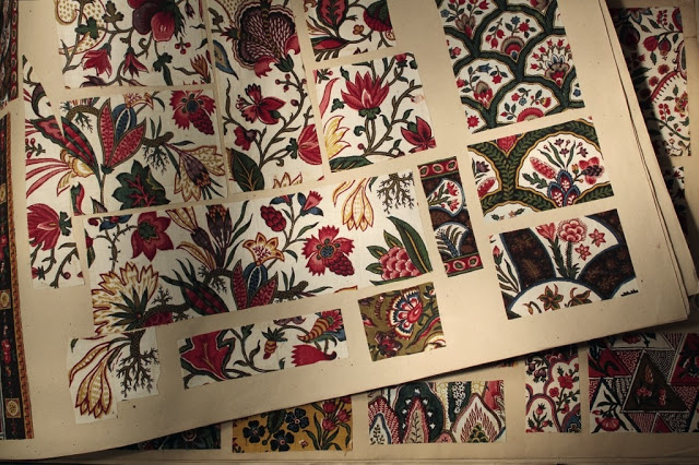
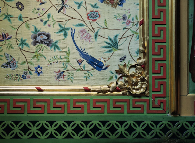
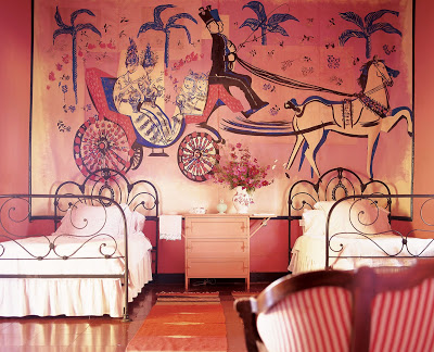
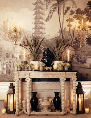
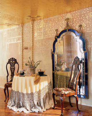
All images from Exotic Taste: Orientalist Interiors by Emmanuelle Gaillard and Marc Walter published by The Verdome Press.  The book includes hundreds of images of rooms and objects influenced by the Far East, India and the Islamic world.  It’s stunningly beautiful and if you have a strong connection to Chinoiserie or porcelain or unbelievable tile, it is a must.  All images Marc Walter.  The publishers provided the book for review.

rssrss      FacebooktwitterpinterestlinkedinmailFacebooktwitterpinterestlinkedinmail

Roots of Addiction

I mention that the Mrs. Livengood of this post was one of my mother’s best friends; I later realized she was one of mine.  It was her birthday yesterday and I thought we would throw some good wishes her way.  Krissy appeared in the previous post; she was helping me open my birthday presents.  This post originally appeared October 15, 2009.

You know those stories about celebrities who give their children controlled substances? And how you read these accounts and wonder, “What were they thinking?”


Well, my mother was a little guilty of this. When I was small and we lived in Atlanta my mother made a very good friend while we were on the playground. I, in turn, became very good friends with the friend’s daughter as these things sometime happen.

While my parents’ house was an ever evolving array of tasteful yet jazzy (probably department store) finds, Krissy Livengood’s parents’ house was not.

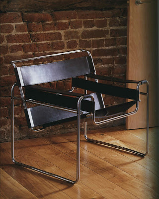
Krissy Livengood’s parents had a pair of Wassily chairs. When I walked through their living room I was mesmerized by the slats made of leather. With every visit I’m quite sure her mother anticipated wiping my grimy fingerprints from the cool chrome. I could not resist running my hand along that silvery steel.

They were wonderful. I was in awe of those chairs. In my memory the room where they resided was always quiet, but perhaps my ears were ringing. While everyone else found it so intriguing that Krissy’s father had one blue eye and one brown eye, I thought that merely a quirk of nature. The thing that made the Livengoods interesting – fascinating even – were those chairs.

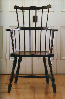
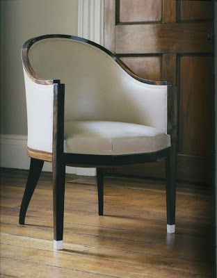
We moved from Atlanta when I was eight, but the chair addiction was firmly established. Imagine my delight with Judith Miller’s new book, Chairs. Over one hundred chairs, beautifully shot by Nick Pope, on big pages, presented in chronological order. Truly a chair lover’s dream.

And a terrific red cover. Almost as good as having a Wassily of my own.
P.S. Mrs. Livengood, in true Southern fashion, has passed her chairs to her daughter. Who now goes by Kristin.
Chairs by Judith Miller was provided to me for review by the publisher, Conran Octopus. All photographs by Nick Pope. The Wassily chair is fourth from the top.
rssrss      FacebooktwitterpinterestlinkedinmailFacebooktwitterpinterestlinkedinmail

Best Friends for Frances

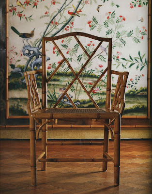
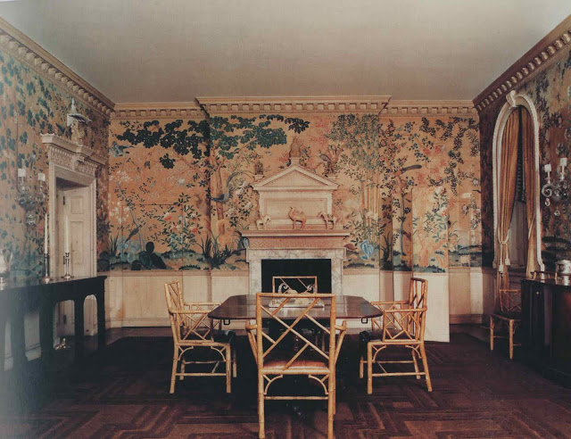
Frances Elkins arrived by post on Monday, swaddled in brown paper, and promptly changed my life.  It may be a week, a month, a year of Elkins, but for now, here is the dining room of Mr. and Mrs. Kersey Coates Reed, Lake Forest, Illinois, 1929.  This room came up last week (and you can see the later version of the room here) and many readers referred to the room as Elkins originally designed it.

The hidden door and the camouflage screen are both there, but indeed, no chandelier (and certainly not two) and then there are the wonderful bamboo chairs.  And, yes, if Mrs. Elkins sat next to me on a plane, I do think we would be friends.

Image from Frances Elkins Interior Design by Stephen M. Salny; photography by Luis Medina.

rssrss      FacebooktwitterpinterestlinkedinmailFacebooktwitterpinterestlinkedinmail

Wall Flower

Somewhat suddenly, a vision is starting to appear.  A plan.  Just for the backgrounds, really, though it has my blood jumping a little.

I have called to see about the weird spot on the ceiling and discovered Folly Green is great for the dining room, and aptly named as well, I fear.  An omen for the stenciling perhaps.

The strie glaze that I thought would be a piece of cake has turned into a piece of, well, unpleasantness and I am now experimenting with glazes and brushes which was not part of the plan.

I looked for wallpaper yesterday for the first time in years.  It came back quickly, the fast flip to see if anything would catch my eye.  I rediscovered a few friends and we reminisced over rooms they have adorned.

I know some people say “Rugs first!” but my visions tend to come fully formed and it is the paint that I can usually afford fastest, so my houses start with walls.  Today I will be out hunting and gathering information to help with the living room wall project; I am so anxious to begin.

All the images today are from Walls, the Best of Decorative Treatments by Florence de Dampierre, Rizzoli International.  The cover may lead you to believe this is purely a traditional tome, but there is inspiration for every taste.  Murals, panels, paper and paint, there are fine examples of them all.  Photography, Pieter Estersohn.

rssrss      FacebooktwitterpinterestlinkedinmailFacebooktwitterpinterestlinkedinmail

“I am a wanderer.”

I’m not sure exactly what I expected when I met Charlotte Moss.  I can only say that she was “more.”  I expected her to be gracious and smart, but she was more than that, really.  And, I think the most pleasant surprise was that she was as interested as interesting; it’s an engaging combination.

She served my coffee in a Pearl River Market coffee cup with clever cover and it was a relief to see someone who is so stylish so unconcerned with label and tag.

Moss’s latest book, Charlotte Moss Decorates, is a compilation of show house rooms that she has designed.  She liked the concept of these projects as they reflect a start-from-scratch approach.  “It is what a lot of homeowners face – four blank walls.”
  
This blankness allows Moss to create a story, to develop a character, to build a room to suit a life.  Moss revels in travel and you can sense from her stories that she is an observer, someone who is cataloguing experience and impressions along with color and shape and scale.
She notes that the “high/low” happens; something clicks.  When these types of things are contrived it is obvious – anything forced looks it in the end.  Moss noted that so much work goes into these show houses, and that the vendors and supplies are so incredibly generous, that they “don’t get the shelf life they deserve.”  We can certainly enjoy them in this latest book.
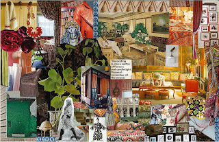
All images courtesy of Rizzoli from Charlotte Moss Decorates; photography by Pieter Estersohn, except the last which is Moss’s inspiration board for Kips Bay 2008.
rssrss      FacebooktwitterpinterestlinkedinmailFacebooktwitterpinterestlinkedinmail