Tag Archives: Designers

Dining In

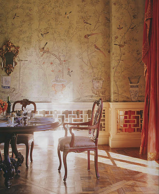
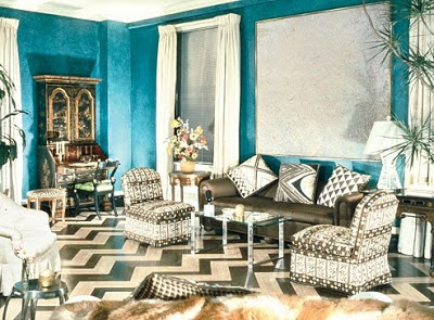
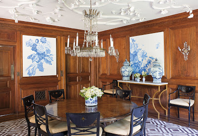
Just one more, technically not from the bulletin board, but inspiration just the same.  These may be my favorite dining room walls.

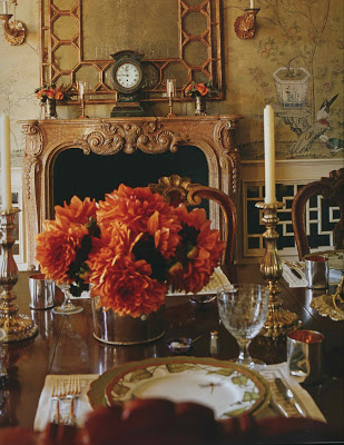
This house wants green and blue (and maybe a dash of red.)  It does.  It has no affinity for yellow, though it holds no personal grudge.  This house shrugs at yellow.  This house would walk by yellow in the hall and say “Hi, how are you,” but would never stop to hear about the horrific drive to work.   It may also be a little vain as it cannot seem to pass up a mirror. 
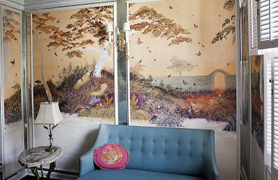
A little mirror, a little fretwork.  I just keep wondering if I could do it myself.
Images from Charlotte Moss’s A Flair for Living, photography by Pieter Estersohn.
rssrss      FacebooktwitterpinterestlinkedinmailFacebooktwitterpinterestlinkedinmail

Forward, March!

Yesterday, just as the snow madness was about to overtake me, the eldest yelled, “Mom, the mail is here.”
In my girlhood I’d read Laura Ingalls Wilder’s series, one book after another, and I wondered anew about having a blizzard come on without two days of weatherman hype. Hard to imagine, as my youngest played Wii, that there was a time when I would have tied a rope to his waist to make sure he would not get lost in a snow drift on the way to the restroom. Still, Ms. Wilder’s fate seemed to pale in comparison to the suffering I have endured here on the Kansas plains as my mailman seems to take issue with delivering anything larger than a letter size envelope.
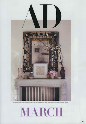
But yesterday, the March issue of AD arrived. Am I going to spill forth image after image, spoiling your first look at the silvery grain of the pickled cypress paneling in the Richard Keith Langham project? Nope. Deny you the pleasure of re-Klineing with Michael Smith? I won’t. How about just a peek at a Paris home a la Grange? No way. But if you have to walk into town through two feet of snow because you can’t get your horse out of the barn? I think it’s worth it.
Image, Architectural Digest, March, 2011, design by Michael Smith; photography by Pieter Estersohn.
rssrss      FacebooktwitterpinterestlinkedinmailFacebooktwitterpinterestlinkedinmail

Masterpiece

Many of us are experiencing a little Downton withdrawal. For me the series has been fast and furious. Like many love affairs, it came on suddenly then seemed over just as it began.

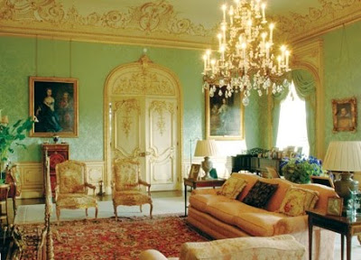
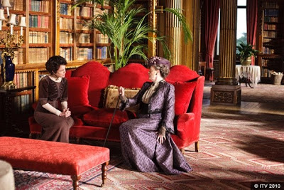
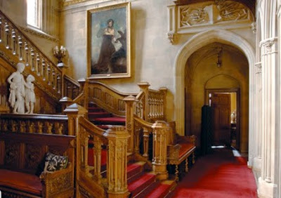
Part of the appeal, of course, are the homes, Highclere Castle being somewhat the star of the show, though, naturally, I prefer the cottage. I never seem to be able to just sit and enjoy this sort of thing, always my brain is click, click, click. What was the process of production design? How much was the house altered? Could it be that most are sets?

So I rang Donal Woods, the production designer for the show, and asked. (That’s normal, right? You would have done that, maybe?) “We moved out a lot of the furniture – about fifty-percent. We added palms and personal affects, removed the modern portraits and things,” said Woods.
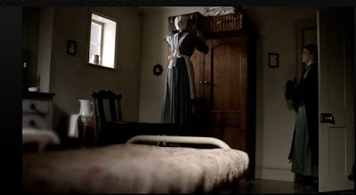
“It was time to do a piece for the twentieth century; we’ve done Austen. We’ve done Georgian and the 18th century to death. We started looking for a house in 2009. We looked at about thirty houses; some were too big and some were too small,” he paused, “It’s a great job, really.” I’d say. Wood said they made a point of providing stark contrast between the family’s rooms and the servants’ spaces, “We only used three-to-four colors downstairs; we wanted the contrast to be dazzling.”

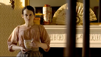
Woods said that screenwriter, Julian Fellowes, provided notes, character outlines and the first script to inspire the set. I’d assumed that the public rooms of the house were authentic, but that the bedrooms were likely sets, though this is not the case. A few of the rooms are sets, but mostly the series was filmed in the house. The girls’ rooms are particularly telling. Sybil’s room is a sunny yellow with wonderful floral curtains. Fresh and vibrant like its mistress.

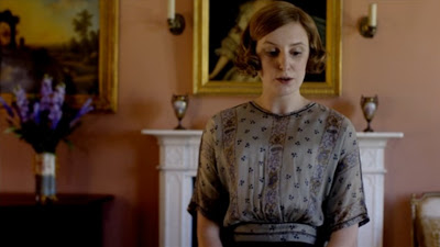
“Edith,” says Wood, “is a plain girl. She has a plain room.” Indeed, though its paint is particularly lovely with her coloring.
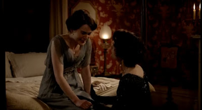
But it was Mary’s wallpaper that sent me down this path. In every scene that it appears I can barely keep my eyes on the actors (except for that dashing Kemal Pamuk – on him, I focused.) Blood red with a creamy floral pattern, it seemed perfectly fitting for Mary, but an unlikely choice for a young lady of her day. The team considered other options, but “It’s pushy, strong, passionate. Like Mary.”
Downton Abbey has just finished running on PBS’s Masterpiece, but you can see the series on-line at PBS.org or purchase it on iTunes. More information on Highclere Castle here. Woods reports that season two has just begun filming.
All images via PBS.org.
rssrss      FacebooktwitterpinterestlinkedinmailFacebooktwitterpinterestlinkedinmail

Tweet, Tweetley Deet

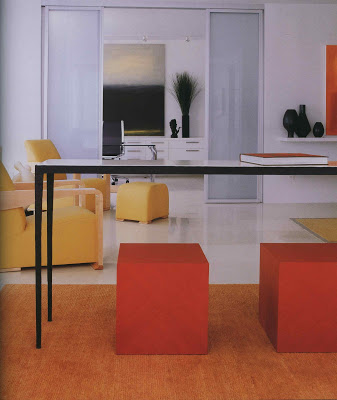
Just so you know, I’m on Twitter, here. Who knows how it will go; you’ll notice the calendar in the side bar has vanished. Still, I’m giving it a go. Sometimes it’s good to step out, as the Jackson 5 have here in their yellow, orange and white. Think it’s a look you can’t pull off?

Jennifer Post,

Keith Irvine,

Muriel Brandolini,

Dan Carithers and

David Hicks managed just fine.
Image, top, photography by Anita Calero, next, Michael Mundy, both from House & Garden Book of Style; third image, Pieter Estersohn, Style and Substance, The Best of Elle Decor; next, Estersohn, again for Southern Accents on Color, image, last, uncredited, from David Hicks: Designer.
rssrss      FacebooktwitterpinterestlinkedinmailFacebooktwitterpinterestlinkedinmail

Wandering Minds Want to Know

As I push furniture and measure windows, I am thinking about what I want. What I want, which is something entirely different from what readers want or what is best or what is on-trend. As I think it over, or over think it, my mind’s eye is drawn to a couple of things. One, was Thomas Jayne’s new year resolution at Elle Decor, “I resolve to listen to my design instincts. At this point in my experience and education, my first reactions are often the best ones.”

The second was in Albert Hadley’s advice to those who are starting out on Architectural Digest’s web page, “The best rooms have history and meaning: photographs that remind you of someone, furniture that has a story. Whatever you put in your house should be interesting. I may not like it, but that doesn’t make any difference. And decorating is not about dollars and cents; it’s an emotional thing, it’s passion.”

I don’t have Jayne’s education and experience, of course, but I think his resolution and Hadley’s observation go hand in hand. I’m making my home. Mine.

And all this ruminating led me back to the books, as usual. This Los Angeles home in Hancock Park was built in 1938. Almost ’40’s, the decade whose aesthetic seems to be wired into my hard drive. The grounds, the patio, the wrought iron awning, all delightful.

But the dining room ceiling, a modification of the owner, is an update that enchanted me. It’s dramatic and subtle at the same time, reminiscent of plaster ceilings of the past while being clearly modern.
Further, the collage panels in the powder room contain butterflies, the heads of which are photos of family friends. And what struck me, was that these details are so completely personal. Nine people out of ten, perhaps anyone whose picture was not included, would walk by that wall without a second glance. But for the owners it is a treasure trove of sentiment.

Hadley, again, “Decorating has never been superficial. It has always represented the best of times. Now I’m talking about the rich, who have always furnished their houses elaborately. But even a cottage is a castle to the person who lives in it.”

Image, top, from Thomas Jayne; next, a Hadley design via Arch Digest for an on-line interview; the profile in the magazine was by Mitch Owens; all remaining images, Classic Homes of Los Angeles, which I received as a review copy, by Douglas Wells; photography by Melba Levick.

rssrss      FacebooktwitterpinterestlinkedinmailFacebooktwitterpinterestlinkedinmail