Tag Archives: Designers

Water(man’s) Mark

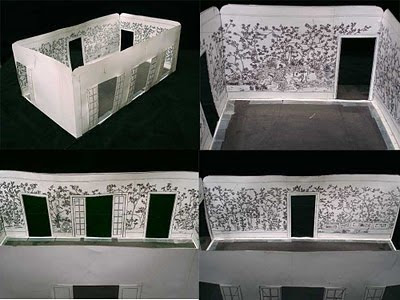
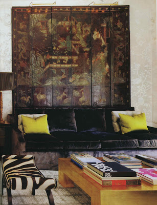
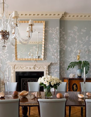
There is a lovely picture (which I’ve cropped badly) of a Windsor Smith project in the January issue of Architectural Digest. The minute I saw the room I remembered it from a post on Corbu’s Cave, painter Scott Waterman’s blog.

That subtle, luminous chinoiserie shimmering on the wall is not paper, rather painting. But the really remarkable thing about it is the process. You can read how the project was conceived and executed here.
Image, top, Architectural Digest, January 2011, design by Windsor Smith, photography Erhard Pfeiffer; next via Corbu’s Cave.
rssrss      FacebooktwitterpinterestlinkedinmailFacebooktwitterpinterestlinkedinmail

Christmas Card

We close on the house on Wednesday, take care of some unfortunate mold, and move on Saturday. (Assuming all goes as planned. Knock wood. Throw salt. Spit.)

I’ve had a few friends say, “You’re not putting up a tree, are you?” “Surely you are not decorating for Christmas?” Heavens. Of course. We have a seven-year-old for the love of Pete (and a 10-year-old and a 14-year-old.) Some things are non-negotiable. Christmas is non-negotiable. (There is also talk of a puppy and I’d like to say I am the voice of sanity, but I rarely am and, in this case, I absolutely am not.)

But as much as I love making our holiday cards, as much as I dig a paper craft, it may be the one thing that I skip. The current plan has two card sizes, a printed sticker and a couple of stick-on jewels to accompany the picture. “It looks like a truck, right?” To which they responded, “Um. Sure. Sort of. Maybe you could paint on a grill. And wheels. Could you make the wheels turn?” Darling, I can make holiday magic the likes of which you have never imagined. But maybe not this year.
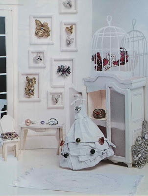
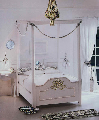
Images from Harpers Bazaar, December, 2010. Photography by Lacey and this really amazing paper art by Su Blackwell. I thought these shots would be included in a larger story in the magazine, but they are not. Just like a little something in your stocking that you might overlook if you didn’t reach all the way into the toe. You can see more of her work here. Other, completely unrelated paper art at Mondoblogo.
rssrss      FacebooktwitterpinterestlinkedinmailFacebooktwitterpinterestlinkedinmail

Your Finest Room

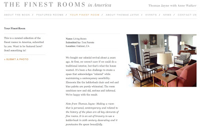
While I was talking with Thomas Jayne last week I mentioned that I had a room that I thought could have made the list. He nodded, good naturedly, and said, “Yes, we actually have a spot on the website where people can post their finest rooms.” It could be, of course, a room of your own, or you can post an interior that inspires you.
I sent a picture of my old dining room. I’m kidding. I did send a picture of Todd Romano’s apartment; if posted, I am quite looking forward to Jayne’s note.
You can send your own selection here.
rssrss      FacebooktwitterpinterestlinkedinmailFacebooktwitterpinterestlinkedinmail

Punctuation

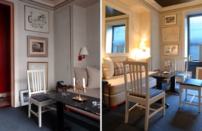
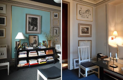
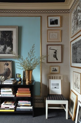
Thomas Jayne is blogging for Interior Design magazine and one of his posts contains a couple of pictures of Albert Hadley’s sitting room, which appears as the last project in the book. Like a spoonful of shaved ice at the end of a meal, it leaves one with a refreshing feeling of satisfaction – a sense that talent and restraint can be as significant as budget.
Jayne has received a lot of positive feedback on the inclusion of this room and it is endearing to note that Hadley did not think the room should be a part of the project. “I asked him,” recalls Jayne, “and he said he did not think it was worthy. I asked if we could shoot it anyway, then he could look at the pictures and decide. When I showed him the proofs he relented, but he still didn’t think it should be included.”
rssrss      FacebooktwitterpinterestlinkedinmailFacebooktwitterpinterestlinkedinmail

The Finest Rooms in America

I was in New York last week and was delighted that I was able to talk with Thomas Jayne about his new book, The Finest Rooms in America.


Many of you may have The Finest Rooms by America’s Great Decorators published in 1965. While several of the selections in the vintage book have a very similar feel, Jayne’s do not. As Jayne said, “It was a microcosm of New York decorating. Today there is not a clear group [of decorators], not a single shared aesthetic. Not everyone wants a French room.”

He notes that his book is a completely subjective compilation. Once he’d conceived the project he sat down to make a list of the thirty rooms he would like to see in the book. He had it in short measure. He then went back to fill in the gaps, “like the big, flouncy chintz room. It needed that.” He was able to secure nearly every room on his wish list.

There are not “new” projects in the book, though there were a few that were new to me. In addition, many of my favorite rooms do appear on the pages and I did not have them in printed form before, like the Brody House by Billy Haines and the Menil house by Charles James. I told Jayne that Suzanne Trocme’s Influential Interiors was, yes, influential to me. Perhaps a retread to others, Trocme’s book introduced me to many names in design history.
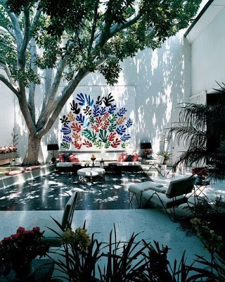
This is part of the value of Jayne’s book as well, to see a clear perspective, a distinct point of view, in what will last; it is a bonus to have them all in one lovely place.
For a schedule of book signings click here.
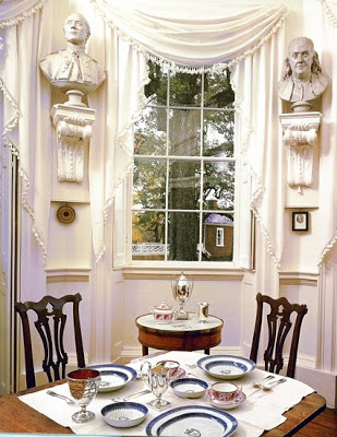
All images from The Finest Rooms in America courtesy of Monacelli Press. From top, Monticello photographed by Paul Rocheleau; Hadley’s sitting room by Kerri McCaffety; Mary Cooper House, McCaffety; Oceanfront House, Scott Frances; Francis Brody House, Oberto Gili.
rssrss      FacebooktwitterpinterestlinkedinmailFacebooktwitterpinterestlinkedinmail