Tag Archives: Designers

Off the Rack

A quick heads up. I know that not everyone makes a point to pick up World of Interiors every issue, but there is a terrific piece on Anna Wintour’s second Long Island home designed by Jesse Carrier in the October issue. Terrific. And if you think it’s a coincidence that I chose an image with a huge needlepoint pillow in it, you would be wrong.
Image, World of Interiors, October 2010, design by Jesse Carrier; photography by Eric Boman.
rssrss      FacebooktwitterpinterestlinkedinmailFacebooktwitterpinterestlinkedinmail

Men’s Club

I saw an astrologer a couple of years ago and one of the things that he told me that pops into my head now again was that this is my first life as a woman.

My first best friend was Krissy Livengood, but the next was a boy. Hard to believe, but Phillip Kent and I caught tad poles and played kick ball and had sleep overs, and ever since I’ve felt more relaxed, less on guard, in the company of males. We did have a minor misunderstanding about rock concerts, but it was mutual, and our parents were very patient as they sat in his backyard and listened to us as we described each specimen in our collection.

Women are often a mystery to me and the girl code is something that I feel like I’ve never unlocked. Women tell me things and I believe them. They say, “Don’t come,” or “Don’t cook,” or “It’s not dressy,” and I think that they mean it, but I find myself standing in my kitchen five phone calls later still trying to determine if it is better to go or to cook or to slip on a strapless.

Men are easier, usually. They are more straightforward, mostly. They can be crafty, sometimes, but even then it might work out to one’s advantage.

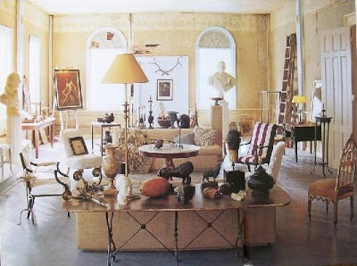
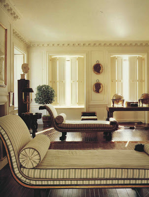
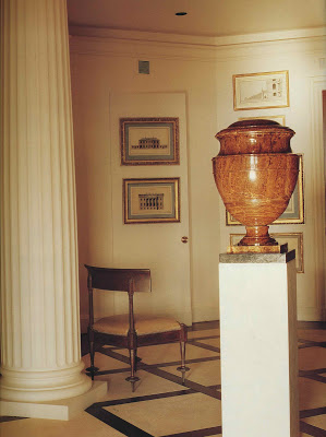
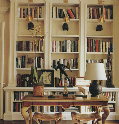
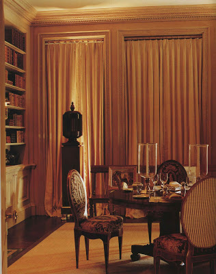
The design in all of these images is the work of artist, Frank Faulkner. I initially found Faulkner’s work trolling Stephanie Hoppen’s Perfect Neutrals; the first two images were found there, photographed by Simon Upton. The last two are via his site. You can see Faulkner’s current residence on Pretty Pink Tulips here.
rssrss      FacebooktwitterpinterestlinkedinmailFacebooktwitterpinterestlinkedinmail

White Lightning

Geez, Louise, but it is hot and sticky here in Kansas City. I’m a warm weather fan, but this Indian Summer is wearing out its welcome.

I aimed to beat the heat inside but my quest for white wall inspiration led to Melissa Rufty and I ended up hot under the collar.

I think I’ve shied away from white walls in the past because I have such an itch to color outside the lines, but Rufty’s rooms show that white can be just right. These spaces are anything but vanilla.

It helps, of course, that her furniture choices are so distinct; mine are not nearly so fine though what they lack in pedigree they do make up for in chutzpah.

Everything looks so crisp. Everything looks so clean.

Even when the upholstery is not as exuberant the look still goes, “pow!” Who needs colored walls? White is the answer!

Or turquoise. Oh, my.
I had a vision of Rufty’s work that I spied on Style Court, here. All images courtesy of Melissa Rufty at MMR Interiors. She does tons more than white walls, in fact, she’s in House Beautiful this month – check it out.
rssrss      FacebooktwitterpinterestlinkedinmailFacebooktwitterpinterestlinkedinmail

Simply Divine

It’s been bookshelf bounty around here the last couple of days. I have neglected everything else and have been reading Jonathan Franzen’s Freedom when not toting or driving or fixing something for someone else.


Today’s post was supposed to be about finding cool stuff for yourself instead of letting catalogue companies reproduce it and deliver it to your mailbox, but I took a turn at Spivey’s Books and never made it to the River Market Antique Mall.

There I found this tiny little pamphlet-like thing, Interiors, Character and Color edited and written by Van Day Truex. For $3. Wonderful. Being so close to Half-Priced Books I stopped in to see if Vreeland’s Allure was still there. Was. Truly, I don’t need to be spending $50 on a book, but it seemed some kind of divine intervention so I lugged it around while making a quick dash through the design section. There, completely unaware that it is fashion week, was The Fashion House with no price tag. “How about $2 since the jacket is torn?” said the nice woman behind the counter. Um. Great. Thereby justifying the alluring Allure.

So while the youngest did his math homework and spelling, I was tutored by Vreeland and Truex. After all her musings on style and photography and attitude she declares, “…really, we should forget all this nonsense and just stay home and read Proust.”

Then, with iCarly in the background, I noticed Yves Saint Laurent’s note in the Fashion House that his entire home was conceived around Rememberance of Things Past. But I can’t possibly return to Proust right now as Franzen has my fancy and in the meantime I must ponder the allure of Bill Blass’s white walls.
All images Bill Blass’s home in The Fashion House by Lisa Lovatt-Smith. Photography by Fritz von der Schulenburg.

Jonathan Franzen will be at Unity Temple on the Plaza, thanks to the wonderful Rainy Day Books, September 22nd. Information here.
rssrss      FacebooktwitterpinterestlinkedinmailFacebooktwitterpinterestlinkedinmail

If Walls Could Talk

As we think, and talk, about moving a few people have said, “Oh, it will be fine. I know you love your house, but where ever you go you will make it great.”

But it doesn’t work like that. Some houses are just great. The architecture is beautiful and the scale is just right and everything has been beautifully calibrated. Houses like that are not within my reach.

But the houses I will see, far less grand, will either have soul or they won’t. Houses have soul. I’ve yet to see someone inject it; it’s there or it’s not regardless the wallpaper or paint or linoleum.

As I came up the walk of my current house, toddler in one hand, baby carrier in the other, I thought, “This isn’t it. Darn. A waste of time.” A sort-of Tudor, seemingly smallish from the street, sure to be full of awkward rooms and nooks and crannies that a symmetry-and-space-loving woman like me could never appreciate.

And then I stood on the threshold of the front door, and, as it turned out my next ten years, and its energy washed over me in a way that the scent of baking cookies could have never conveyed.
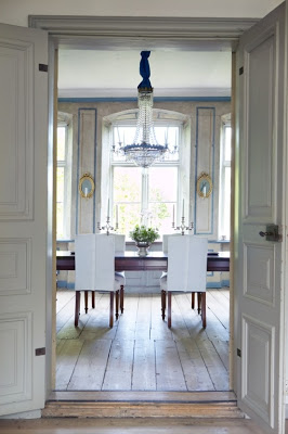
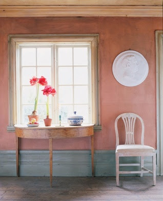
Images courtesy of Vendome Press from Lars Bolander’s Scandinavian Design by Heather Smith MacIsaac, photography, these images, by Staffan Johansson. The book is beautiful and brings to life the philosophy that country does not mean kitsch. The rooms delight and while distinctively Scandinavian, provide inspiration for anyone interested in using that soothing mix of formal pieces, informal fabrics and wonderful color.
rssrss      FacebooktwitterpinterestlinkedinmailFacebooktwitterpinterestlinkedinmail