Tag Archives: Designers

Roger Lussier – White Knight

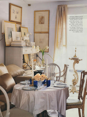
Previously, I have posted two versions of Roger Lussier’s Boston apartment. The first was published in ’89 and the second in ’94. (You might remember that Suzanne Rheinstein noted Lussier’s apartment was a space that would last in the Enduring Styles series.)

My needlepoint guru recently passed along piles of Southern Accents and I whiled away a few mornings catching up with that old friend.

This is a third version of Lussier’s apartment which appeared in SA in March/April of 2003. Another jewel. With white walls.
Photography by Thibault Jeanson.
rssrss      FacebooktwitterpinterestlinkedinmailFacebooktwitterpinterestlinkedinmail

White on White

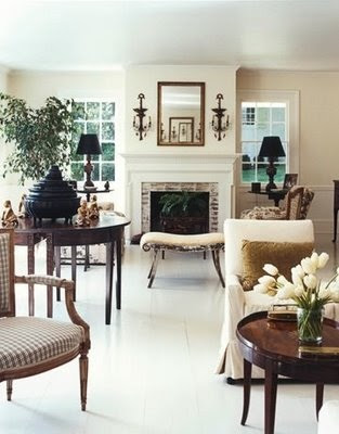
You probably already know this. It’s like someone telling you that sugary snacks are not good for you. But if you read the text from the Elle Decor piece on John Dransfield’s and Geoffrey Ross’s home, above, you know that Parish-Hadley originally decorated the house.

Which you can see hither and yon. My image comes from Influential Interiors by Suzanne Trocme, but the house also appears in Parish Hadley, Sixty Years of American Design. Which I don’t own, but yearn for. I thought this was the case (that this was the same house, not that I yearned for the book) when local dealer, Barbara Farmer called to tell me she had the magazine and the book open on her desk.

The previous owner of the home moved here, a spot also decorated by Albert Hadley. All beautifully crafted with white walls. White walls may be the theme for the rest of July.
Images from top, Dransfield and Ross in Elle Decor, July/August 2010, photography by Simon Upton; Albert Hadley from Influential Interiors by Suzanne Trocme, photography Michael Mundy, I think; Albert Hadley from House Beautiful, photography by Simon Watson.
rssrss      FacebooktwitterpinterestlinkedinmailFacebooktwitterpinterestlinkedinmail

Scanning the Horizon

The boys’ swim season has just ended and this year was the first time the youngest participated. As he sat at clerk of the course (don’t ask) preparing for his first event my mother-in-law said, “He looks nervous.” “You think? Why?” “He’s swinging his feet.” I looked closer at his lean frame, his forearms resting lightly on the arms of the chair. He was already wearing his googles, their mirrored lenses gleaming in the sunlight, though he would not need their protection for another five minutes or so. “He’s not nervous. He’s happy.”

He’s pretty much always happy unless his older brothers are being older brothers and even then his bother is brief. He inspires me.

As Megan Arquette has inspired me with her post of an image of Charlotte Perriand (you must) in a moment that is joy personified.

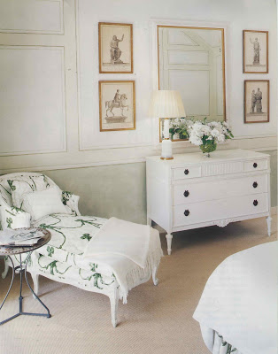
As does Diane Dorrans Saeks who featured Bellamont House in Ireland and its beautiful white walls. I’m having a flirtation with white walls and am fantasizing about their crisp, clean freshness.

Which is why I pulled this spread. No other reason than it confirmed my attraction to green and black and white. And happy. Just scrapbooking and playing connect the dots.
All images Veranda, July/August 2001, photography by Casey Sills.
rssrss      FacebooktwitterpinterestlinkedinmailFacebooktwitterpinterestlinkedinmail

Newell Post

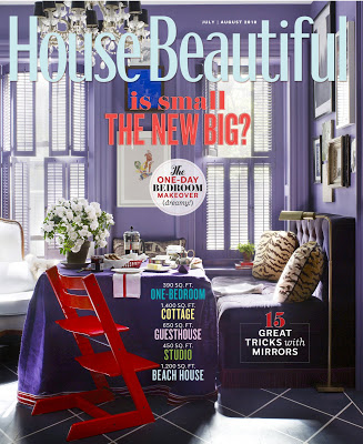
The recent round of editor musical chairs made the magazine junkies excited, but maybe a little jumpy and twitchy. No one likes anyone messing with one of her favorites. Such a relief, though not a surprise, to find Newell Turner’s first issue of House Beautiful such a delight.
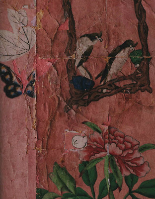
Not a surprise as Turner has been Style Director at House Beautiful for quite a while; the magazine has felt his influence already. “I worked so closely with Stephen Drucker over the last four years here that I feel like it’s already my House Beautiful. But, great magazines are alive and dynamic – meaning there’s always some evolution in progress. Especially today, no one wants exactly the same thing over and over again,” says Turner.

I wondered if he had a moment of giddy pleasure being able to feature David Kaihoi’s distinctly beautiful apartment in his debut issue. “I did! This may sound a little crazy, but that purple color spoke to me.” No, no that doesn’t sound crazy at all. That sounds normal. That’s normal, right?
Turner was quick to give credit to his team, “Of course, I have one of the best design directors, Scot Schy , in publishing. I loved what David did with the salvaged wallpaper in the bedroom. And, when Scot showed me the layouts for the story including a full page detail of the wallpaper…how much more evocative does it get? Every time I look at that spread in the magazine I want to reach out and touch the wallpaper. I hope it does the same thing to our readers!”
If you haven’t had a chance to pick up the July/August issue you should make it a point. That sunny beach house, top, can put a spring in any one’s step. And Kaihoi’s apartment? Tear Sheet Hall of Fame.
All images House Beautiful, July/August 2010. Photography, second from top, Victoria Pearson; design, Krista Ewart; remain photos by Ngoc Minh Ngo.
rssrss      FacebooktwitterpinterestlinkedinmailFacebooktwitterpinterestlinkedinmail