Tag Archives: Designers

Peppermint Twist

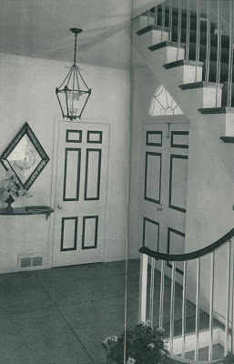
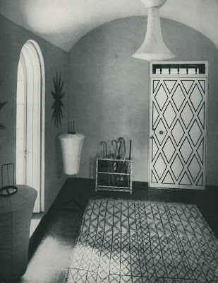
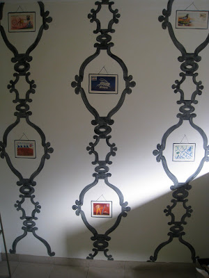
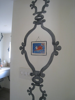
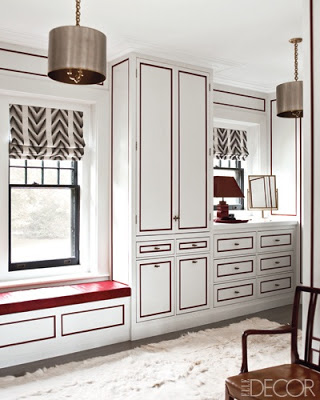
Custom cabinetry aside, this handy little paint trick has me falling right in line.


“Why not?” said Henry B. Swap. “Why not?” said Mrs. McGillicuddy.

“Why not?” said all the people.
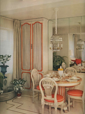
Why not, indeed, snappy designers have been doing it for ages.

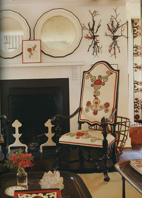
Marian McEvoy lined them up with Sharpie.

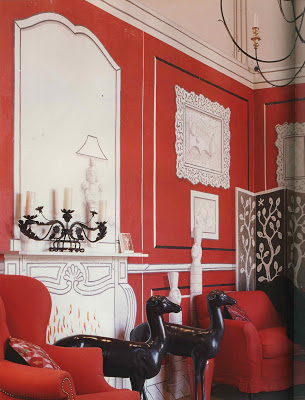
Suzanne Rheinstein colored outside the lines with this eye-catching display.


And don’t feel confined to handwriting on the wall, you can easily outline your objectives on the furniture, too.
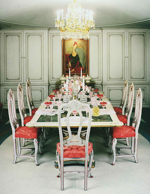
Image, top, designed by Steven Gambrel in Elle Decor, January/February 2010, photography by Eric Piasecki; the lines on this doorway are blue, as is the railing atop those very jazzy lucite balustrades (ala current style setters Alexis and Trevor Traina), design by Baldwin & Martin. Hmm…Baldwin & Martin again with the diamond mine, and a twist of orange by Mallory-Tillis all from HG’s Complete Guide to Interior Decoration, 1960. Marion McEvoy from Rooms to Inspire, photography by Tim Street-Porter as is Rheinstein’s black and white and red all-over by painter Paulin Paris. And, once you are finished admiring the lovely Modigliani, do click the image, bottom, to admire the refreshing red sorbet popping against the pink carnations and fizzy cocktail from Mr. and Mrs. Frederick Mann’s Philadelphia apartment featured in House & Garden in 1953 from The Well Lived Life by Dominique Browning. Pieces of the text refer to Mike Mulligan and His Steam Shovel.
rssrss      FacebooktwitterpinterestlinkedinmailFacebooktwitterpinterestlinkedinmail

Nature v Nurture


As I was strolling arm-in-arm down the street with Miles Redd the other day he was reminiscing about his childhood. Oh, wait. Perhaps it didn’t go quite like that.

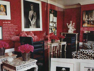
Redd and I did have an exchange about his childhood, but it was more like this – I had the enormous pleasure of interviewing Thomas Britt a few weeks ago. In my living room. Britt is from Kansas City and was in town to see friends. My editor and I thought it would be interesting – great fun, really – to interview him for the magazine. Beyond interesting, it was fascinating and immensely entertaining.
He told me stories of Studio 54 and maharajahs, but some of his most interesting tales were of his growing up. He told me of redecorating his parents’ dining room while they were out of town. Really redecorating. Painting the floor and walls and installing salvaged columns and moving things around. “How’d they take it?” “What?” “The redecorating, when your mother came home from her trip, how did she react?” “React?! She loved it, of course!”
Of course. That is the kind of mother I want to be, but sometimes fall short. The kind of mother who would come home to find that her incredibly talented son had redecorated the dining room, better than she, and celebrate it. It got me thinking.
So I shot Redd an email. Did he, I wondered, begin showing an interest in lacquer and lamps while knee-high? And if so, did his folks just hand him a paint brush and go back to the Journal Constitution? Pretty much.
“As a child I had a fascination with with front doors and chandeliers,” said Redd,”the grander the better. My bedroom was an ever-evolving canvas. I remember arranging stuffed animals and was always into the arts, painting and drawing.
My parents were very supportive. My mom, ever clever, would get me to decorate the house for Christmas. I would slave on pomanders and polish all the silver, but she had a strong sense of her own style and we did not always see eye-to-eye. I wanted ball fringe on everything, and my mother had a very colonial approach to things. She loved that scrubbed, Spartan look – polished mahogany, hemstitched linen, very plain silver, air twist glasses. She taught me restraint and understatement, and I suppose I teach her about a certain grandeur.
My mom has [my] Christmas list from age five requesting a fire place in my room. I thought falling asleep to the dying embers would be nice.”
If only one of my boys would refer to me as “ever clever,” I’d be quite content.
Image courtesy of Miles Redd.
rssrss      FacebooktwitterpinterestlinkedinmailFacebooktwitterpinterestlinkedinmail

Wonderfully Cutting

Ever see grand rooms like this and admire them, but think they have nothing to do with you and your dream house?

Think again.

So many classic design concepts can be applied to a variety of contemporary interior styles.

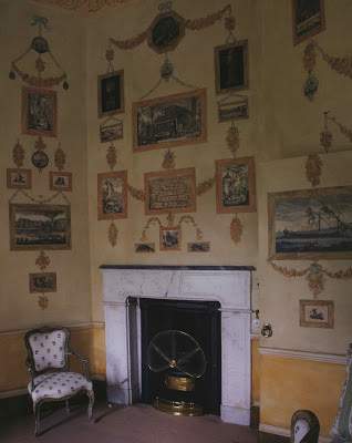
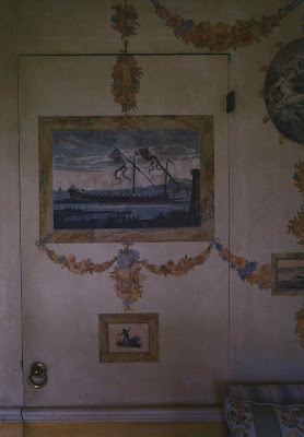
Here, George Terbovich has used a very similar concept as the print room in Yester House, above. Instead of etchings and swags he has applied images from the book, “Letters to Giorgio” by the late Jean-Michel Folon. Click the images and you will see charming illustrations from Falon to his friend. They are decidedly personal as the recipient of the letter and the shop owner share the same name.
Images, top, from In House by Mitchell Owens, photography by Derry Moore.
rssrss      FacebooktwitterpinterestlinkedinmailFacebooktwitterpinterestlinkedinmail

Britt Invasion

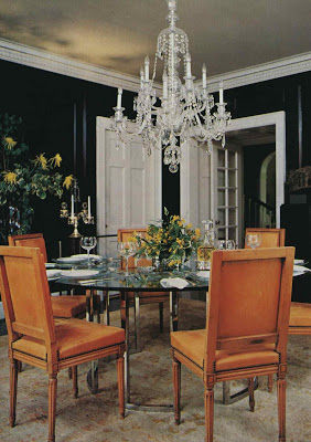
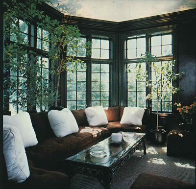
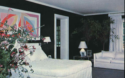
I had coffee with a local home reporter, Stacy Downs, this week and we were talking about design trends from 2009 (be on the lookout for Stacy’s article in the Kansas City Star; she is rocking the House and Home section.) Stacy noted the preponderance of black walls which sent me digging through my files.

I have several features from the late 70’s with walls clad in inky black, many including punches of white.

One of my favorites is a Kansas City home designed by Tom Britt that appeared in Architectural Digest in November of 1978. Just as I had finished scanning the images I heard the mail drop in the slot. Thunk. Heavy and hard, I knew a magazine would await. And, then whose work appeared in Vogue December 2009?

Mr. Britt, again. This time using black and white as accents in Alexis Swanson’s and Trevor Traina’s drawing room. Old dog. New tricks.
Photography from AD, Russell McMasters. Photography from Vogue, Francois Halard.
rssrss      FacebooktwitterpinterestlinkedinmailFacebooktwitterpinterestlinkedinmail

At Last Sweet Mystery of Life

I’ve scoured and searched and begged hither and yon for pictures of George Terbovich’s work.

I’ve hit pay dirt a few times, but George is not all that interested in being published. Not his style.

Speaking of style, I’ve seen four projects on which George has worked and each is quite distinct. I think I know his personal style, but he is not a designer that one hires for a particular look.

Which you can now see for yourself as he has put a glimpse of his portfolio on-line along with great stuff from his shop.

Click here to see the portfolio; here for the shop.


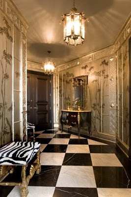
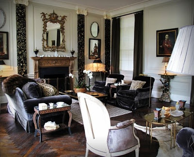
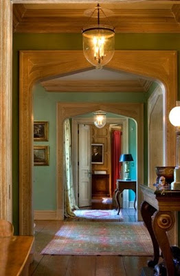
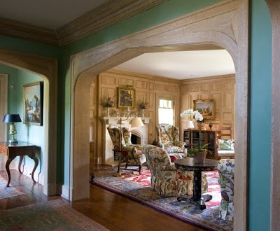
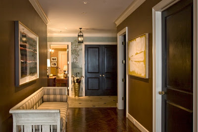
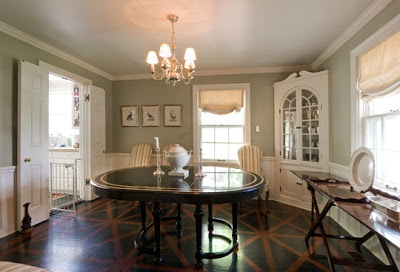
All images George Terbovich Design. The portfolio is arranged by room, so I have done a little match-making myself. These images may or may not be related.
rssrss      FacebooktwitterpinterestlinkedinmailFacebooktwitterpinterestlinkedinmail