Tag Archives: Designers

Disarmingly Incongruent

The blog break was caused by two things. The first was my weariness with making the boys wait while I scanned or posted or replied and the resulting sulking.

And the second was the buzz in my brain that was growing louder, “Why am I doing this?” The emphasis was on the subject and not the verb. Some would say this is typical.

In any event, this home provided the tipping point. You see, this is where I thought we were headed. After our mash with mid-century, every room a greatest hits, I thought we were on our way here.

Climbers do occasionally become part of the mix and a generation later they are “old guard.” I had an inkling that those precocious youngsters would eventually settle in with their elders – simply become part of the vocabulary.
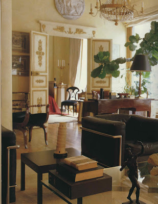
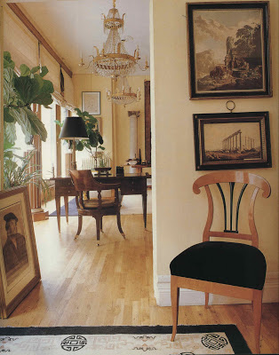
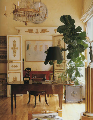
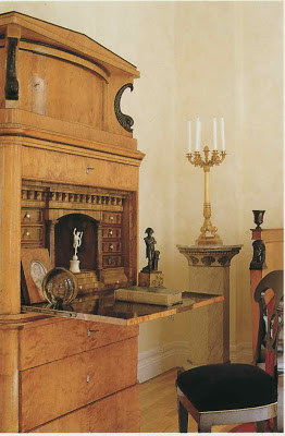
Then I stumbled upon Bernd Goeckler’s home in Classic Style. Viennese chandelier, Louis XVI writing desk, German day bed, Beidermeier secretary and Le Corbusier armchairs. A lot has been said lately about incongruent chairs, but these seem quite comfortable in their Neo-classical nest. Published in 1998.
Unfamiliar with Mr. Goeckler, I googled him. Sakes. Already in the midst of an engaging exchange with reader Toby Worthington I all but wailed, “I didn’t even know who Bernd Goeckler is.” And he typed back, “So. You didn’t and now you do.” Or something like that.
And the book sat open on this page for two weeks. Each member of my original audience surely saw it but it elicited not one comment. And then I remembered why I was doing this in the first place.
All images from Classic Style by Judith Miller, photography by Tim Ridley.
rssrss      FacebooktwitterpinterestlinkedinmailFacebooktwitterpinterestlinkedinmail

Off the Rack – Back in Black

At first I thought the altitude was making me light-headed.

But after returning to the plains I was assured that my original assessment was correct.

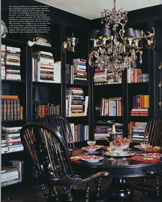
Black is the new black at least when it comes to wall color in the September shelter mags.

Shiny or matte, paint or paper, I applaud them all.

I considered matte black walls in the dining room of our first house and a friend with solid, if conventional, taste gasped, “It will look like a chalkboard! Don’t!”

In a crisis of confidence I demurred. It was not the the first time nor the last that I allowed someone else’s opinion to change my course.


I rarely look back on these shifts with relief and often with remorse. Life is shockingly unsure. Be bold.
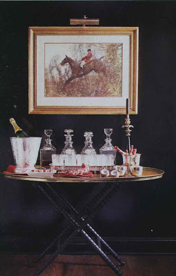
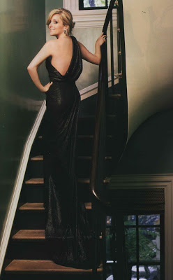
Images from top: Bookshelves and tray-top table, Mark Badgley and James Mischka’s Kentucky library, Elle Decor, photography by Roger Davies; Robert Duffy’s Provincetown library, Elle Decor, photography by William Waldron; Windsor Smith’s entry and glimpse of game room, House Beautiful, photography by Victoria Pearson; Eric Cohler’s Manhattan bedroom, House Beautiful, photography by Jonny Valiant; Houston home designed by Rob Southern, House Beautiful, photography by Victoria Pearson (the paint here is actually a smidge brown); Jane Krakowski photographed for Town & Country by John Huba in Steven Gambrel’s New York townhouse. All images appear in the September 2009 issues.
rssrss      FacebooktwitterpinterestlinkedinmailFacebooktwitterpinterestlinkedinmail

Speaking of Transitions

By now I am sure you have heard that Time Inc. will cease publishing Southern Accents. There are people, I know, who will see the demise of the shelter magazines as a sign of the times, as a by-product of the choppy economic waters. All I can see is the loss of a gracious publication from which I have torn countless pages of inspiration for my own home. It feels very personal. I am heartened to know that the website will continue and I hope to find Karen Carroll and her crew there offering me entree into their distinctly lovely, Southern world.
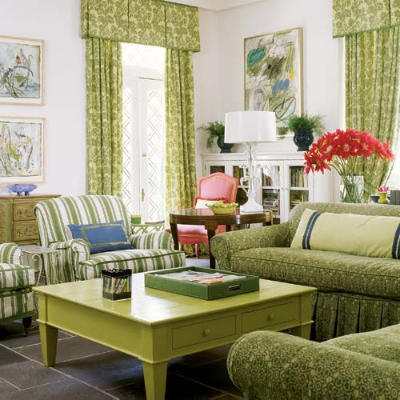
Image courtesy of Southern Accents. Room design by Heidi Friedler.
rssrss      FacebooktwitterpinterestlinkedinmailFacebooktwitterpinterestlinkedinmail

Kismet

A fair number of folks end up on my site because they are searching for George Terbovich, who happens to be an outstanding Kansas City-based designer and friend.

Very few of George’s projects have been published.

In researching some historic homes in Kansas City I ran across the KC Modern blog which is a terrific resource for information on Kansas City architecture.
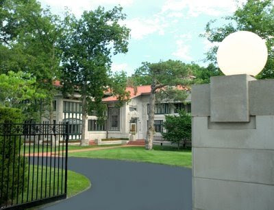
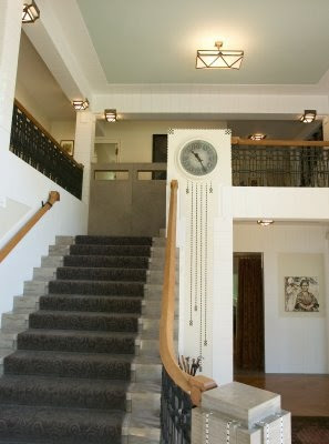
This is the Bernard Corrigan house by architect Louis S. Curtiss. I will send you to the link at KC Modern for more information about the house; I have been in it and it is extraordinary.

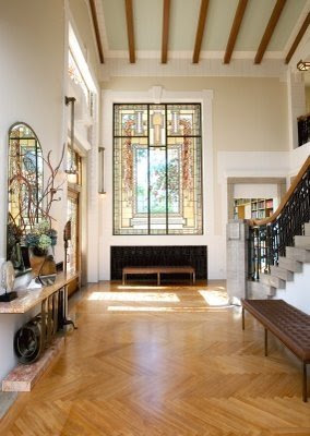
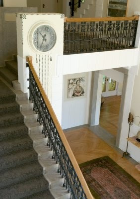
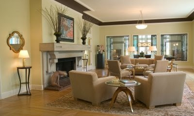
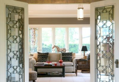
The design of these rooms, by Mr. Terbovich, was for a previous owner; they have been dismantled. When I saw these images earlier this week I was struck, not just by their beauty, but because the design does not overwhelm the architecture.

I think the restraint is stunning.
Images courtesy of KC Modern; photography by Gary Kabrink.
rssrss      FacebooktwitterpinterestlinkedinmailFacebooktwitterpinterestlinkedinmail

Whitcomb – Hudson River

When I had posted images of David Whitcomb’s city townhouse and apartment a couple of weeks ago a very astute reader suggested finding images of his country home, “Marvelous post-Modern (in the best and wackiest sense) rambling pile overlooking the Hudson River.”

Based on that description how could I not? After emailing a few other knowing souls Toby Worthington emailed back that it had been photographed and appeared in Judith Miller’s Classic Style. Which I bought on line for $2.50. Really.

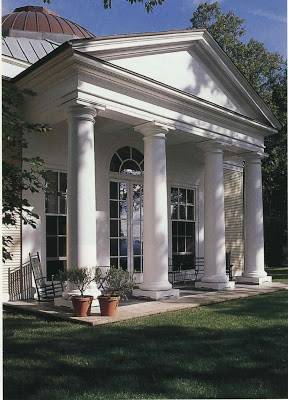
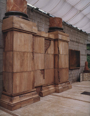
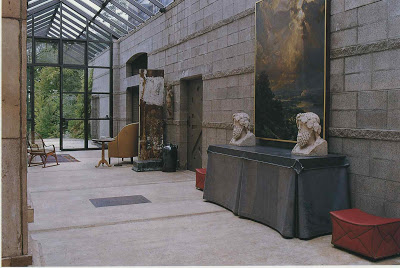
Whitcomb, an architect, was committed that the house would suit the site, an old iron mine, in both a physical and historical way. This covered walkway with its transparent roof signified the opening up of the frontier pioneered by a nearby railway. The metal table had less lofty ambitions and served primarily as a bar.

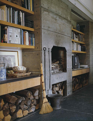
The slate of the kitchen floor was salvaged from a museum in Albany and the blocks used in the construction of the wall were piers from the railway.

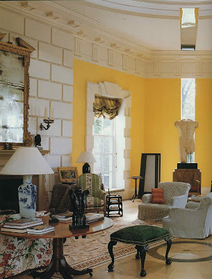
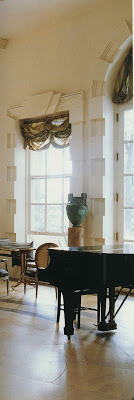
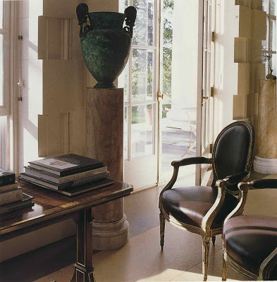
The scale of the living room is impressive. The geometric wood floor is faux marbre.

The living room is the rotunda that you can see in the first image.
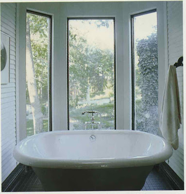
I know very little about architecture, but this seems an interesting mix of Classic and Modern that feels timeless; Miller notes that it was built 1983-87. And, well, I like it. It’s just the sort of place that reads very personal and distinct.

Some of Whitcomb’s favorite buildings appear in the mural below including the Pyramids, William Kent Lodge and the Hudson River Lighthouse.

It makes me wonder what’s become of it.

All images from Classic Style by Judith Miller; photography by Tim Clinch.
rssrss      FacebooktwitterpinterestlinkedinmailFacebooktwitterpinterestlinkedinmail