Tag Archives: Designers

Off the Rack

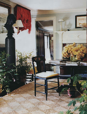
I have to admit, as much as I love Kansas City, no one lives here for the weather. It’s been a terrific surprise that while we have had friends in town KC has put on a marvelous show. 80 degrees, sunny, no humidity. Which led to a pool outing/recovery (last night was a big one) and magazine reading today. Jeffery Bilhuber’s Long Island home is in the August issue of Vogue. If you like the rug that he uses throughout (over those deliciously black floors)

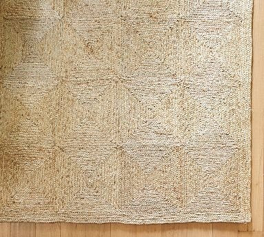
they have something very similar at Pottery Barn.

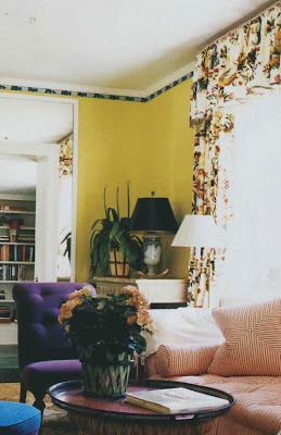
Also, his living room curtains are Le Lac. Just in case you missed it.

Vogue photography by Francois Halard.
rssrss      FacebooktwitterpinterestlinkedinmailFacebooktwitterpinterestlinkedinmail

On the Back

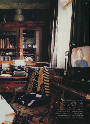
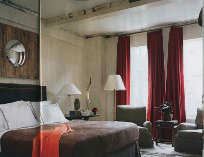
Every now and then I’ll pull something from the file and discover a really great image on the back of one of the pages. This was one. Eric Cohler found his 15 x 12 brownstone bedroom “very depressing. I decided to fill it with the things I loved best.”

House Beautiful, March 1994. Sadly, I do not have the photo credit.
rssrss      FacebooktwitterpinterestlinkedinmailFacebooktwitterpinterestlinkedinmail

More Whitcomb

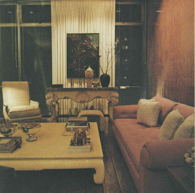
An astute reader commented about David Whitcomb’s apartment this week. Seems he had a pretty jazzy house upstate as well.

I flipped back through the New York Times Book of Interior Design and Decoration to see if it was in there.
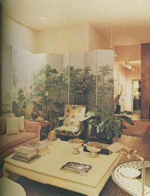
No. But! There were a few photos of the apartment Whitcomb lived in following this one.
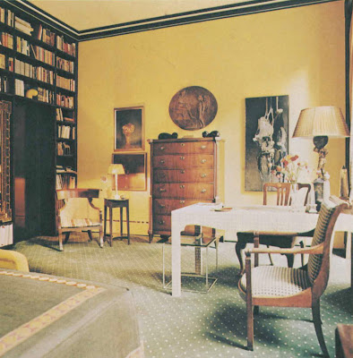
Do I love those black stripes on the moulding against the yellow walls? You know I do.
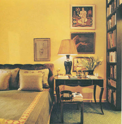
But I digress. The transition from one space to the next seemed to fit with the post at the beginning of the week about the two Albert Hadley projects.

It’s an interesting shift and I think one that many people who have an affinity for design would envy. Many of us wish we had a way to explore all the facets of design that appeal.

It’s also a fun “I Spy” game to see what moved from one spot to the next and how. These benches, which seem made for the space actually appear in the first living room.

The asymmetrical balance of this room is particularly appealing. (Let’s do just ignore that headboard.) As for the country house, Toby Worthington (another astute reader) knew (of course) where it had been published and the book is on the way.
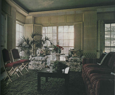
This is from another Whitcomb project. I couldn’t help but post it. That linear latticework and the shutters are so chic. And the chintz. Terrif.

Whitcomb’s apartments photographed by Daniel Eifert. The sun room was photographed by Robert Perron. All images from New York Book of Interior Design and Decoration.
rssrss      FacebooktwitterpinterestlinkedinmailFacebooktwitterpinterestlinkedinmail

More Summer DIY

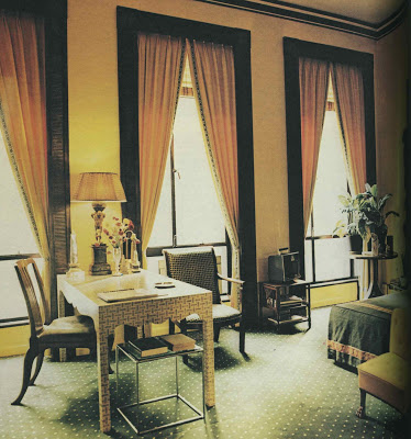
Recent mentions here and here of covering furniture in paper made me sit up and take note of this desk from designer David Whitcomb’s townhouse in The New York Times Book of Interior Design and Decoration. Whitcomb used a small pattern to jazz up the simple Parsons-esque lines.

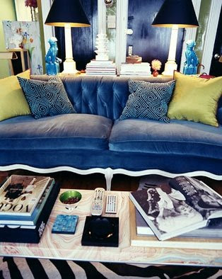
Which reminded me of Courtney’s reference to Nick Olsen’s Ikea coffee table photographed by Paul Costello for domino. Nick’s tips for such a project? “The pros use wallpaper paste but I slopped on rubber cement! I like it because you can reposition more easily and it’s not water-based so thin paper (like the marbleized stuff I used) doesn’t warp or wrinkle.”
More handy tips and design musings from Nick here and here. Because one blog is never enough.
The Whitcomb image by Daniel Eifert.
rssrss      FacebooktwitterpinterestlinkedinmailFacebooktwitterpinterestlinkedinmail

Fabulous Faux

Faux painting took a bad turn somewhere in the 80’s (90’s?) and the baby got pitched with the swirl of marbleized bath water.

But the Miles Redd designed faux ivory and horn bedroom, above, is a striking reminder that in good hands faux can be fabulous.

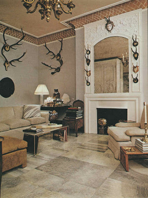
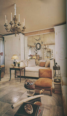
There are wonderful examples from back in the day of course. The Manhattan apartment of Kansas City native and decorative painter Richard Neas featured a floor of “large squares simulating the striation of cut agate.” Neas painted the treillage at the ceiling as well.

Horn and ivory would take a pretty practiced artisan, but the finish on the floor would be an easy project for any do-it-yourselfer. For a closer look click the images.
Redd images from House Beautiful, July 2009; photographs by Thomas Loof. Neas’s apartment appeared in the New York Times Book of Interior Design and Decoration, 1976 by Norma Skurka; photography by Norman McGrath.
rssrss      FacebooktwitterpinterestlinkedinmailFacebooktwitterpinterestlinkedinmail