Tag Archives: Designers

Reduce Reuse Recycle

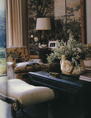
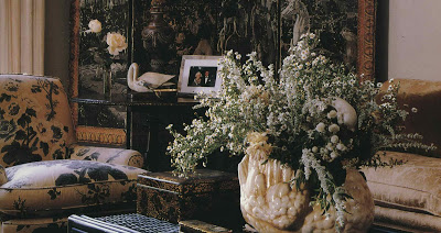
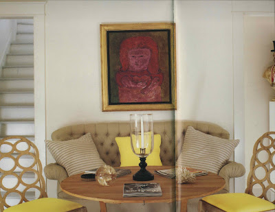
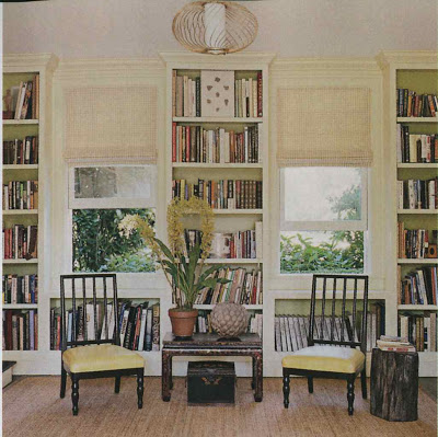
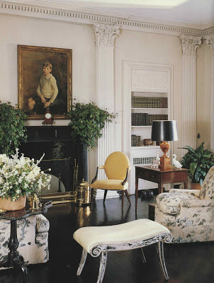
I’ve always enjoyed the lightness of this Albert Hadley room despite its serious setting. The bare floors, the faded chintz, a touch of yellow.

And those fantastic benches with their perfectly ragged finish.

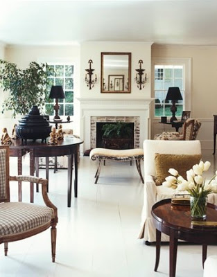
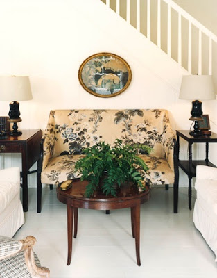
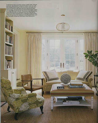
House Beautiful featured the homeowner’s new residence in their latest issue. Beautifully relaxed you can see elements that have made the move.

Not just the benches and the upholstery, still in its delightful chintz, but the pillows from the sofa, above as well.

The new home seems more reflective of what I think of as Hadley’s personal style.

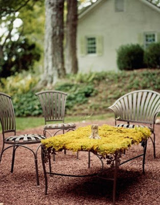
A delight to find the homeowner has the spring chairs of my current obsession as well.

You can find the full story here.
Images of the new home via House Beautiful, photography by Simon Watson. The previous residence appears in Influential Interiors by Suzanne Trocme; some images appear at House Beautiful as well. Image second from the bottom of Hadley’s Naples, Florida home from Albert Hadley: The Story of America’s Preeminent Interior Designer by Adam Lewis.
rssrss      FacebooktwitterpinterestlinkedinmailFacebooktwitterpinterestlinkedinmail

Delish

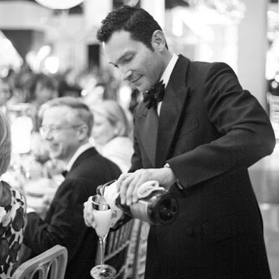
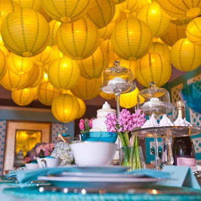
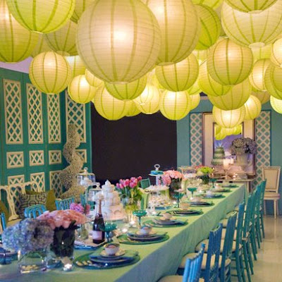
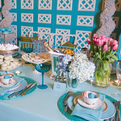
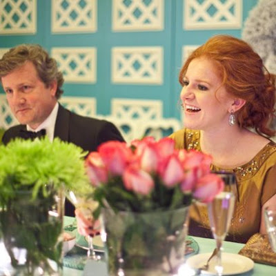
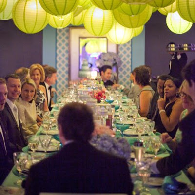
Speaking of hot men, I’ve been hounding David Jimenez, above, for pictures of his table from Kansas City’s Dining by Design.


He’s busy I know. VP Visual Merchandising and Store Design for Hallmark Cards, writing for Spaces, volunteering, being fabulous, it all takes time.

Right before the event he had emailed me to say he was worried about the table.

I never was, though I knew he was under a lot of pressure; his tables for the last few years have been knockouts.

This year was no exception.

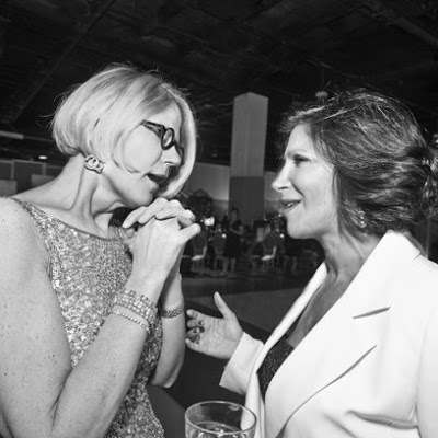
David and his cohort and co-hostess, Merrily Jackson, above left, can always be counted on to throw a terrific party.

Mr. Blandings, he’s the hottie on the left, and I, not the gorgeous number on the right, had a wonderful time.

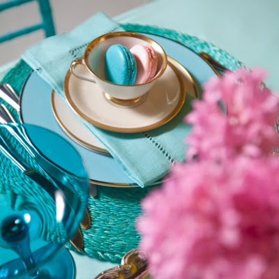
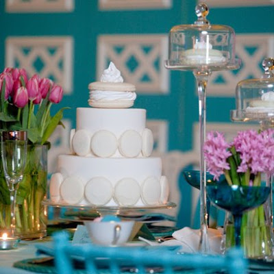
Of course I was nearly speechless as the table linens were one of my favorite colors ever. Actually, that’s not true as I am never even nearly speechless, but I was certainly enchanted.

The entire evening was a confection and we were oh-so-lucky to be a part of it.

Post script. Here I am with our own home grown Tom Ford look-alike Phil Scaglia. I do seem to gravitate to dark and dreamy.
Visual treats by David Jimenez, edible treats by Natasha’s Mulberry & Mott, top images of both by Patrick Binder; last image by Gary Fabro.
rssrss      FacebooktwitterpinterestlinkedinmailFacebooktwitterpinterestlinkedinmail

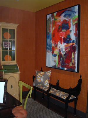
Orange Crush

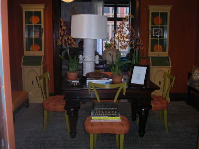
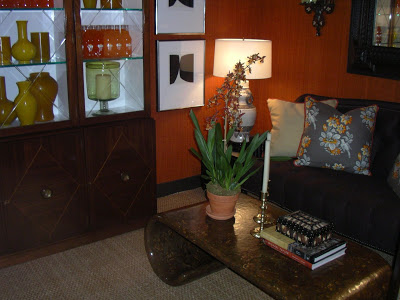
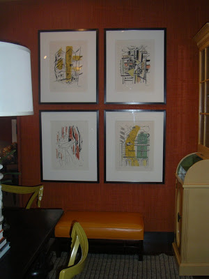
I’ve enjoyed the Kips Bay Decorator Show House coverage.  While it’s not in my back yard I couldn’t help but weigh in on this particularly happy room.
Joe Nye balanced a great use of color with classic elements and a dash of humor.  You didn’t miss the pop bottles, right?  (Or since they are in New York are they soda?)

Just a touch of black, something I think every room needs, and oh, that ceiling.

Only one of the reasons I am yearning for spring in New York.
All images courtesy of Marisa Marcantonio at Style Beat.
rssrss      FacebooktwitterpinterestlinkedinmailFacebooktwitterpinterestlinkedinmail

En Pointe

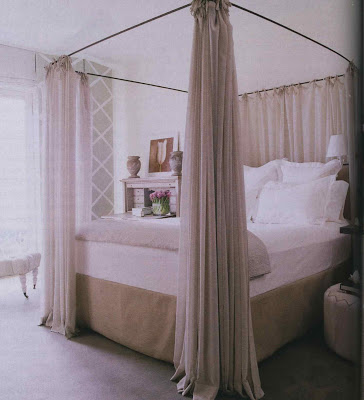
I have the oddest bug.  It’s sort of up and down, better then woozy.  Yesterday I made a lot of progress on the Churchill biography but Monday night it was too heavy.  In every way.  Fortunately, my Elle Decor arrived so even through the fog I could take in the pretty pictures.  The one above reminded me of the toe shoe reference from yesterday.  Maybe that is where my love affair with ribbon began.

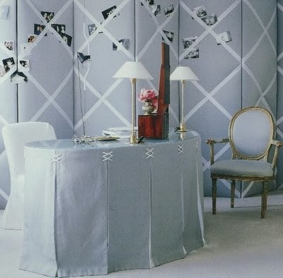
Which then reminded me of this one, another favorite.  The graphic criss-cross is fantastic, but the break of her skirt?  That’s the kind of thing I would remember even in a fevery stupor. 
Both images are rooms by Vicente Wolf.  The first is by the designer himself from the May 2009 issue of Elle Decor.  The other image, from Learning to See, is by Peter Estersohn.  
rssrss      FacebooktwitterpinterestlinkedinmailFacebooktwitterpinterestlinkedinmail