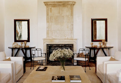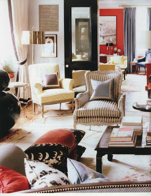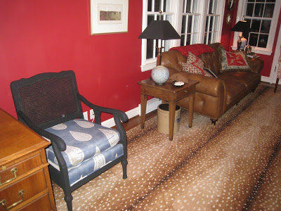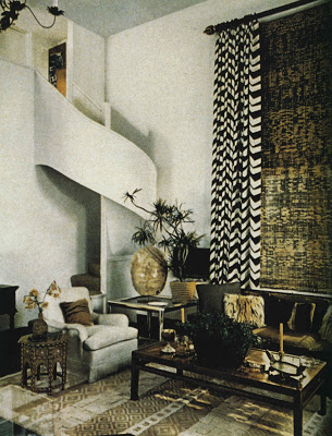
Or “Some of the Best Rooms of 2008” also known as “A Random Selection of Rooms I Liked This Year.” I did go back though my files and pulled a selection of rooms that made my pulse quicken over the last twelve months. Once I had them in one spot I realized most were from December and, shamefully, January. I considered disqualifying January, but, well, it’s my list and I received the magazines in 2008 so they remain. My filing system is abysmal, so I don’t mean to suggest that these are not fabulous rooms, I’m just saying it’s likely there was something great from February to September and perhaps I over looked it. Enough qualifying – here goes.
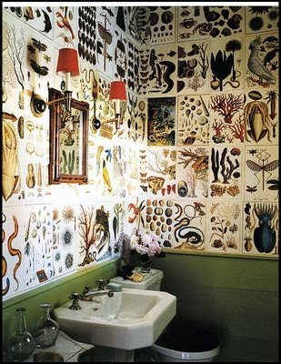
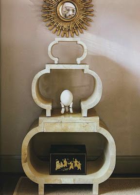
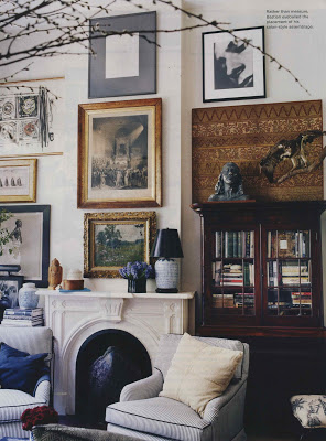
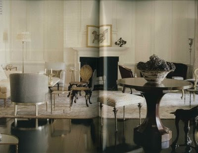
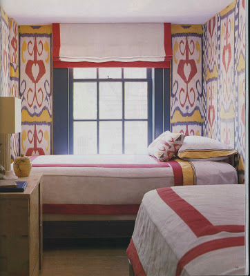
Image, above, interior design Carol Curtis & Sarah Norwood, photography J. Savage Gibson,
House Beautiful, February, 2008.

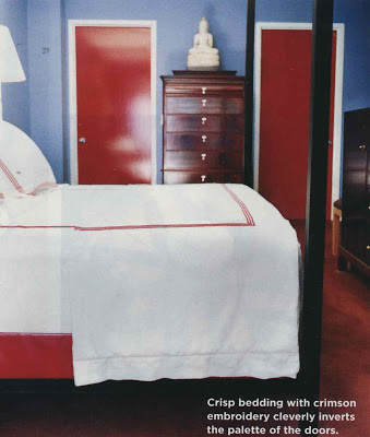
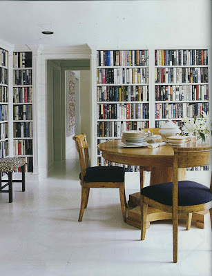
Kate and Andy Spades’s apartment, interior design with Steven Sclaroff , photography Simon Upton,
Spaces, September, 2008; the apartment was previously featured in World of Interiors, December, 2006.
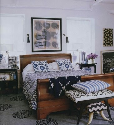
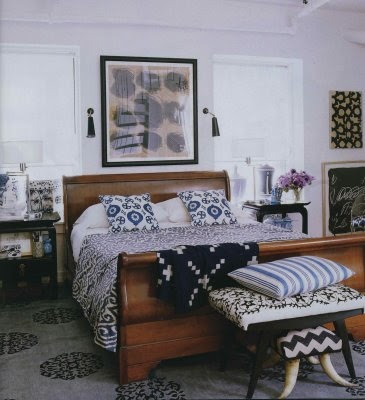
Michael Bastian’s apartment, his own design, photographs Melanie Acevedo,
domino, September, 2008.
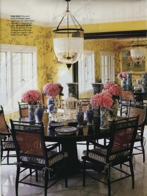
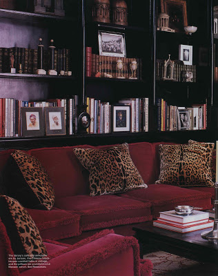
Pamela Skaist-Levy’s home, interior design Peter Dunham, Bazaar, September, 2008.

Gretchen Bellinger’s home, interior design Andrew Fisher and Jeffry Weisman, photography Joshua McHugh,
Elle Decor, November, 2008.

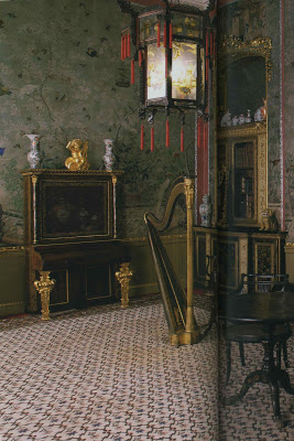
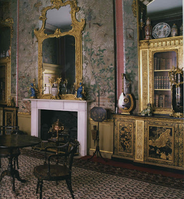
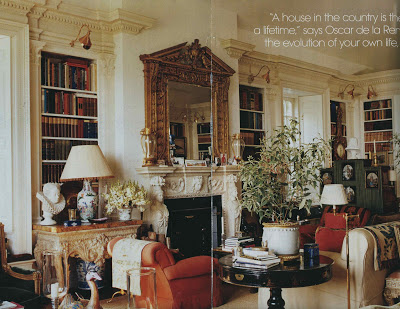
Annette and Oscar de la Renta’s home, with architect Ernesto Buch, photography Francois Halard, Vogue, December, 2008.

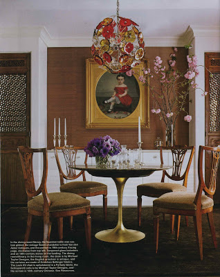
A New York apartment, interior design Bill Sofield, photography Simon Upton, World of Interiors, December, 2008.
Miles Redd, photography Paul Costello, domino, December 2008/January 2009.

Madeline Weinrib’s SoHo apartment, photography Simon Upton, Elle Decor, December, 2008.
 Marco Scarani and Jamie Creel’s Paris apartment, their own design, photography Roger Davies, Elle Decor, December, 2008.
 Home of Stephen Gambrel and Chris Connor, their own design, photography William Waldron, Elle Decor, January, 2009.

Joseph Montebello and Ron Leal’s home also of their own design, photography Tim Street-Porter, Metropolitan Home, January/February, 2009.
It was a very good year.


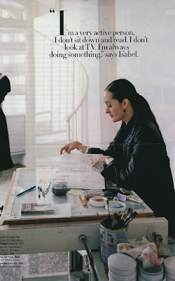
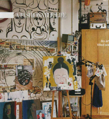 No, not the one from the Times. I had originally thought House & Garden, but in examining the fonts (desperate and crazed people do these kind of things) I thought not. Vogue, maybe. But the long and short of it was that I could only find this one page. This one tattered page that I had kept in a separate file because she is wearing a pair of Ted Muehling earrings that I am quite sure I would wear every day if I owned them. I searched for hours. Well, a really long time.
  No, not the one from the Times. I had originally thought House & Garden, but in examining the fonts (desperate and crazed people do these kind of things) I thought not. Vogue, maybe. But the long and short of it was that I could only find this one page. This one tattered page that I had kept in a separate file because she is wearing a pair of Ted Muehling earrings that I am quite sure I would wear every day if I owned them. I searched for hours. Well, a really long time.
