Tag Archives: Designers

In a Nutshell

I went to New York to see people.  Not big masses of people, though I saw that, too, but a few individuals with whom I have become friends over the last year and some change.

Up until now if I said to Mr. Blandings, “I got an email from my friend….” he would say something along the lines of, “Honey, he’s not your friend; you’ve never even met him.”

Which is exactly the stance I would take if one of my children ever claims an on-line friend, but this is different.  We are friends.  We have a lot in common.  I know things about them and I don’t really think they’re lying when they tell me about recovering a chair.  

But when I received Joe Nye’s invitation to attend a book signing with Carolyne Roehm it seemed the perfect excuse to go.  To meet.  To shake hands and hear the voices of some of the many friends I’ve been lucky enough to know only on a screen.

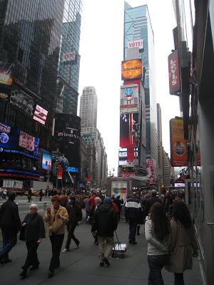
So, I hopped a plane (or two) and ended up in the city.  It is magic, isn’t it?  I had a tiny bit of time to walk around the Village with my big city friend (and have a free cup of coffee on Starbucks to celebrate our vote) before we were off to an election party.

The next day, a bit weary, up and out and then about to see a couple of the shops that I had pined for on-line.

Nothing new, nothing you haven’t seen.  John Darian and Flair and I adored them both.  Of course, at Flair I met a charming young gentleman from Pittsburg, Kansas.  His sister lives in Kansas City not very far from me.  Naturally.

Another friend works at a gallery and she wanted us to stop in.  I had been hoping to get to the Cooper Hewitt to see the collection of watercolor interior paintings, but it had been nearly two years since we had seen each other and people are more important than pictures.  

In an unexpected twist of fate, after admiring the pieces on display she said, “Come back, I want to show you something.”  Into a private viewing room, planted in the cushy chair, she took the cover off a very large, stunning piece of art.  As I gazed wide-eyed I caught the signature.  Lee Krasner.  Geez.
Close enough to walk, after being briefed on the directions six or seven times, I headed a few blocks up to Joe Nye’s showroom.  

Gorgeous, everything, each piece so special and distinct.

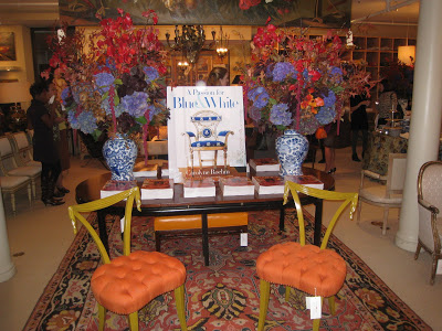
To say nothing of the flowers, the food and the energy which were all top notch.  Joe, who had up until that moment been an email friend, in Mr. B’s book an un-real friend, became a true friend in every sense.

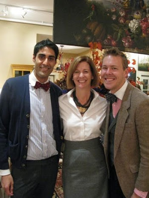
Warm and gracious he squired me around and introduced me to the most lovely people.

Not the least of whom were Jaithan Kochar and Eddie Ross.  A special treat was meeting Lisa Newsom, the editor of Veranda; I can only describe her as completely Southern, which is a great compliment in my book.  Carolyne Roehm was as beautifully mannered as she was turned out, gorgeous in her sleeveless sweater dress and (I think) Faraone Mennella earrings.  She’s from St. Louis, you know.  Speaking of Missouri (again) it was a treat to see hometown friends Pam Fleicher and Ken Weiner of Creative Candles.

I could have stayed until the very end, but had to dash to meet Hollister and Porter Hovey for cocktails.  As if I didn’t adore him enough already, Eddie managed to hail me a cab in the pouring rain at 6 o’clock in Manhattan.  My prince.

Hollister and Porter are as engaging and delightful as you would expect them to be.  We sat and talked and laughed and traded Kansas City stories.

The trip was a joy.  I felt like presents and surprises awaited every turn and not one of them was an item with a price tag.  OK, except for the Krasner.


“You have to come back more often.” “Oh, we want you to see this!” “Have you been here? But you must!”  A merry chorus espousing all the things they love about the city.

I will, I will.  I will go back.  I always swear to go back more often.  And, my dear friends, you need to come here, too.  You must!

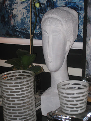
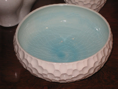
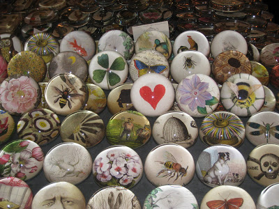
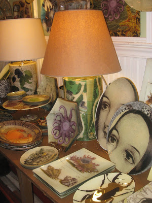
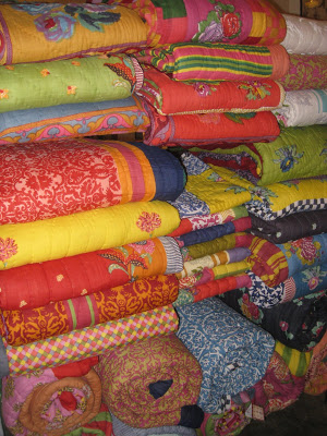
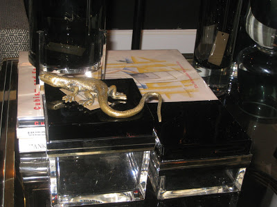
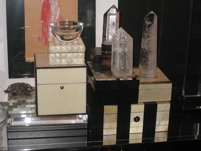
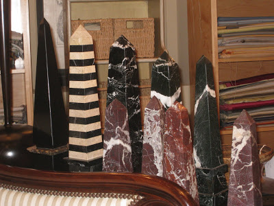
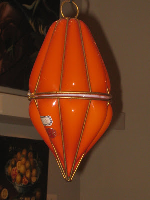
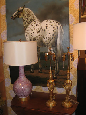
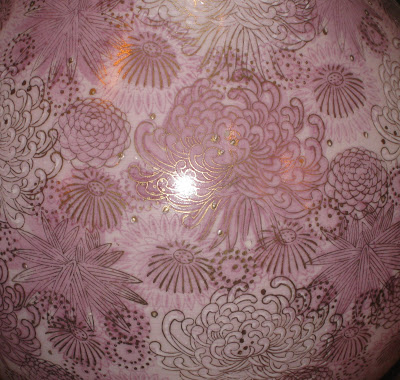
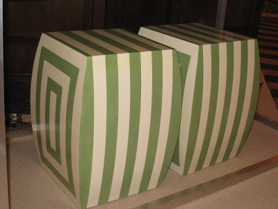
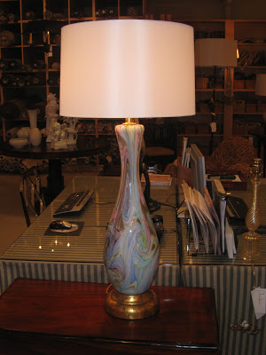
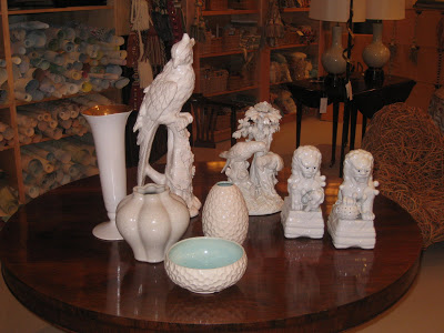
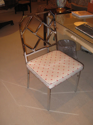
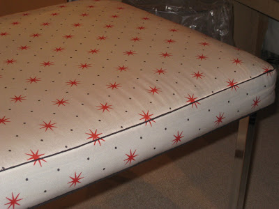
Images, top, my own, Times Square, if I’d had a hat I might have tossed it MTM style, the next three, John Derian, three following, Flair and the remaining, Joe Nye’s showroom.
rssrss      FacebooktwitterpinterestlinkedinmailFacebooktwitterpinterestlinkedinmail

Oz

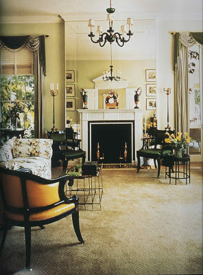
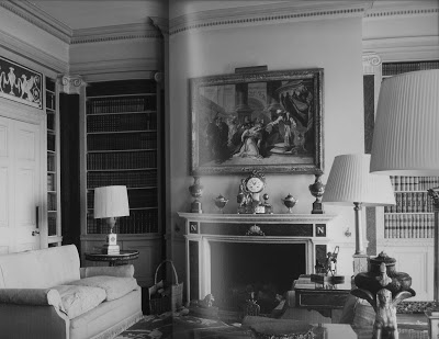
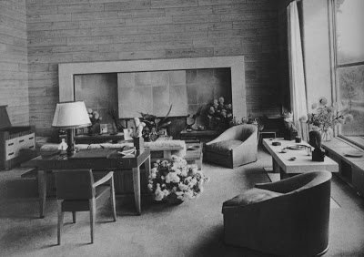
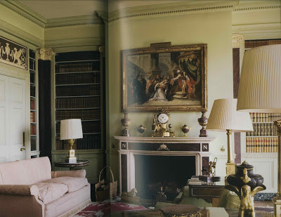
OK, so here we go. The room, above, is from Regency Redux, but would you be surprised if I told you it was from World of Interiors last month? I don’t think so. Even in color this room holds its own.

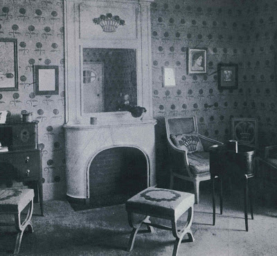
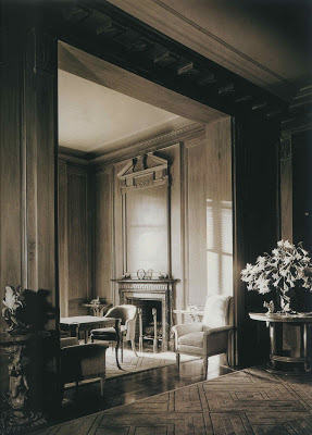
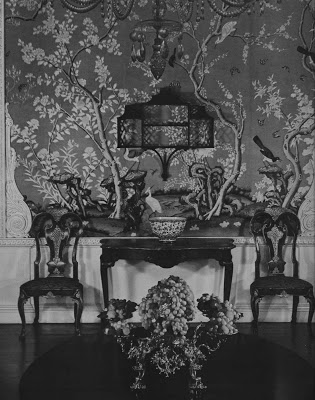
This room by antiques dealer Andre Groult appears to have one of Michael Smith’s favorite fabrics applied to the walls. The X benches, of course, are an element that appear and re-appear. One of the things I had to edit around a bit in putting together the first post was art and flowers; they are dead give aways for dating a room.


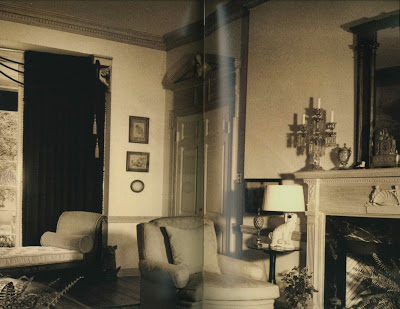
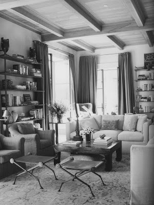
The room above, poorly scanned, encompasses all the elements of the 1940’s Connecticut farm house that is my particular back story. Formal and cozy at the same time it is all the things I’d love for my home to be.

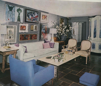
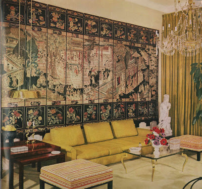
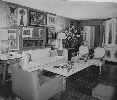
This jumpy little number could be straight out of domino when you erase the color. Circa 1960, as you might guess, many of these pieces would fit right into today’s scheme. Boxy, Hicksian sofa. Chrome and marble coffee table. Drum shade on ceramic lamps. Gallery wall, painted armoire and mix of old and new.

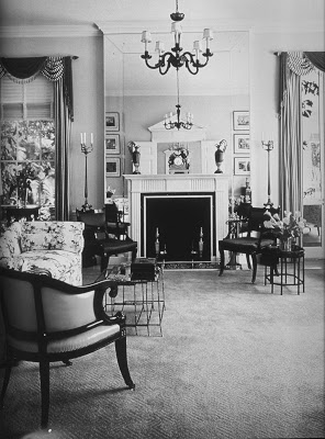
I’ve adored this room by legendary designer Ruby Ross Wood since Jennifer posted it originally in her endorsement of Regency Redux. Besides the mirror surrounding the fireplace it still reads beautifully; coincidentally, the color palette does not date it. Remove the swags on the curtains and it could be published today.

Gorgeous. T. H. Robsjohn-Gibbings, 1937. Even the flowers are right in this one.

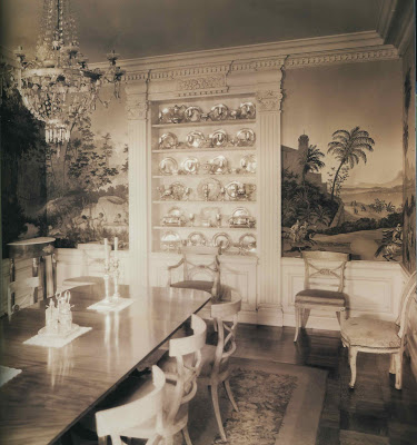
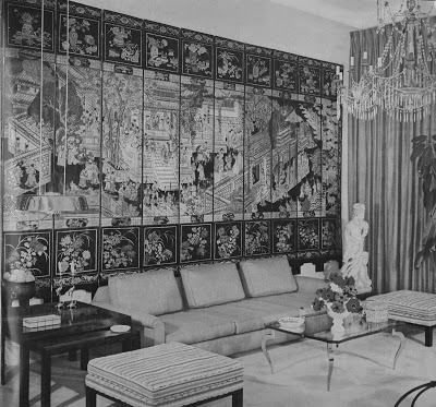
This room was a surprise to me. I like it better after seeing it in black and white. There must be overhead lighting (even beyond the chandelier) and I am missing lamps. I’d replace the glass on the cocktail table with some sort of stone, but otherwise, I really, really like this room.

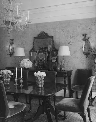
Fantastic in every way, Billy Haines’s own dining room. Heaven.
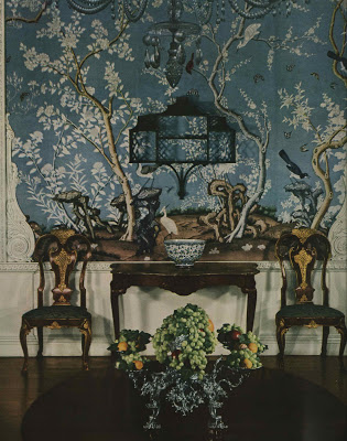
If it weren’t for the grapes would you know this was vintage?
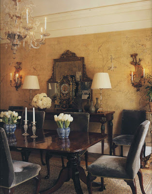
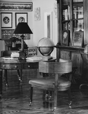
Smith.

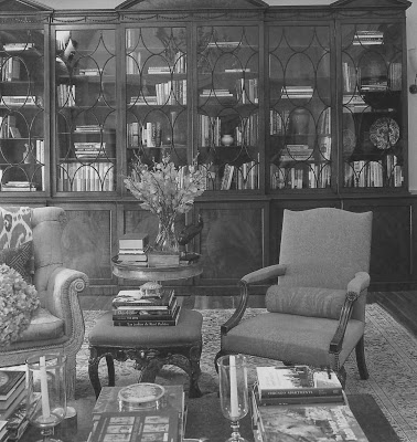
Smith, again, but look back at yesterday’s post. They could be vintage images.

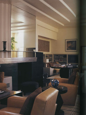
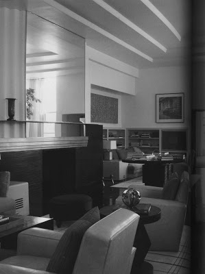
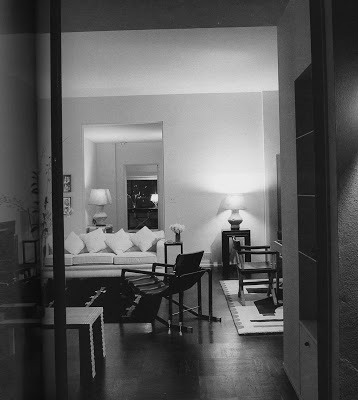
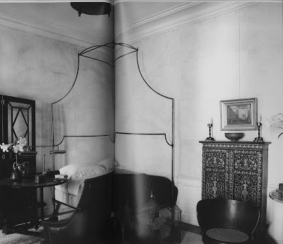
Andree Putman, 1987. Even though this room is not traditional, it is classic in design. A sofa, a pair of chairs, the lovely enfilade. So chic.

Paul Dupre-Lafon, 1938.
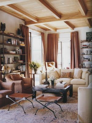
Again, Smith.

And, again.

But this, you might recognize, is Chessy Rayner for Bill Blass.

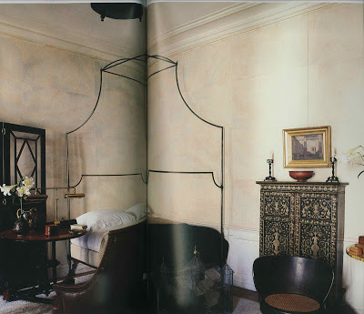
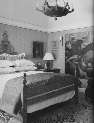
While there are elements of Smith here, plaster walls, iron bed, exotic pieces, there is not enough color and layers of fabric to be a telltale Smith room; this is Jacques Grange circa 1987.
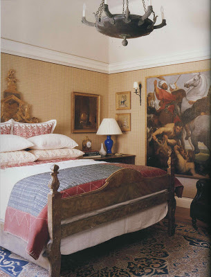
So, are they all more appealing in color? What are your favorites? Old or new?

Photo credits as follows: Ralph Dutton, RR; Andre Groult, RR: Hugh Chisholm, RR; Henri Jova, HG Complete Guide to Interior Decoration, 1960; Ruby Ross Wood, RR; T.H. Robsjohn-Gibbings, furniture & interiors of the 1940’s; HG Guide 1960; Billy Haines, RR; Govenor’s Palace, Williamsburg, HG, 1960; Smith, Houses; Smith, Houses, Andre Putman, HG Best in Decoration, 1987; Paul Dupre-Lafon, f&i of the 40’s; Smith, Houses; Smith, Houses; Chassy Rayner, RR; Jacque Grange, HG, Decoration 1987; Smith, Houses.

rssrss      FacebooktwitterpinterestlinkedinmailFacebooktwitterpinterestlinkedinmail

Fade to Black – and White

Blogging being what it is, a sort of personal stream of consciousness, inspiration can come from many sources.

Courtney Barnes at Style Court (recently deemed one of the best classic design bloggers by domino, with which I happen to agree) did an interesting post inspired by Michael Smith’s philosophy that we create a back story for our designs and then work to fulfill them.


My copy of Smith’s book, Houses, arrived shortly thereafter.  I, too, was intrigued by his musings on inspiration and the castles in the air that eventually become the sofa in the living room.  “I think we collect images.  We string them together like beads until we have a rough notion of what our dream house could be,” says Smith.  

But what really piqued my interest was this: “Once in a while, I think about having a house photographed in black and white, just to see what it would look like.”  

Which triggered a memory of Aesthete’s Lament post on David Hicks Garden Design.  
In the post, our admirable Aesthete quotes Hicks as explaining that the book is illustrated in black and white to emphasize the structure and planning of the garden.  To put sentimentality aside.

I am, usually, all about color, but I began to wonder how timeless a room would appear to be if the palette of the day were removed.

Could it be a test for timeless rooms?  

I doubt Smith will have the opportunity to have a project photographed in black and white.  It’s a tough sell.  “Really, Margaret, I do think your readership will get it.  And the advertisers.  And the publisher!  Genius, black and white, we’ll be the rage!” 
 No, I think not.  But here, where no financial stake exists, we can study the structure a bit.  Just today.

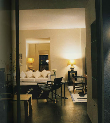
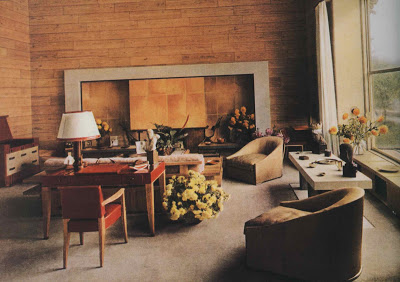
Some of these rooms are Smith’s and some are not.

But I think these rooms are timeless and you will see similar elements repeated in many.

It’s a testament to making investments in the tried and true and mixing in the trend of the day with discretion.

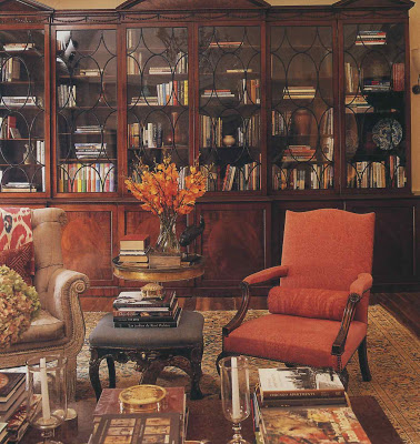
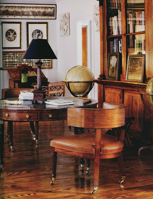
Two of my favorite houses in town are across the street from one another.  One, a stately Georgian is chic and slightly formal.  The other, a Tudor, is more relaxed but gracious and lovely nonetheless.

Two different designers and two different families, but one common denominator – good, strong, classic design and fresh, updated fabrics and placement.   

I will post the color images tomorrow and you can see how they affect your impression of the rooms.  

I highly recommend Smith’s Houses and Regency Redux by Emily Evans Eerdmans; both are beautiful and beautifully written.  (And, if I were Ms. Eerdmans I would monogram nearly everything.  Wonderful.)

Photo credits as follows:  Ralph Dutton, RR; Andre Groult, RR: Hugh Chisholm, RR; Henri Jova, HG Complete Guide to Interior Decoration, 1960; Ruby Ross Wood, RR; T.H. Robsjohn-Gibbings, furniture & interiors of the 1940’s; HG Guide 1960; Billy Haines, RR; Govenor’s Palace, Williamsburg, HG, 1960; Smith, Houses; Smith, Houses, Andre Putnam, HG Best in Decoration, 1987; Paul Dupre-Lafon, f&i of the 40’s; Smith, Houses; Smith, Houses; Chassy Rayner, RR; Jacque Grange, HG, Decoration 1987; Smith, Houses.
Smith wrote Houses with Christine Pittel and I am secretly hoping she is the genius behind the text.  It’s almost too much to fathom that Smith would be such a good designer and a good writer.
rssrss      FacebooktwitterpinterestlinkedinmailFacebooktwitterpinterestlinkedinmail

Housewife Meets Contessa

I posted a while ago about my great debt to Ina Garten.  I know my family secretly gets down on their knees and prays that nothing happens to my Barefoot Contessa cookbooks.  I’m not a cook, but with Garten’s help, I can fix a meal.  Triumph.
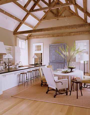
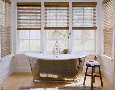
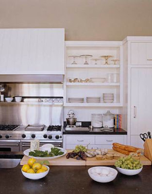
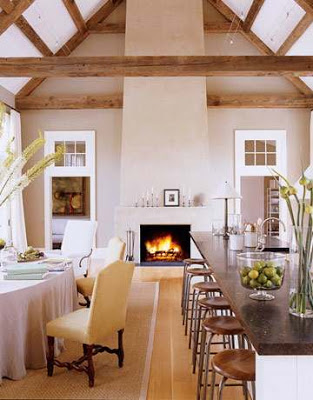
Garten has a new cookbook out and she’s been getting a good little bit of publicity.  House Beautiful recently featured her “barn” which she built to entertain and to film the show.

As if I weren’t already besotted, I spied the Ted Muehling candlesticks on the mantle.  Pea soup green with envy.  (By the way, I can’t say these are Creative Candles for sure, but that is what Muehling recommends.  Couldn’t pass up the KC connection.)

Garten’s Paris flat appears in Town and Country this month as well.

I have admired all her homes for their serene, subtle interiors.  

They are the sort of back drop I always like and think I want, then I end up with walls the colors of M&Ms.

Lucky me, Garten is in Kansas City this week and Mr. Blandings and I are sneaking away in the middle of the day on Thursday to see her.  11 o’clock, Unity Temple on the Plaza.  A very few tickets are still available through Rainy Day Books.
Photographs by Simon Upton courtesy of House Beautiful, November 2008.
rssrss      FacebooktwitterpinterestlinkedinmailFacebooktwitterpinterestlinkedinmail

Wonderful

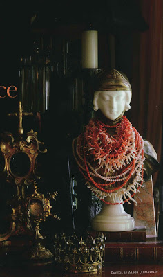
I have long admired Nancy McGee’s booth at the Mission Road Antique Mall.  She has a distinct aesthetic and a fine eye.  I was initially surprised that the owner of the space was a woman as her objects have a particularly masculine feel.  I’ve had this image of a tablescape in her home open on my desk for days.  Vintage coral necklaces adorn an alabaster bust of Joan of Arc.  Four obelisks, different sizes and materials.  Two gilded reliquaries, one empty, one containing her father’s watch – and something else, the chain?, draped around its spire.  Crystal, wood, black, red.  I can’t stop looking at it.
Photograph by Aaron Leimkeuhler from the Holiday issue of Spaces.
rssrss      FacebooktwitterpinterestlinkedinmailFacebooktwitterpinterestlinkedinmail