Tag Archives: Designers

House & Garden, Part 2

“Come in,” said Cindy Sutherland, and so I did to this charming home.  Not magazine slick or jumpy or trendy.  Quiet and lovely and loved.


The wash on the walls in the entry was subtle and soothing developed to mimic the tone of a French mat on an old print.

Sutherland added the horizontal accents to the existing balustrades to give it a more interesting Chippendale feel. 

The dining room, where we sat and visited, is as sunny and relaxed as its owner.

She had originally tried botanicals on the walls but they never felt quite right.  The majolica eventually came home here.

The TV room also serves as library (and houses the Aarons’s book of the last post.)  Sutherland is so glad they updated the kitchen but did not “blow out” the back as many had suggested.  She reports that her husband comes home to sit in the same spot every night.  The lesson learned was that people do gravitate to small spaces and the soaring ceilings and masses of square footage do not translate to “more.”

I adore the hunt scene, and, as you might have guessed, Sutherland painted it.  She’s begun to paint more and is delighted and slightly amazed that this passion is finding an audience.

Things were bound to go well for me here, right?  Yellow and white, that soft red and chintz.  Blandings heaven.

Oh, yes, and needlepoint.  Sutherland stitched this pillow that was once a kit offered at the Nelson, much like the one I had painted recently.

I tried putting it under my shirt, but she noticed.  Now I’m kidding.  But I would’ve.

The house was built by Edward Tanner, a prominent Kansas City architect, as a spec house for the J.C. Nichols development.  One house on the street originally had a three hole golf course.  Sutherland can trace the changes to this house from the original floor plans and pictures included in the original brochure.

 The room is filled with family pieces as well as a significant collection of Staffordshire.

This is the women’s wall and is hung with portraits of family members, a couple by Sutherland herself.

The oyster wood chest was her grandmother’s.

It’s difficult to tell because of the light in this image, but the slipper chairs are upholstered identically to my office chair.  Smudgy turquoise and red.
 Sutherland took me up to her studio where light flooded the room.  She has captured her children, her own pets and others’, as well as scenes from her garden.  She shows to a small group once a year.


Currently working on illustrating a children’s book, she also has cards available at George Terbovich Gallery in Crestwood.


It was a wonderful morning, a welcome break from shuttling boys and picking up toys.  

And while this seems a “very Mrs. Blandings” house the real appeal is that it is really all Sutherland’s own.  
rssrss      FacebooktwitterpinterestlinkedinmailFacebooktwitterpinterestlinkedinmail

House & Garden, Part 1

Suzanne called and said, “I talked to Cindy Sutherland and she’d love to have you come see her house and garden.  It’s very Mrs. Blandings.”  Any recommendation of Suzanne’s was bound to be a good one, but I felt so awkward, heavens, how would I go about asking someone if I could post pictures of their home on the internet.  
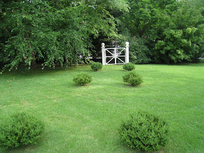
Sutherland placed the gate here because she likes the view it creates from the front of the house.  While a visitor did not see the point, she said, “The point is I like looking at it.”
No surprise, Cindy is lovely.  When I told her I feared it was such an imposition she assured me that it would be fun.  She loves to share it.

White crab apples and narcissus create a stunning early-spring display.  Cool and inviting, still, in July.
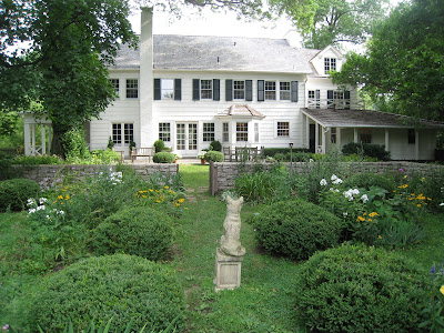
We all have houses that we drive by all the time and think, “Favorite.”  Imagine my surprise when I pulled up to see the house that was “very Mrs. Blandings” was on my short list.  Georgian Revival, but more fondly known as “Connecticut farmhouse” to me and Mr. Blandings in our conversational shorthand.  
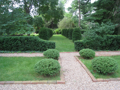
The parterre outlined in gravel paths.  
The kind of house, regardless of size, that could never intimidate, but is forthright and candid in its ability to be gracious and hospitable.  “Come in.” it invites and Cindy does, too, then out we go to see the glorious garden.
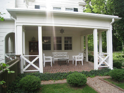
Sutherland has the original plan for the house and this bit was added; originally a screened porch, she and her husband decided to open it up.  Usually working when she is outside (although she assures me it only takes a short time every day) this is a favorite spot during a rain shower.
Cindy tells me that gardening has been a recent passion.  She puttered with flowers all along, but once her children were older and the yard was no longer a playing field she began to lay it out in her mind then with her hands.
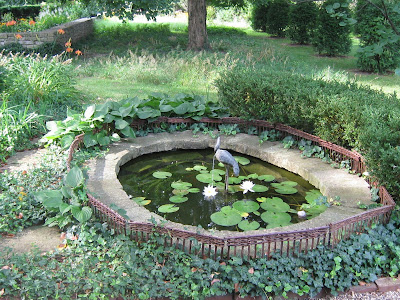
The small pond has been encircled to keep Rosie and Lily out of peril.
Tall and lovely, her eyes snap as she discusses the garden and how it came to be.  Twelve years ago she began laying out the allee and the parterre.  She believes a garden with structure satisfies everyday of the year; flowers cannot be trusted.

The plantings closer to the house are more formal and then as you move out it has a wilder, more prairie-like feel.  
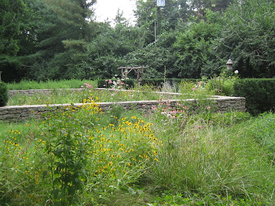
Cindy has been careful to establish the views from inside the house so paths and beds are on an  axis with the windows.  
The beds within the wall have three bursts: spring bulbs, peonies and day lillies.  Sutherland avoids planning for late summer as it is usually hot and humid here.  You’re often better off inside.
Talking to a gardener like this is bringing a dawning of understanding about the planning.  I’m starting to “get it” and I can’t help but be drawn in by her enthusiasm.

A family of foxes has taken up residence in the neighborhood.  Here is Sutherland’s charming tribute.
We started outside then moved in to refresh.  The thing is, my path should have crossed with this woman’s a million times.  We know the same people, we go the same places.  There is a slight age difference, but still.  We traded views on houses and schools and children and all the things that come with and all the while I couldn’t help but think, “How could I have missed this engaging woman for all these years?”
Currently completely obsessed by the Mitford sisters, I asked her if she had read Hons and Rebels, a book recently given to me by another amazing woman, and she dashed to the library to pull out Slim Aarons book to show me the famous “Mitford eyes.”
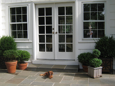
The patio is mostly potted evergreens and some, only white, flowers.


So even this town, my home for over twenty years, keeps unfolding.  Stay-tuned tomorrow for the inside.  Treasures await.
(Oh, how Mr. Blandings loathes “to be continued…”

rssrss      FacebooktwitterpinterestlinkedinmailFacebooktwitterpinterestlinkedinmail

Not Far From the Tree

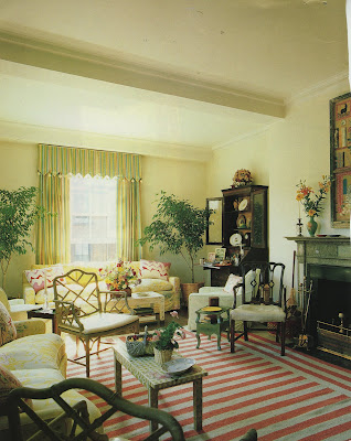
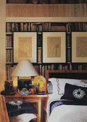
I could have made this a quiz, but it would be nearly impossible to guess unless you happened to remember this layout from House & Garden, August 1984.  This is the Boston apartment of Apple Bartlett (as you can see, Gwyneth is not so avant guard.)  Bartlett, while not avant guard, is old guard.  The daughter of Sister Parish, you can see her mother’s influence in her own home.


Always intrigued to see if rooms (and fiction) hold up, there are elements of these that definitely do.  The striped dhurri could have come straight from Wisteria or Williams Sonoma Home.  I do like the way the direction of the stripe changes at the edge; this is an easy alteration for any carpet professional.  The curtains in the living room hold up nicely.  I usually think these are the first elements to give away a vintage image, that and the flower arrangements.  The fabric on the sofa pillows resembles the graphic Alan Campbell that we have been referencing this week.  A subtle chintz, the bamboo Chippendale chair and the secretary would also be snatched up by the current generation.

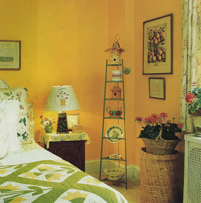
A vintage quilt – a definite keeper.

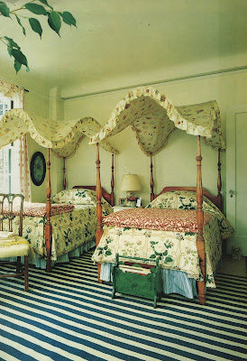
Again, the dhurri and the four poster beds are charming.  The canopy could use some altering, but these are Mrs. Bartlett’s childhood beds and I adore the sentiment of that.

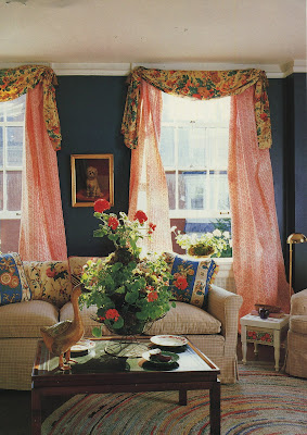
The braided rug is from the house in Maine.  Mrs. Bartlett made the sitting room curtains and decoupaged the living room table and the lampshade as well.   Besides her now-in-the-news name, Apple Bartlett was working as a collage artist at the time her home was featured.  Maybe old guard is avant guard after all. 
rssrss      FacebooktwitterpinterestlinkedinmailFacebooktwitterpinterestlinkedinmail

New and Improved

On Monday, Decorno threw out the question to her readers, “Is it All Too Much?” And she posted a few rooms that made some folks furrow their brows and say, “geez, yes.”


But, being a great over-thinker, I couldn’t leave it at that. (You should read the comments if you haven’t already; it’s an interesting discussion.) We of the shelter magazines and the tear sheets and the vintage design books, we like to see patterns. I’m not talking trends, the things of the moment that suddenly every it-girl with an it-address must have.

A very valid question was, is the age of excess and trying too hard to be wacky (there is an old HG Mayer Rus column on “fun” in decorating on just this subject that is classic) a backlash against the Liagre of the 90’s? Perhaps.

But, I think there are a couple of other things at work here. One is definitely the swing of the pendulum. Once we tired of the mid-century resurrection and felt the need to mix we might have gone a little fusion-crazy. If you can pull your period chairs in with the Nelson coffee table, then maybe you can add the antlers and the coral and the rococo mirror and the garden seat, too.

And the other thing is where you choose to gather your information. I’m not in the business of marketing or demographics, but I am fully aware that I while I sometimes enjoy domino, I am not its target market. So, if it’s geared to a younger market maybe that is why it’s seeming so frenetic to me. And, as one of Decorno’s readers noted, a lot of what we see is over-styled and I’m not sure that is the designers’ fault. Even in one of my favorite magazines I’ve noticed in the last few issues that many of the rugs look as if they have been unrolled just for the shoot. And it bugs me.

There are two publications that don’t seem to get a lot of press in the blogs I read. Metropolitan Home may be a bit too modern for some, but their features are not styled-to-death. The other is Western Interiors, which seems to be picking up some steam. This is not to disparage any of the other stalwarts of the news stand, just a nudge to cast your net a little wider to see what you might find. A reason to buy more magazines – who would argue with that?
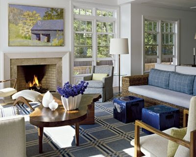
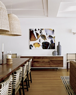
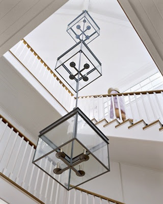
The images above are from Metropolitan Home, July, 2008. Architecture by Francine Monaco and interior design by Carl D’Aquino. Photography by Peter Murdock.
rssrss      FacebooktwitterpinterestlinkedinmailFacebooktwitterpinterestlinkedinmail