 My maladjusted middle child got into the car on Saturday sweaty and a bit grimy and queried, “Why does life have to be so discouraging?”
Which is serious business when you’re eight. Or the mommy of an eight year old. These are the kinds of things that keep us awake at night wondering if they are ok, if they are over-scheduled, if they have friends.
He had just played soccer with his friends, blocked four shots as goalie, received a medal and had a popsicle. Seemingly boy heaven. And yet, discouraging.
As I am prone to do, I over-reached the moment. “Life, darling, is mostly what you make it. You can focus on the sweaty and tired or the beautiful day spent playing a game you like with your friends. Happiness, sweetheart, is a decision.” And on and on. No surprise, in real life, as on the page (screen) I have a lot to say.
 Which is a lesson I needed to repeat to myself yesterday. The last few days of the boys’ school year is always a bit hectic and frenetic. Meetings and field days (which I always dodge thanks to Mr. Blandings) practices and games seem to multiply in May.
Other mommies must be a bit over-extended, too, as I have been on the receiving end of a fair bit of testiness.
So, I sat down last night, wanting to post. Needing a little inspiration.
Courtney had wondered yesterday about Gambrel ever using red and white stripes and it made me wonder myself.
I clicked on over to
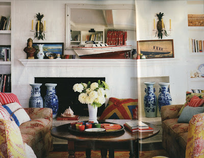
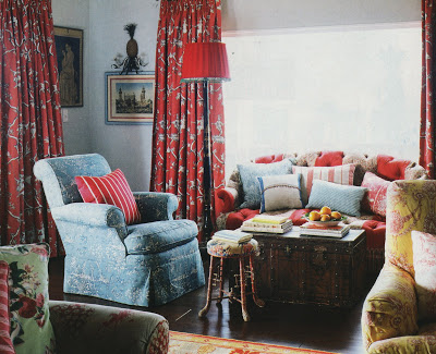
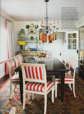
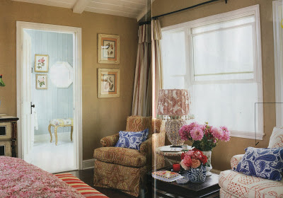
srgambrel.com to cruise through the portfolio. Unlikely, I supposed, and it appears that I am right, but look what I found on my hunt.
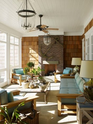
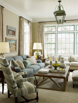
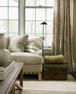
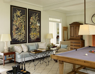
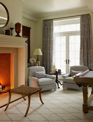
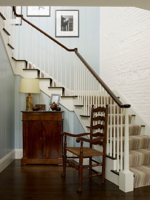
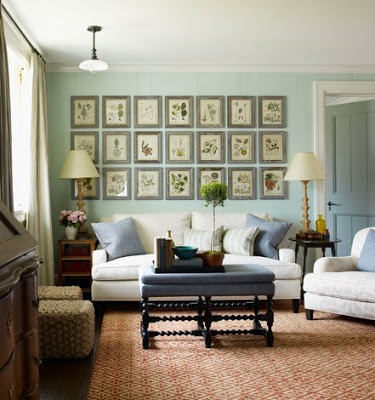
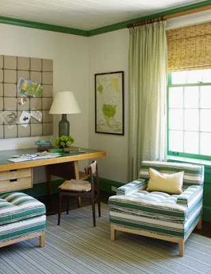
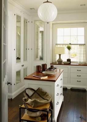
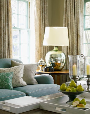
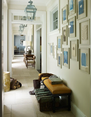
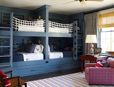
A new little number right there under “Country.” Chic, as usual. Lots of blue, which is what keeps me from full on cut and paste from his inspiration to my dream house. Gambrel seems to steer clear of yellow and in the last Elle Decor layout (which featured a lot of yellow) he mentioned that yellow can be tricky; he prefers to use it in fabrics more than on walls.
I adore his work. (Really? Gosh we hadn’t noticed as you mention him once a week.) And seeing something new is always a treat. I like city Steven, but country Steven soars.
Botanicals, baskets, lanterns, yes, used lovingly, but not unexpected. But the Robsjohn-Gibbings stool set just off from the periwinkle-felted pool table? Delish.
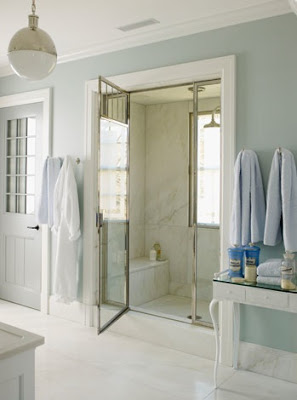
Like a hot steamy shower, suddenly I was refreshed. Invigorated. Ready to face another day of reports and notebooks and calendar-watching children.
And, just in case you were worried, number 2 seems just fine. After my moving soliloquy he said, “Um. OK. But, Mom?” “Yes?” “My shin guards are itchy.”


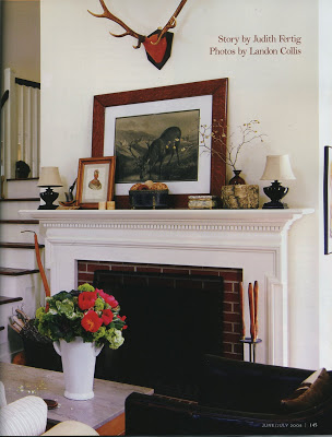 The new issue of Spaces came yesterday. Its focus is second homes and it is spot on. One of the things I like best is that most of the features are second homes within driving distance of KC.
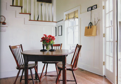
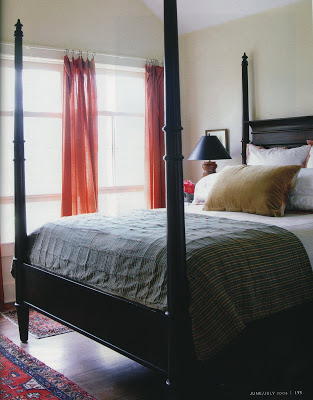
 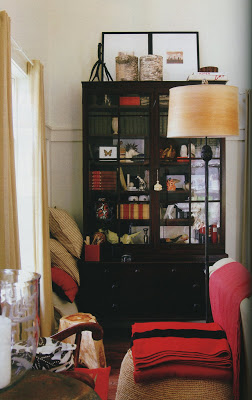 Dan Auman and Kirby McCullough wanted a country house within an hour-and-a-half of the city. They scoured their determined radius from east to west before they settled on two adjacent lots in Arrow Rock, Missouri.
 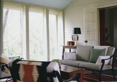 Auman and McCullough used the floor plan of the George Caleb Bingham house in town as the jumping off point for their new construction.
 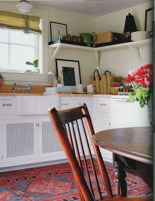 Clean and fresh, the owners wanted to express a different side of themselves here. Their home in town is mid-century modern and they were wanting something a little “different.”
 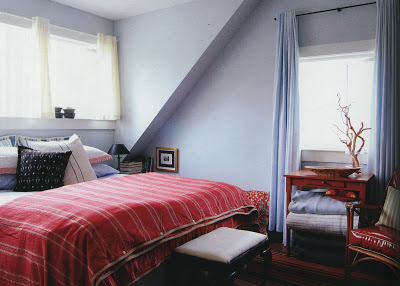 Ultimately, it was the people they met there who drew them in and made them feel at home. With only 32 full-time residents, my guess is they pick you as much as you pick them.
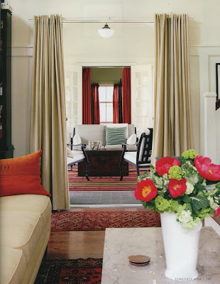







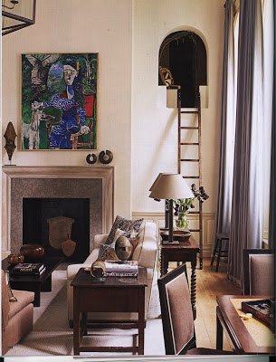
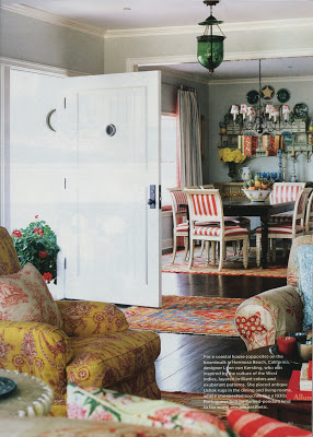
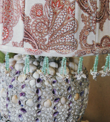
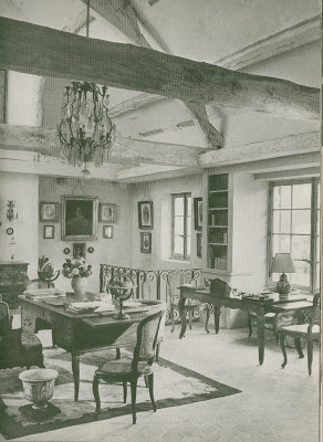
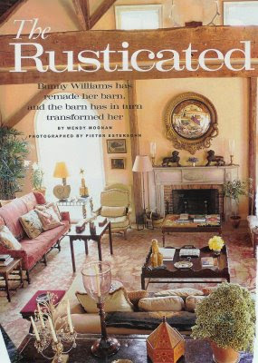
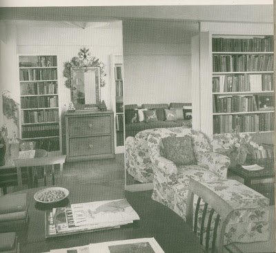
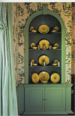
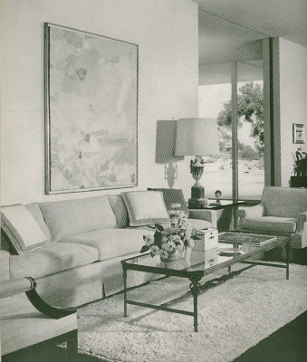 I have not read it cover to cover, merely flipped back and forth and oohhed and ahhhed. The HG Complete Guide to Interior Decoration, 1960 is a gem. A few images caught my eye. I’m pretending they’ve inspired some modern day masters. The image above is Violet Searcy.
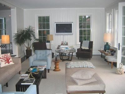 Whom my big city friend is unlikely to know, but I think his Sag Harbor living room has a similar feel. It’s a bit hard to tell from the camera angle. Trust me.
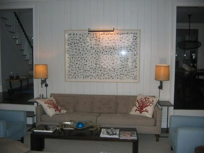
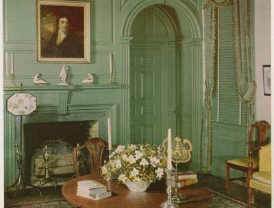
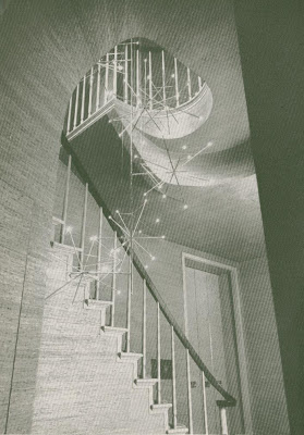
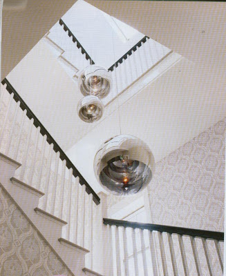
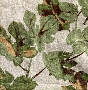
 Edward Wormley designed the room below.
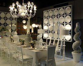
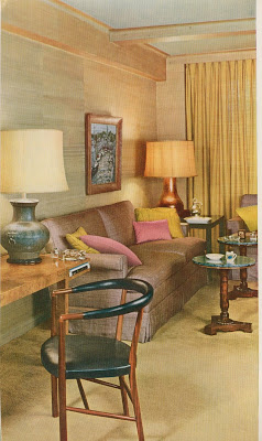 It is just me, or can you see the influence on the Gambrel room?
