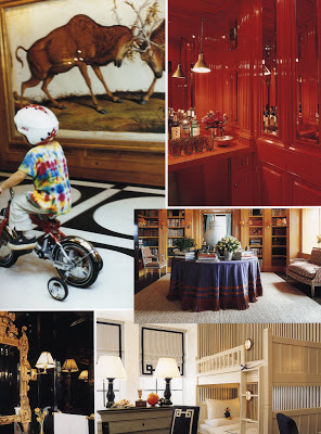
 Jennifer is nearly always right. Her comment on yesterday’s post led me to Tory Burch’s apartment in Vogue Living, Houses, Garden, People. I own the book. I’ve looked through it a dozen times, but sometimes your perspective changes. Now that Jennifer had pointed out the Walton Ford painting in the entry, I noticed how many things on this one page were in keeping with my style stalwarts.
Tag Archives: Designers
Slacker
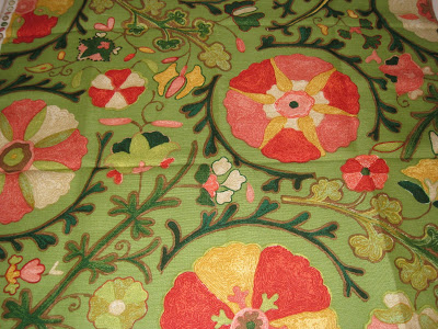 Did I mention I’m co-chairing the boys’ school auction? Oh. I did? If you think you don’t want to hear it again, imagine how Mr. Blandings feels. I’m distracted and disorganized and certainly not getting around to all the stuff I really want to be doing. But, I did manage a little work last week, and noticed one of the new colorways of Dzhambul by Brunschwig & Fils that Courtney has mentioned. Fabulous.
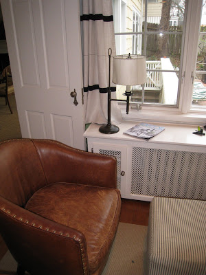 And when I returned home today, after working at school all day (not that I’m complaining) there was the new Elle Decor waiting for me like a trusty friend.
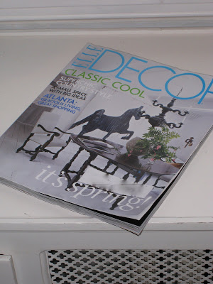
I didn’t have a lot of time to catch up, but, like all good friends, she delivered just what I needed. I was a little bitter, as she looks absolutely flawless, while I am a bit haggard and tired. She didn’t mention it, of course. We’ll sit down for a long visit soon, but somehow, just knowing she’s there makes all the difference.
It’s My Pleasure
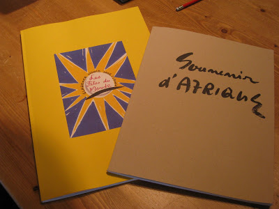 One of my favorite trade showrooms here in town is Designers’ Only. They carry a lot of the English lines, as well as Brunschwig and Ralph. Last year they picked up Clarence House and I was in hog heaven.
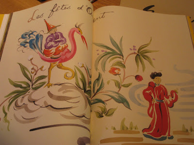
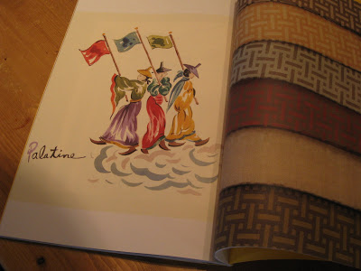
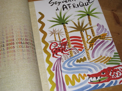 Out on one of the tables are two promotional brochures by the artist, and Executive Vice President of Clarence House, Kazumi Yoshida. I’m always wondering if anyone will notice if I slip these into my over-sized memo bag.
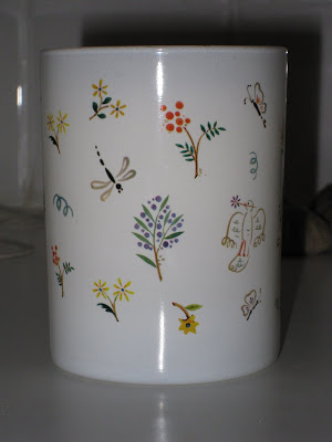
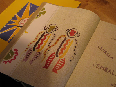 Obviously, you can see how some of these pieces relate directly to the fabrics and wallpapers that Yoshida is responsible for producing.
Having a Ball
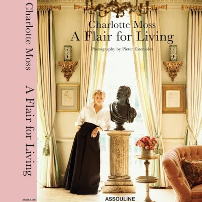 The cover of Charlotte Moss‘s soon to be released book.
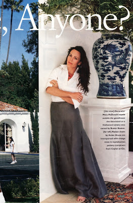 Mary McDonald, image courtesy of StyleCourt.
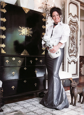 Windsor Smith, image courtesy of, um, StyleCourt. (Thanks, Courtney, you’re an easy mark.)
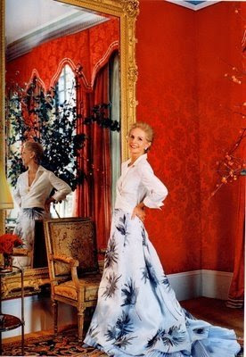 So, I have a little fete this summer which calls for a ball gown. It is a nice change, after all, from my regular uniform of denim and black.
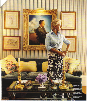 This image, and the one above, Carolina Herrera, courtesy of The Peak of Chic.
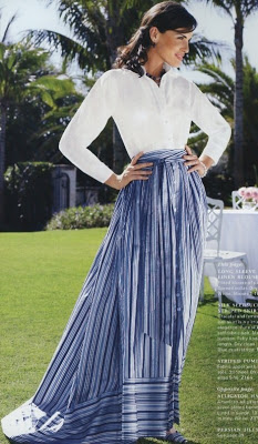
This just caught my eye at Brooks Brothers. Yes, Brooks Brothers. Sleeves rolled up, neck open a bit more (nothing scandalous) turquoise beads, maybe? Oh, how I’m shamelessly dreaming of June.
The Tudors
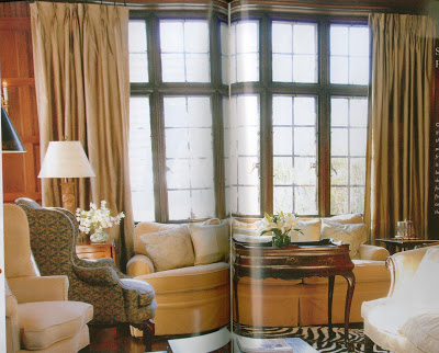
In the current issue of Spaces, there is a wonderful “Tanner Tudor.” This is shorthand in “our town” for one of the homes designed by architect Edward Tanner, who also designed the majority of the Country Club Plaza shopping district.
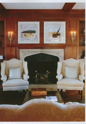
Tanner’s Tudors are particularly lovely, and the owner of this one has done a careful renovation, keeping the style and feel of the home where overhauls were necessary.
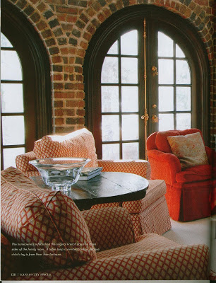
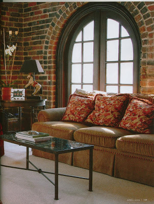 It’s a particularly good issue. If you don’t subscribe (what? you don’t?) rush to the news stand today.
