Tag Archives: Designers

Everyone Loves a Mystery

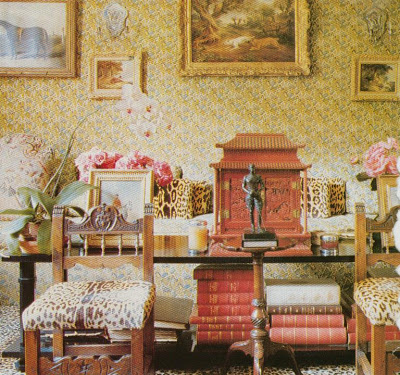
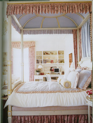
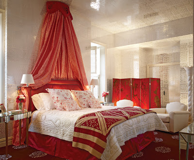
One of my readers e:mailed a couple of weeks ago to see if I recognized the Brunschwig & Fils wallpaper, above. I didn’t, but I was so charmed by her e:mail, that I set off on a bit of a quest. I didn’t really think it would be that tricky. She already knew that the paper had been used in this project and Britt’s beach house. This layout was in Architectural Digest in February of 2007. She had contacted AD (why, oh why do they refuse to do any resourcing?) but, as of today, they have not responded.

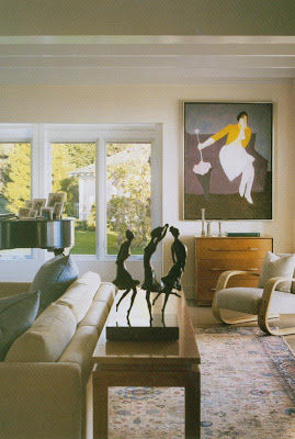
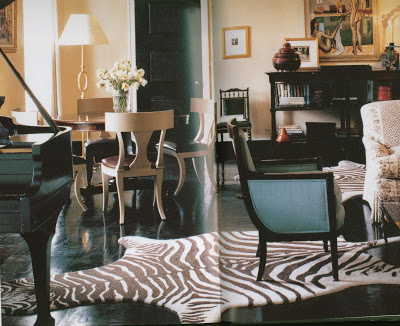
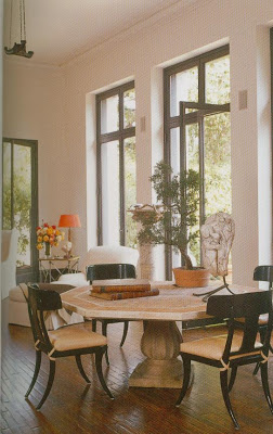
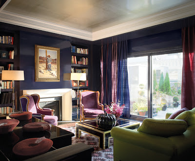
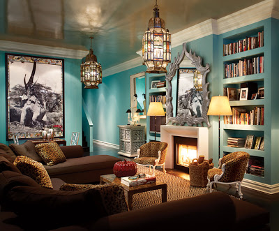
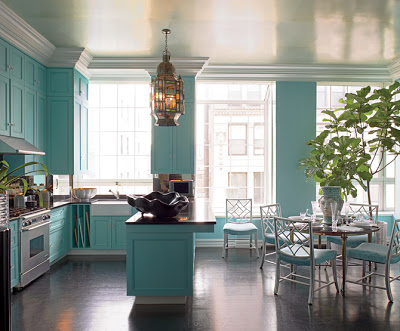
The article, and the information on the website, do identify the paper as B&F, so I e:mailed the image to our showroom here. Designers Only is owned by a well-respected designer in town and her staff is always gracious and lovely. Sure, happy to help, get right back to you. (I’m including other images from the story so you don’t get bored reading my text.)
Nothing. No one recognized it. But, as kind people often do, they took it to the next step and e:mailed the image to the B&F showroom in Chicago. Nada.

Curiouser and curiouser. So, I picked up the phone and called Tom Britt. Well, why not? We’re not exactly tight, but, you know, he’s from Kansas City, I live in Kansas City…
I talked to a woman in his office. Nice. Professional. Could I e:mail the image? Fax? Well, yes, I could fax it. As of today I have not heard back. I get it. They’re busy. Getting published in AD and things like that while my calendar today reads, “Stop Rosie’s meds.” You know, because of the allergy test next week. (If you are new to the site, she is my itchy boxer pup. Mr. Blandings has taken to calling her a lemon, but she’s beloved.)
So, now I turn to you, gentle readers. Can we help Barbara? She’s been so patient. And optimistic. (She contacted AD!) I’m constantly in awe of the knowledge bouncing around out there. Look again. Silver and white, somewhat Moorish, clearly not boorish. We can all get a little fixated and we need to help Barbara, and her master bedroom, move on. Anyone? Bueller? Anyone?

rssrss      FacebooktwitterpinterestlinkedinmailFacebooktwitterpinterestlinkedinmail

Little Man Complex


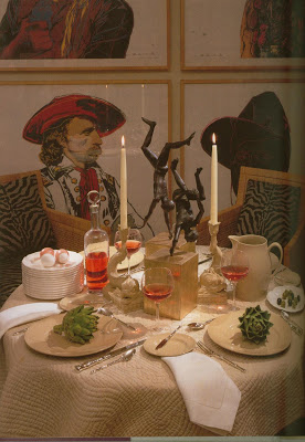
Sometimes in life, and in design, you have to take on the big questions. And sometimes, you just need to ask yourself, “Who is that man break dancing in the middle of my table?”


Van Day Truex, The Man Who Defined Twentieth-Century Taste and Style, Adam Lewis, 2001.

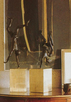
These aren’t men, of course, they are boys. And they aren’t dancing, they’re diving. And it’s not my table, though I would gladly claim everything on it except that blush wine. This is the table of Van Day Truex and some of the classic items he created for Tiffany. Drabware plates, bamboo silver, Liverpool jug, dolphin candlesticks, All Purpose wine glasses. The striking Franzini “Diving Boys” sculptures were his own.

House and Garden, March, 1992.
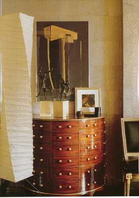
My guess would be that these are the same sculptures here in Albert Hadley’s apartment. They are not mentioned or credited in the article, but Hadley talks a great deal about enjoying “objects with associations.”

Hadley was a student of Truex’s and they were friends from the time Hadley enrolled in Parson’s until Truex’s death.


House and Garden, December, 1991.

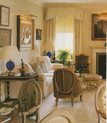
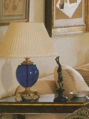
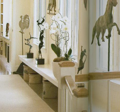
Here Hadley and Gary Hagar, of Parish-Hadley, use very similar sculptures in the living room of Louise and Henry Grunwald. While these figures are striking, they are definitely accents in the room. Objets. You know, stuff.

Hadley was frustrated with clients who “have no possessions and bring nothing along, you feel that there has been no life before.”


C.Z. Guest’s library, House and Garden, October, 1988.

It takes a while to accumulate the kind of things that give a room dimension and it’s easy to spend your energy on the paint and the rug and the curtains and the sofa.

This image and the one below, Mariette Himes Gomez, Houses: Inside and Out.
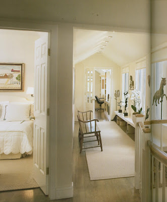
Just make sure at the end of the day when you are easing back into your favorite chair, that the glass that you set down on the table, or the thing that you nudge aside as you put your feet up on the table, make sure that it is something that is yours.

That there is a story behind it, even if the story is, “I saw it and I had to have it.”


Not so much, “I got it on sale at Target.”

rssrss      FacebooktwitterpinterestlinkedinmailFacebooktwitterpinterestlinkedinmail

Join the Club

There are people who have a natural attraction to chairs. One of my friend’s husband says he’s afraid without intervention and a little personal fortitude he might live surrounded by dozens of individual chairs. I don’t want to disparage the sofa, but sofas are mostly functional. They can be stylish. But they don’t have distinct personalities like chairs.

Mark Weaver in Rooms to Inspire, Annie Kelly.

Sometimes it’s not so much of an attraction as an obsession. Not so much a club, say, as maybe CA. Chairaholics Anonymous.

Rooms to Inspire, Annie Kelly.

I went to an estate sale with a neighbor one time. We both spied the funny, vintage wing chair that is now in my office at the same time. She said, “You get it. If you don’t have a place for it, I’ll take it.” Yes, maybe to her attic. To be friends with the other chairs there.


Patrick Naggar and Terese Carpenter in House and Garden, Book of Style.
I’m not throwing stones. I have some chair issues myself. My problem is, I don’t want to stop. Even though I know it’s not healthy to have three pairs of chairs in the basement, well, you never know when there will be the right place. You might never come upon a good chair again so you better get them while you can.
The late Roger Banks Pye, Colefax and Fowler Interior Inspirations.
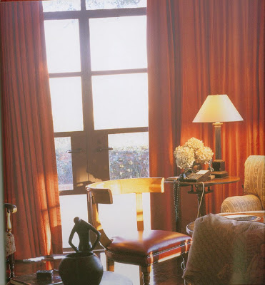
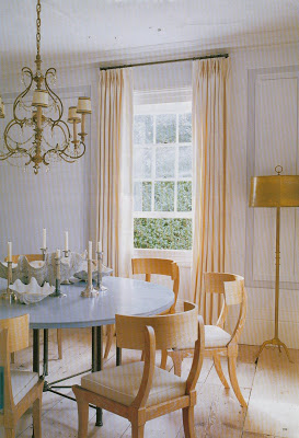
One of my favorite styles of chair is the klismos. The Greeks dreamed this baby up in about the 7th century B.C. and it’s been making comebacks ever since.
Michael S. Smith in his book, Elements of Style.
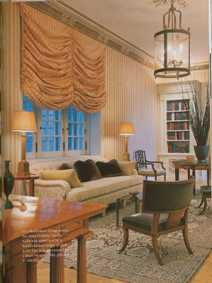
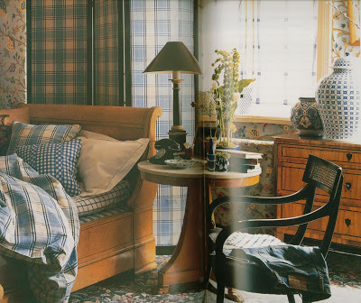
Klismos chairs are characterized by legs that curve out, a back support of a rectangular panel that curves to hug the body.


Stephen Sills and James Huniford in their book, Dwellings, Living with Great Style.
Beyond that, the maker can do any crazy thing he wants to it. Widen it. Deepen the seat. Craft it from metal, aluminum or wood. Gilt, wicker, carvings.


Banks Pye, again.
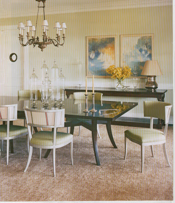
Still klismos. You can see the style has quite a following. Klismos chairs work well as side chairs, desk chairs (careful about arm height) and dining chairs.
Steven Gambrel, above, his own home, Elle Decor. Below, in House and Garden.


Hmm…dining chairs. That would be a nice excuse to acquire ten new chairs. Nice upholstered seat. Perhaps even the back.
Neirmann Weeks

Perfect spot for a meeting. “Hi. My name’s Mrs. Blandings…and I’m a chairaholic.
Image, top, Albert Hadley for Mr. and Mrs. Michael Druckman in Albert Hadley, The Story of America’s Preeminent Interior Designer, Adam Lewis.

rssrss      FacebooktwitterpinterestlinkedinmailFacebooktwitterpinterestlinkedinmail

“What you make is important.”

When I slept in the boys room to accommodate the aforementioned patient, I reacted badly to the clock that seemed fit for a Pink Panther episode. There I was, too tall for my bed, too much on my mind, with a pillow over my head to block out the tock, tock, tock. I finally rose to remove the battery after lying there forever not wanting to get up and praying for sleep.

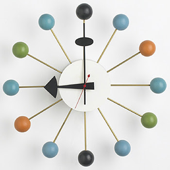
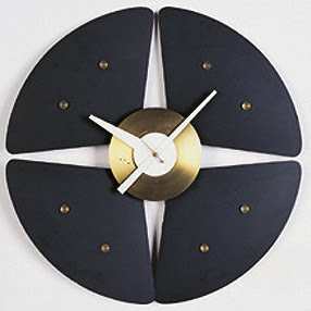
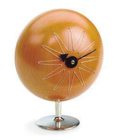
It was down for days, but the inhabitants complained, and now it is back. But I do think there needs to be something new. Better. Possibly the George Nelson Ball Clock. Ubiquitous perhaps, but classic nonetheless.


George Nelson graduated with a degree in architecture from Yale in 1928. He traveled extensively in Europe over the next few years and returned to the States, “a convinced modernist.”

He was an accomplished writer and advocate of the modern movement as well as a designer. His hanging “storagewall” brought him to the attention of, and eventually into business with, the Herman Miller Company.


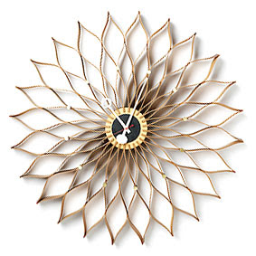
He introduced the ball clock in 1950, though the clocks were only identified by numbers at the time. He designed an estimated 150 clocks during his partnership with Herman Miller. The company produced the clocks into the 1980’s until they were discontinued. Vitra resumed production in the 1990’s.

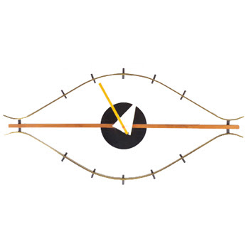
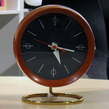
What has become known as the “eye” clock, below, was originally pictured at an angle in the catalogue, not horizontally as it is usually placed today.

We visited one of Mr. Blanding’s friends in Chicago many years ago, certainly before mid-Century was the rage, and her husband had a collection of Nelson ball clocks in nearly every color. She made him hang them in the garage. I remember seeing them on the way out to dinner and thinking, “fabulous.”


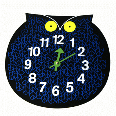
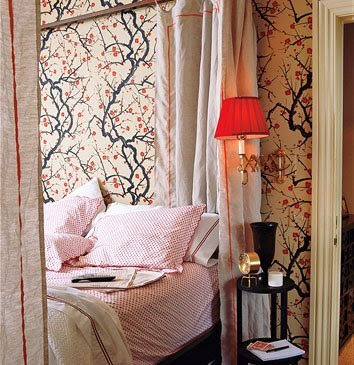
But while I consider the ball clock for boys 1 and 2, and am so tempted by the owl for number 3, it is the desk clocks that have captured my heart. Jennifer at the Peak of Chic posted this picture of domino editor Sara Ruffin Costello’s bedroom last May. The Flowering Quince from Clarence House certainly dominates the shot, but I zeroed in on the bedside clock.


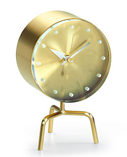
Not exactly the one I had my eye on, though I love the tripod base.


The more I post, the more aware I am becoming of my own taste. These desk clocks are so sculptural.

I want one on my desk, but as I’m in the habit of watching the digital clock in the corner of my screen, I might have to place the clock in front of it.


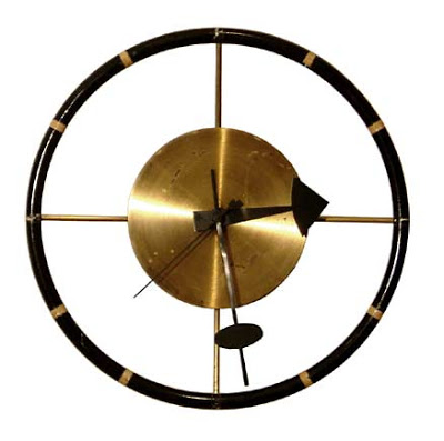
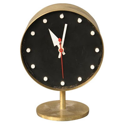
This is the one. Black face, white dots in place of numbers, and red second hand. I couldn’t design it myself as I am not a 20th century icon. But, if I could, this would be the one. As I said, Vitra has reissued many designs and there are dozens of on-line vendors standing by. This handsome number is vintage. He stands patiently, on 1st dibs, waiting for someone, me perhaps, to take him home. Nelson thought a collection should be permanent, not “scrapped for every new trend.” I think he would be satisfied.


Image top is the logo that appeared on many of the Herman Miller catalogues. The quote that is the title is from Nelson.

rssrss      FacebooktwitterpinterestlinkedinmailFacebooktwitterpinterestlinkedinmail

Baroness Bomburst

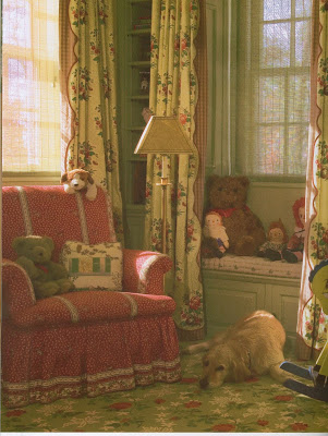
While writing the post yesterday I realized how few pictures of children’s rooms are in my file. They do show up in magazines fairly regularly, but apparently Baroness Bomburst is editor of most design books. (She’s the meanie in Chitty Chitty Bang Bang who employs the Child Catcher. Just in case you forgot.)

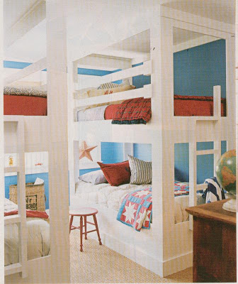
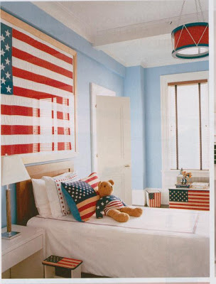
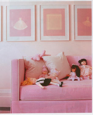
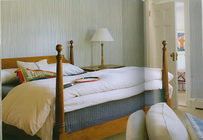
I did manage to pull a few from the files. Not surprisingly, a couple of my favorites are designed by Steven Gambrel. (Did you notice how much restraint I’ve been showing? Post after post with no mention. And, no, there’s no restraining order.) All images House and Garden.
Mariette Himes Gomez acknowledges that children exist in her new book, “Houses.”

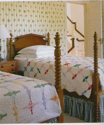
The beds and the quilts reminded me of Waldo Fernandez’s son’s room in House Beautiful, January 2007.

The spool bed came from “somewhere in Kansas,” of which he’s says, “Well, they have a lot of great stuff there. All the Midwest does.” See?

Vintage Mario Buatta.
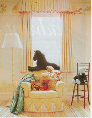
My bedroom growing up had yellow (surprised?) walls, orange carpet (it was the 70’s) and yellow faux bamboo furniture that I thought I picked out myself, but that, very likely, had been chosen by my mother on a previous trip.

Designed by Sallie Giordano and Leta Austin Foster, Farrow and Ball, The Art of Color.
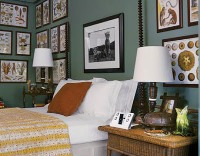
She let me move the furniture, rearrange the shelves and put just about anything up on my walls. Although, as an aside, the only thing on the walls in her rendition were four, large Joan Walsh Angland prints in wide washed-green painted frames lined up on the long wall. I don’t know what I would do with them, but I wish I had them now.

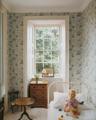
Baby Iris’s room in the home of Stella Tennant and David Lasnet, Vogue Living: Houses, Gardens and People. I must admit, there are several children’s rooms in this book worth seeing.
Perhaps because of this, I tend to go more English country-house or crisp beach house when it comes to children’s rooms. Teenagers are different; they can pop all they want. Someday I might show you pictures of the Blandings boys’ rooms. Likely when they go to college and they are clean enough to be photographed. Ahhh…it’s all making sense to me now. Editors aren’t overlooking them. They just don’t want to pick up the Barbie shoes and the Legos.
Image, top, unknown Cottage Living.

rssrss      FacebooktwitterpinterestlinkedinmailFacebooktwitterpinterestlinkedinmail