Tag Archives: Designers

Infidelity

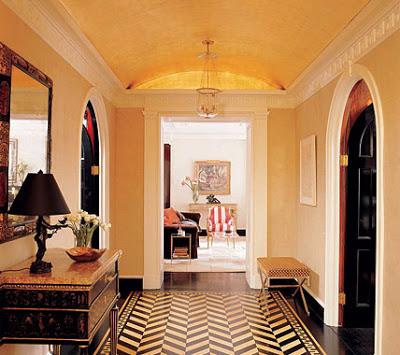
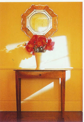
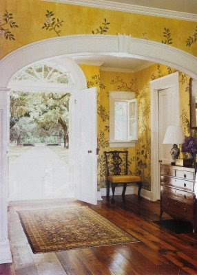
Entry hall, Thomas Janes, Whitehall, SC; many thanks to Courtney for the source.
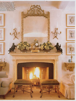
You know that game some couples play? You know, “If I die, who do you think you would marry?” This is not a good idea on any level, especially as, if this comes up, it is usually not in time of crisis, but instead after the inquirer has had a drink or two. Be forewarned: There is no good way to answer this question. In addition, if anyone asks it of you, pretend you are having an appendicitis. Better yet, have an appendicitis.
Which is why when Sarah at Things That Inspire asked me to post a virtual dream house I squirmed a little. It makes me feel unfaithful. I love my house. It is my dream house. How could I think of another? But, heck, it’s just a game so here goes.

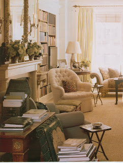
My living room is loosely modeled on Bunny William’s living room both above and below. This room is the perfect combination of formal and informal. It communicates her wonderful taste without being overly impressed with itself. And, I adore the klismos chairs.

Living Room, Bunny Williams, her own.

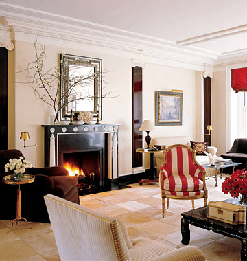
Amelia Handegan for Thomas Ravenel, House Beautiful, July, 2003.

This living room by Amelia Handegan has also had a strong influence on mine. This room and Williams’s both focus on variations of a single color using a variety of fabrics and textures. I do use my living room as a retreat from the testosterone bouncing off the walls in almost every other room, but it is mostly for entertaining. It’s a careful balance to communicate that a room is special – not just for dogs and kids and carry-out – and to still be welcoming. I think a living room wants to say, “We were careful here. We took some time. We hold it dear, but we want to share it with you, because you are special too.” Not a tomb, a treasure.

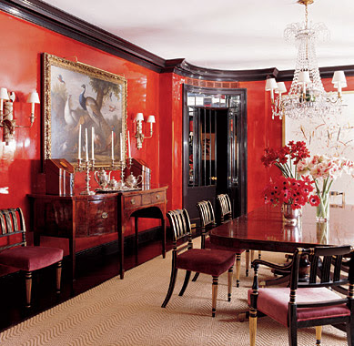
Brian McCarthy, Elle Decor, December, 2007.

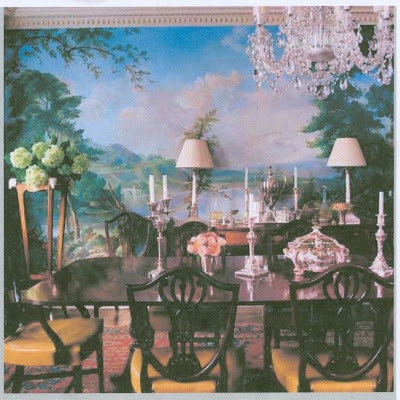
Dining rooms need drama. I was torn between this and the Michael Smith (end of post), but while I love the sculpture of the pieces in the Smith room, a dining room needs to go “pow!” for me. It needs to knock your socks off. Red, black, lacquer, crystal. Yep, that sounds about right.

Mari Ann and Michael Maher’s home, Elle Decor, July/August, 2007.

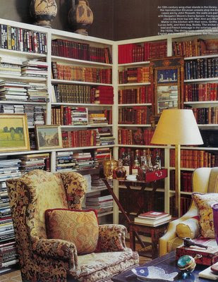
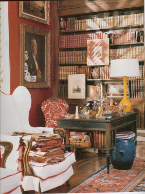
Whether it’s gros point or needlepoint on that wing chair matters not; I simply would never want to leave. Piles of books, bar on a tray in the corner, and the light looks dreamy. Library perfection.

Victoria Hagan, Town & Country.


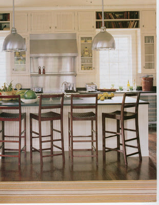
Kitchens should be white. Or so says Van Day Truex and who am I to argue with him? Almost all the kitchens in my file look remarkably, or unremarkably depending on your taste, the same. I pay particular attention to Hagan’s kitchens because she has children and I think she gets it.
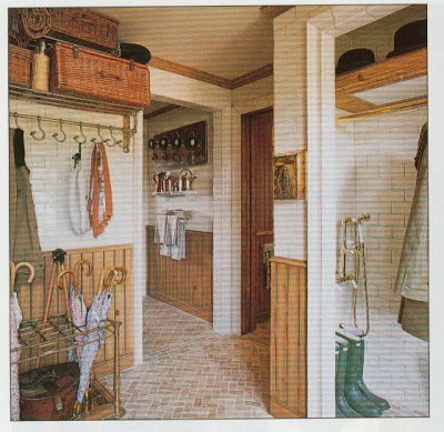
Howard Slatkin, Architectural Digest.

I do not have a mudroom now, so this is total luxury for me. You cannot imagine how much I would use the shower for dog and boys alike.
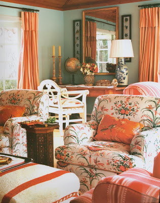
Lynn von Kersting, La Strada della Dolce Vita
This is where I’d like to teach the shoe-tying, gather the markers and monitor the algebra. Cheerful stripes and chintz would surely send everyone out the door with smiles on their faces and welcome them home again at the end. Family Room.

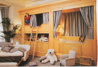
Cool enough for the boys, Christopher Robin enough for me. I’d have to add another bunk, then I could lay awake in my room listening to the quiet talking and laughter that always comes once the lights are out. The only time they seem to like each other is before sleep. Then you can hear in the murmurs from one twin bed to the next the connection that will make them brothers the rest of their lives.
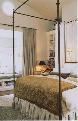

And “our” room, that I often mistakenly refer to as “my” room. In reality and fantasy, it is last on the list. Our current bedroom languishes in leftover hell of both linens and furniture. When the eldest claimed it to convalesce, Mr. Blandings and I blushed as well-wishers paraded through with balloons and books. It’s time for a little attention. That made choosing this image tricky. I don’t think either one of us knows exactly what we want, but it should be soothing and comfortable. The black iron canopy seems to give the room a little edge and structure to balance out the softness of the rug and fabric.

What? No, darling dream house, I don’t think she’s prettier than you! Besides, she’s had all that work done. You’re a natural beauty.

Post Script

These rooms came in and went out of the post so many times, I think they deserve a mention.
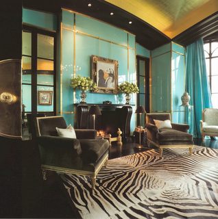
Brian McCarthy. I couldn’t have this room and the red dining room. In addition, this seemed to be overpowering the rest of the scheme and I just couldn’t quite get comfortable with it.
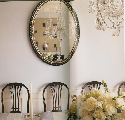

Michael Smith for Maria and Gary Gersh. This room is so pretty. But, again, it wasn’t working with the whole, and, as much as it enchants me, it’s a bit to subtle to serve as my own dining room.
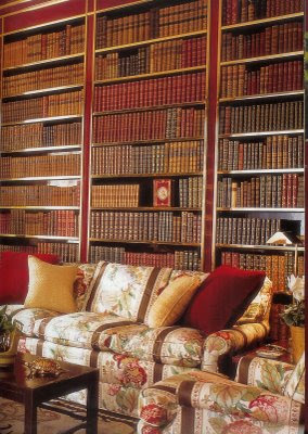
And, Albert Hadley’s study for Brooke Astor. This is one of my top ten rooms, but I couldn’t have this and the McCarthy dining room as well. I’m so hoping Mr. Hadley would understand.

rssrss      FacebooktwitterpinterestlinkedinmailFacebooktwitterpinterestlinkedinmail

Crimson and Blue

Last night, my alma mater, KU, beat Virginia Tech in the Orange Bowl. Now, I’ve been to a couple Final Fours in my day, but football was never our strong suit and I spent a lot more time at the Wheel than Memorial Stadium.


But it was fun to watch the Jayhawks play football in January. We looked so snappy in our red jerseys with the blue helmets. I’m sorry to say, but Virginia Tech’s maroon and white combination left me a little cold. And, you might think this is shocking, but they seemed to be accenting their colors with a dash of orange. I know, try not to think about it.


But, in honor of the ‘Hawks and their bowl victory, today’s post is crimson and blue.

Possibly Jackye Lantham.
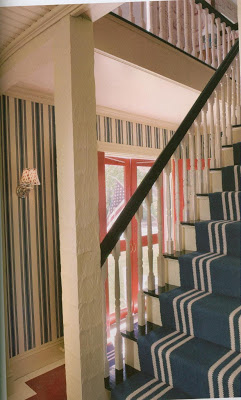
There are a lot of nautical images that could have been posted, but I restrained myself – only two.

I think this is Delphine and Reed Karkoff’s beach house. I think.

A couple of these might look familiar as The Peak of Chic did a little something on primary colors a while back.

Southern Accents on Color.

It’s a tricky combination to pull off and not feel like The Star Spangled Banner should be playing in the background.

Albert Hadley, The Story of America’s Preeminent Interior Designer.


Did you notice the jazzy blue stripe down the pant leg? Even the producer liked our colors better. What would you rather see? Crisp clear blue with a dash of red. Or white. With maroon. And a little orange. Sounds like an ensemble one of my boys would but together.

Farrow and Ball, The Art of Color.
I uploaded the images earlier in the evening, but I had to wait on the text as any reference might have been construed by Mr. Blandings as a “jinx.” You can never be too careful. If it weren’t so late, I might look for something with a little maroon, white and orange.


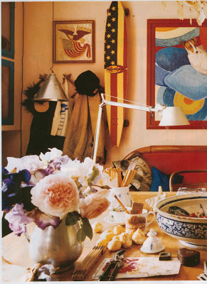
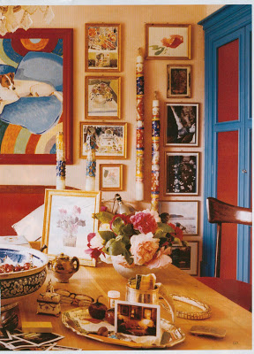
Photographer Oberto Gili’s farm in Italy, House and Garden, Nov. 2005.

Then again, maybe not. It would be so hokie.*

* We are, of course, sensitive to the terrible tragedy at Virginia Tech last year. If this post is, in any way, considered insensitive, I do apologize.
rssrss      FacebooktwitterpinterestlinkedinmailFacebooktwitterpinterestlinkedinmail

Any Friend of Mr. Hadley’s…

Seems that organizing tear sheets is on many people’s resolution lists this year. I don’t make resolutions. It’s not that I couldn’t use a little spit and polish, but I’ve just spent a lot of time focusing on what needs to be fixed and I’m a bit too old for the grand gesture. Still, I’m messy by nature and I do have to focus to keep the piles at a manageable level. It’s not that I can’t find things, I can. But I do think the visual clutter is wearing over time and, well, we could all use a little zen.


So, I’m working on a little filing myself. Sorting and shifting and wondering what needs to be really handy, what can go into binders, and what can hit the external hard drive.

And while I wasn’t really going to do a top ten, I have to say, when I ran across this New York apartment by Brian McCarthy from the December 07 issue of Elle Decor, it made me a bit wistful. This was one of my favorites from last year.


For one thing, it had a lot of red, and I’ve had red coming on for a while now.

I don’t know that much about McCarthy, so I went poking around.

McCarthy’s living room courtesy of New York Social Diary.
Brian McCarthy worked as a personal assistant to Albert Hadley after graduating from Pratt, then eventually became a full-fledged designer for the firm. He adored working for Mr. Hadley and reports that he is “a gentleman,” which I believe to be the ultimate compliment.


You can certainly see that he’s been influenced by Hadley. I like a room that looks modern at first glance, but, upon dissection, reveals itself to be a fresh composition of classic pieces.

Mr. McCarthy, who started his own firm in 1991, is also very comfortable with color, which I admire.


The seamless addition of contemporary art shows finesse as well.

Wouldn’t it be a toss up to decide between the Gracie paper and the painted mural? It’s win/win with McCarthy. The leather upholstery on the chairs, below, is a chic and practical choice. Form and function.


I did not know if he could top that red lacquer dining room, but this leaves my mouth agape. I have a couple of pieces of vintage jewelry that are turquoise and gold and I love them. Who knew how well the combination would translate into an entire room. I’m looking forward to 2008. I can’t wait to see what Mr. McCarthy shows us next. A gentleman never disappoints.


Elle Decor images from www.pointclickhome.com, others courtesy of Mr. McCarthy’s web site.
rssrss      FacebooktwitterpinterestlinkedinmailFacebooktwitterpinterestlinkedinmail

Gladys Kravitz

Mr. Blandings and I are a good match for a lot of reasons, but one of the critical ones is he is an amazing cook and I am not. But I do love to eat. For many years when we were first married, and even after the addition of the first baby, I would come home from work, put on comfy clothes and wait for Mr. Blandings to come home and fix dinner. I know this is flying in the face of traditional gender roles, but I was awful and he was great and it seemed a little silly for both of us to eat badly, especially since he liked to cook.

But, eventually, the boys were eating solid food and I quit my job, and it seemed a little silly for us to be sitting at home, a little grouchy and hungry, waiting for Mr. Blandings to arrive.

I did try. I simply don’t have an affinity for it. No feel. What is the equivalent of a “good eye” in the kitchen? I don’t have it. But we muddled through and Mr. Blandings, as is his nature, was always very polite.

Then one day someone recommended the Barefoot Contessa cookbooks. Shaking my head, assuring her I was beyond professional help, my friend emphatically replied, “It’s easy! It’s great! You’ll totally get her because it’s never a list of ingredient as long as your arm and you won’t need a dictionary to look up the techniques. Ina is the answer.”

So I bought Ina Garten’s Barefoot Contessa Parties. And it changed my life. It’s easy! It’s great! And I don’t need a dictionary or a trip to the Asian market.

And then, oddly, I became hooked. I have all her cookbooks. And I use them. And I’m…good. Better. Now Mr. Blandings and I sit down together to watch Ina’s cooking show on the Food Network. The only problem is, I became a little obsessed with her house. The kitchen hooked me. Green walls, white cabinets, black counter tops. Finally, something to love about cooking.

But I’m always craning my head around the corner trying to see into her living room. I looked on line, but I couldn’t find anything. Apparently, it hadn’t been photographed. Except it had, in 1994, while I was still drinking wine in my KU sweatshirt waiting for Mr. Blandings, Ina’s charming Hamptons home was in House Beautiful.

It’s changed a bit, but it’s remarkably the same. The kitchen island is black granite now and the upholstery in the living room has been updated, but the house is strikingly similar to the images from 14 years ago.

Ina’s New York apartment was in House Beautiful this past year. It is also clean and simple. And chic.

The lines are classic and sculptural, the colors mostly neutral and soothing.


With some pop.


We are now best friends because she allowed this chair to be photographed with the fabric that it is going to be recovered in. But isn’t yet. I like a girl like that.

And she has the amazing Ted Muehling candlesticks. 


It was so nice of Ina to let us have a peak at the New York pad. The thing is, I hate to be nosy, but I still want to see a new spread on the Hamptons house. Really.

I know I’m a bit like the rubber-neckers trying to peer through the privet. It just seems that House Beautiful would have a bit of an “in.” She does write a column for them.

Could she possibly think that we’ve seen enough on the Food Network? Not nearly. And the magnifying glass doesn’t help a bit, even with the DVR on pause. Maybe I just need to stop by for a cup of sugar.

rssrss      FacebooktwitterpinterestlinkedinmailFacebooktwitterpinterestlinkedinmail

Mirror, Mirror


I have a picture of a mirror in my head. Not a non-existent mirror that I have dreamed up, although I do have a problem with that kind of thing as well. No, a real image of a mirror from one of the many design books in my office. I think.

I was sure it was from Mariette Himes Gomez’s “Rooms.” So, I whisked it under my arm on the way out the door this morning.

Alas, it was not there. But I noticed, as I was flipping frantically, then thumbing slowly, that Gomez has a way with mirrors and maybe that was why I thought it had to be there.


Most of the mirrors she chooses are almost works of art. While her rooms are usually crisp and subtle, her mirrors have a lot of interest.


I think she is especially strong with furniture placement, but noticed today that she has a great eye for placing mirrors and art as well.


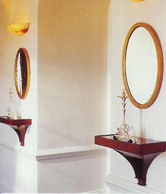
She often uses pairs, which always seems just right. This little vignette above would be pretty easy to replicate on almost any budget. And so charming.

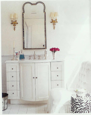
The chinoiserie mirror is terrific, but especially so as it is placed in this pristine environment. All that white makes it pop.

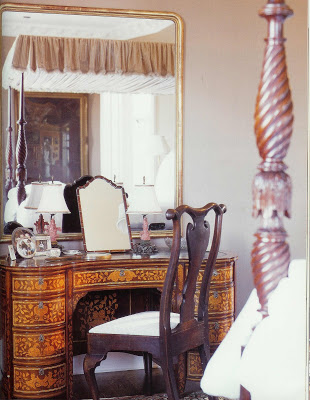
I noticed the smaller mirror on larger mirror a couple of times. The arrangement above is genius as it is reflecting the light from the window which makes the whole room sunny and warm. Also, who doesn’t want a vanity mirror? Instant glamour.

So, like running into a good friend, it was fun to see Mariette again. Now I have to go home and see if I remembered something real or not. Large, oval, black with white “dots,” possibly mother-of-pearl or ivory inlay? Does she sound familiar? Let me know. Wild goose chases welcome; something good is always bound to turn up.

rssrss      FacebooktwitterpinterestlinkedinmailFacebooktwitterpinterestlinkedinmail