Tag Archives: Designers

It’s Crystal Clear


House and Garden, September, 2007.

I’m sending out a bit of a trend alert. I somewhat ignored all the body parts, mostly hands, that I was spying this summer because I thought they were, well, contrived. But this trend has piqued my curiosity as it’s raised my eyebrow.
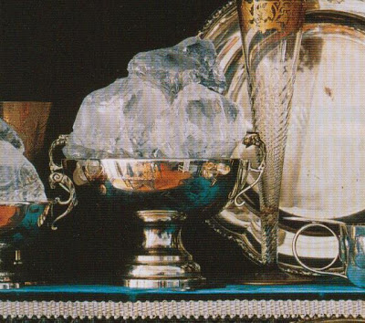
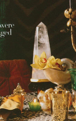
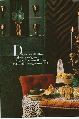
You see, I really like Rock Crystal. A lot. And I know it’s not anything new, but it’s popping up in so many lay-outs lately. I’m worried about Rock. I’m afraid he might become a cliche. Like the Coral sisters, Red and White.

Bazaar, Fall 2007 supplement. Styled by Douglas Little.
I’m wondering if it’s the convergence of two forces. Could it be possible that Rock is the off-spring of Ms. Wearstler, wee of frame but mighty of influence and exposure, and Mr. Duquette, a big personality in his own right, who is enjoying a bit of a resurgence?

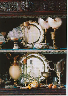
One of the best parts of the substance is that it is so appealing in so many forms. Big, chunky rocks, sleek obelisks, or as utilitarian object, like the lamp below.
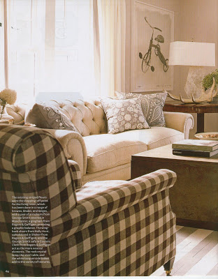

House Beautiful, January 2008. Design by David Mitchell.
Another thing about Rock, he can go anywhere. Dress him up and put in him silver and he is urban and urbane. Settle him into a rustic beach house or cabin and he takes on an easy-going organic air.


He’s not the jealous type, either. He can hang with other trends and not feel threatened, be it antlers,
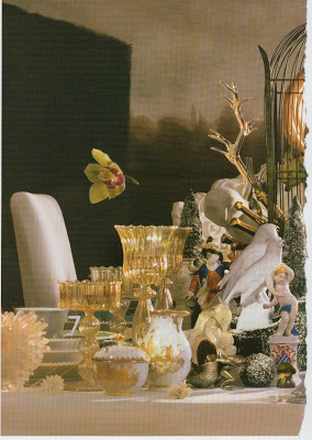

House and Garden.

or blanc de chine,
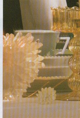

or suzanis. He’s happy to share the spotlight. He might be the George Clooney of trends.
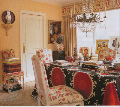

Elle Decor, November 2007. Design by Alex Papchristidis.
I should caution you about one thing, though.
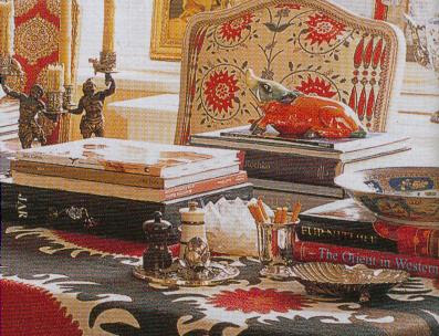
As lovely as he is, as he gains notoriety, his price will go up. Way up.
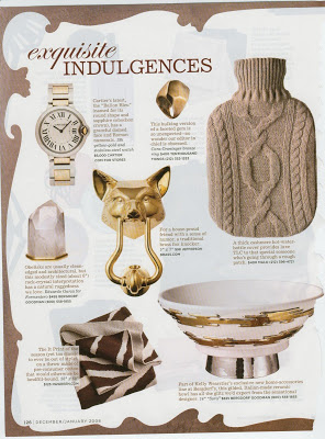
Domino, December/January 2008.
When I was in Cascade, Colorado this summer, at the foot of the hill that has been Mr. Blandings’s family’s vacation home for five generations, there is a little spot called The Rock Shop. No, I’m not kidding. Anyway, I’ve been going to this little retreat for fifteen years, give or take. Every year I say, “Let’s go to the Rock Shop.” And every year Mr. Blandings says, “My grandmother used to call that the Gyp Shop.” Every year.
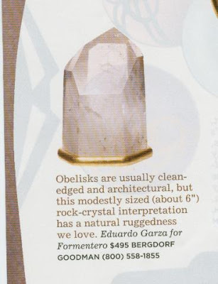

But this year, in a driving rain, I gave each boy five dollars and down the hill we went. I hate to say it, but sometimes Mr. Blandings doesn’t know what is good. Baskets of beads, arrowheads, geodes. All in all, a wonderful spot. But the point is, in the back room (Where you have to be at least 10 years old to go. Still not kidding.) there are rock crystals bigger than my head for under $200. Bigger. Bigger than Frankenstein’s head. All I’m saying is, if you go to Bergdorf’s and buy a measly 6″ rock crystal squatty obelisk for $495? Well, the elder Mrs. Blandings might have had a name for a place like that.

rssrss      FacebooktwitterpinterestlinkedinmailFacebooktwitterpinterestlinkedinmail

A Little Holiday Sparkle


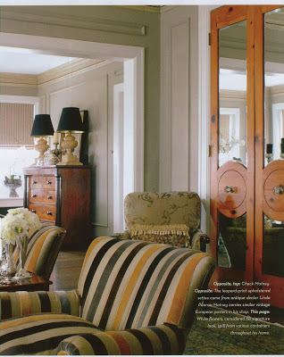
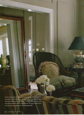
I adore this cut velvet and linen fabric on the chairs.

Just a quick treat as I’m out the door to finish up the shopping. This layout is in the current issue of Spaces, our home town shelter magazine.


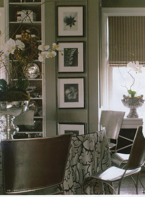
I recommended these French, metal garden chairs to a woman I know. Poor her, lucky Chuck.
As this is Kansas City, you’ll see this all ties together. Zim Loy, who was a finalist in the Domino contest, is the editor. The apartment belongs to Chuck Matney, the floral designer who did the flowers in David Jimenez’s wonderful home for the Kappa House Tour last year. And those amazing dining room chairs are from Parrin & Co., Barbara Farmer’s shop that I have profiled here before.

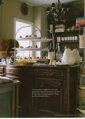
This is the kitchen. Which makes me smile, because I want to cook just enough to need a kitchen like this.
Sleek and elegant, mostly the same tone with pops of color, the apartment reflects Matney’s handy-work with flowers as well.

His arrangements are often one type of flower, generally one color. They are sculptural and relaxed at the same time.

Just the kind of soothing and elegant treat you might want to give yourself as you are running around like a crazy person trying to create the magic for everyone else.

rssrss      FacebooktwitterpinterestlinkedinmailFacebooktwitterpinterestlinkedinmail

Beads on a Thread

As I have been trotting out my vintage images, a certain “anonymous” reader has been commenting and giving me much-valued advice. Anon suggested I pay special attention to the Louis Gopp years at House and Garden; he also recommended Mark Hampton’s monthly column in these issues as particularly informative.

I’ve been a bit of a Hampton fan. I was very fortunate to find a signed first edition copy of Mark Hampton: On Decorating at Spivey’s, one of our used book stores “in town.” As I began saving the articles from House and Garden, I realized they had been compiled for On Decorating.


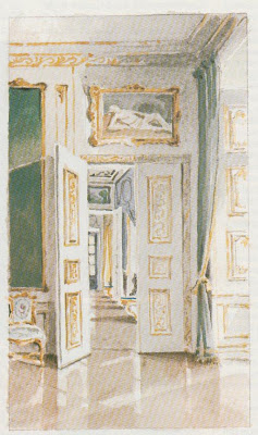
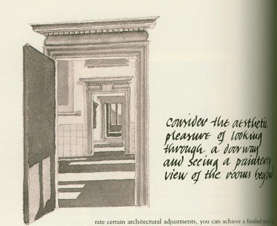
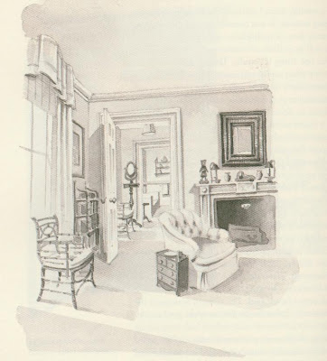
Part of the charm of this book is Hampton’s illustrations, some of which accompanied the articles. One of my favorites is “Long Live the Enfilade.” The word enfilade means strung along like beads on a thread. This architectural approach to design is classic and enduring and creates particularly lovely views.
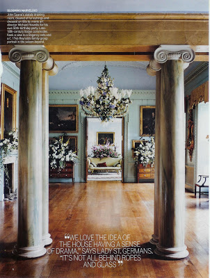
Vogue Living, Fall/Winter 2007; Port Eliot, Cornwall, England. Photographed by Francois Halard.
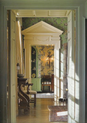
As Hampton notes, the enfilade can be used effectively in houses both grand and modest. The advantage of this layout is the feeling of discovery as you pass through the spaces, and the elimination of what are often dull hallways.

Farrow and Ball; The Art of Color, designer Sallie Giordano, Photographed by Edward Addeo.
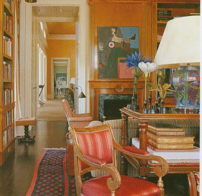
Hampton speculates that the enfilade passed out of favor because the long vistas were difficult to heat and cool and provided less privacy than a more complicated floor plan. Apparently, it’s difficult to ditch the servants if your rooms open on to one another in this way.

Mica Ertegun, American Designers’ Houses.
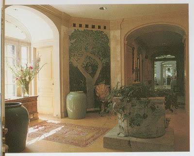
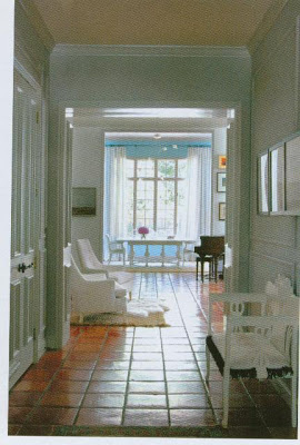
As Hampton notes, neither of these factors is a common problem in the modern day.


John Saladino’s Robin Hill in Influential Interiors. Guess where he’s from?
As I am more a decorator, and less a designer, it’s difficult for me to fathom moving doorways three to four inches, but Hampton believes what must be done, must be done.

Spaces Magazine, Zim Loy, designer. Photographed by Landon Collis.
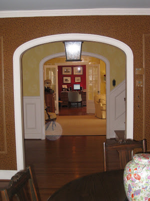
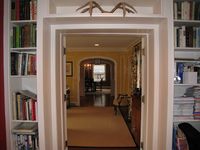
He retells the story of the legendary Albert Hadley and how he threatened to run away from home unless the driveway was repositioned “to form a circle centered on the facade of the house.” This is a guy who needs an axis. And yes, as the tale goes, the elder Hadley changed it.


It is a lovely view. I think I’m drawn to Georgians for this reason.

There’s a particularly striking sun dial at Christopher Filley’s right now (or there was last week) that I’m thinking would be perfection on a stand right in front of that window. It’s not for me, you understand. I think I owe it to Mark and Albert.
Drawings, top, all Mark Hampton, Mark Hampton: On Decorating.
rssrss      FacebooktwitterpinterestlinkedinmailFacebooktwitterpinterestlinkedinmail

DIY Digs


You do need to let me know if you tire of these vintage posts. I’m less than halfway through my boxes; at the advice of a friend I started with House and Garden. I’ve ripped more pages than I know how to store of the greats, Hampton, Parish, Hadley and Hicks. Celebrities like Vreeland and Chanel. But I’m captivated by this do-it-yourselfer.


There are whole issues of these magazines that I recycle without pulling a single page. (I was conflicted about keeping them, then Jennifer said, “bugs” and the decision was made.) Some things simply don’t translate.
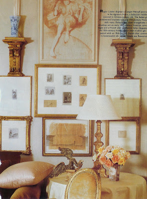
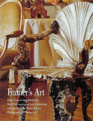
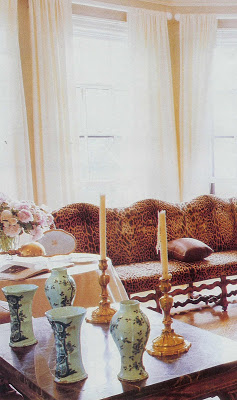
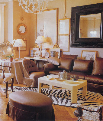
But I am captivated by Roger Lussier’s Back Bay apartment. Featured in the December 1989 issue, these rooms are classic and timeless, but not stuffy or boring. I considered posting them and quizzing you on who the designer might be.

Lussier’s Boston apartment once belonged to Richard Avedon, but the star quality is his own design. As an owner of a frame studio, he admits to an artistic eye, but does not accept the label “decorator.”

He apparently tried working for others, but was dissatisfied with the results. “It takes an unusual temperament to accept something this soft. This is my little workshop.” I have always had an unusual temperament. His workshop suits me just fine.


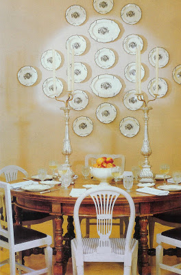
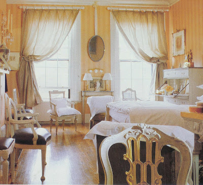
Painted chairs and a brown wood table always seem just right to me, a perfect combination. So much of this apartment is on my hit parade; animal prints, satin, brown, gilt frames, crystal chandeliers, the great touch of turquoise and, always, a million great chairs.

The bedroom walls seem to be the only thing that gives away the age of these images. If the walls were a little more orange and a little less peach, you’d never know this was published almost 20 years ago.
These rooms are an inspiration to me. Not a professional decorator. No prestigious design degree. Just a guy creating his own sanctuary. Beautifully. Trying new things, painting them, moving them around. I think we can do that. I think we can educate our own eyes and create our own homes.
I did google Mr. Lussier. No other articles appear, but it looks as if he still owns his frame shop in Boston. My hat is off to him.
Photographs by Oberto Gili.

rssrss      FacebooktwitterpinterestlinkedinmailFacebooktwitterpinterestlinkedinmail

Zim Loy Should Be Famous

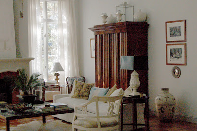
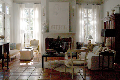
Zim Loy should be famous. Actually, here in Kansas City she is a bit of a local celebrity. Zim edits Kansas City Spaces magazine. But with a name like “Zim Loy” I think she’s a perfect fit for a little national exposure.

Actually, she’s getting a little. Zim’s living room is one of the five finalist for Domino’s Decorating Contest.

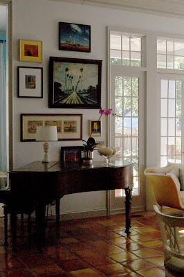
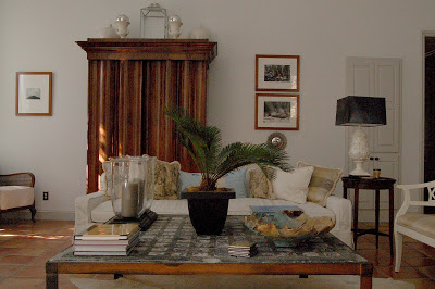
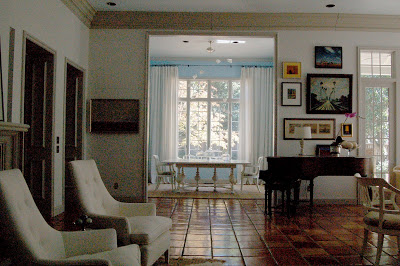
Her home was in the August/September issue of Spaces, a generous gesture to her readers. It’s fresh and clear, but singularly her own.

If the green movement extends to homes and furnishings, Zim and her husband are at the top of the compost heap. They have renovated several houses in town and she admits to being an estate sale and flea market fanatic.

These beauties were estate sale finds, $50 each, in an unfortunate burgundy velvet. Zim could see straight to their souls.

She also found the gorgeous armoire at an estate sale. It was a bargain, but as a serial mover (seven!) she must have more than it cost her wrapped up in transport. That’s what happens when you fall in love. And she must be madly in love; she said in her column in September that this was forever. Who could blame her?


The Holiday issue of Spaces arrived in my mailbox last week. She sort of sneaked it into the last paragraph of her column that she’s moving again. I had to read it twice. Moving? Surely not! She said this was “the one.”

My dismay was fleeting. I can’t wait to see the next house.

Vote for Zim. She’s a good egg. And she could use the prize money to move that armoire back across town.

(Hurry, votes must be submitted by the 15th.)

rssrss      FacebooktwitterpinterestlinkedinmailFacebooktwitterpinterestlinkedinmail