


 Hook also developed 75 acres in Siesta Key in Sarasota, Florida. She died there on her 101st birthday.


 Hook also developed 75 acres in Siesta Key in Sarasota, Florida. She died there on her 101st birthday.
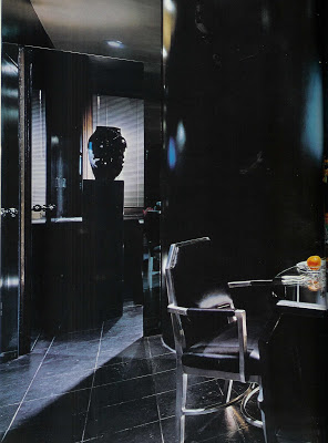
I know that there are people who count Halloween as their favorite holiday. I hope this doesn’t come between us, but I don’t like Halloween. Never have. I don’t like to be scared. And, surprisingly, for a drama-queen like myself, I don’t like costumes, especially masks.
But, as you know, I love black.
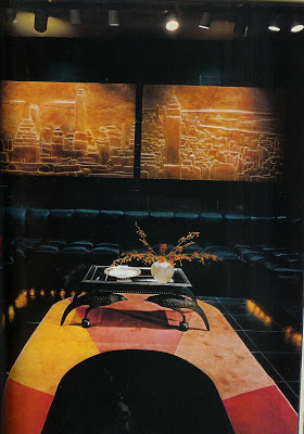 Architectural Digest, October1979, featured designer Eric Bernard’s apartment in Manhattan.
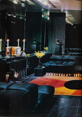
The grid of slate squares was rubbed with shoe polish (!), a striking backdrop for the Scalamandre leather-clad sofas.
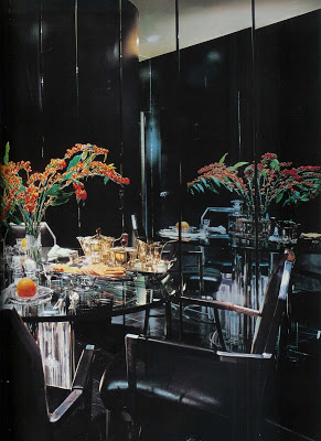
“The lacquered storage cylinder” (upper left) “conceals a bar and sound system.” The tea service is Josef Hoffmann.
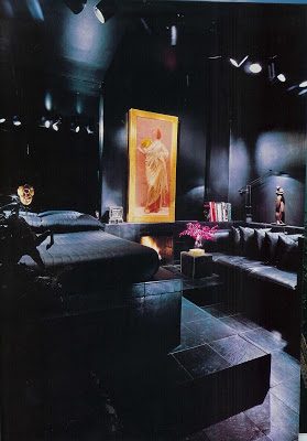
“An opulent study on canvas, by Albert Moore, counterpoints the bedroom’s sleek platformed simplicity.” This image was also the issue’s cover. Saying this room is simple is a bit like me trying to sell Mr. Blandings on how low-maintenance I am. I can make the case, but complexity abounds.
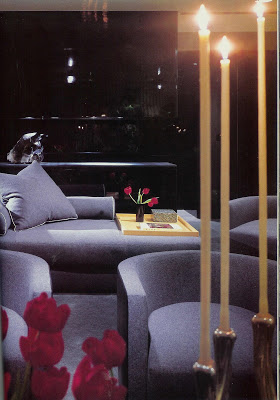
My other little vintage Halloween treat is a 1984 creation from Bob Patino and Vicente Wolf. Appearing in the March issue of House and Garden, the clients report that they wanted the apartment mostly for entertaining in the evening. The wall, above, is black glass.
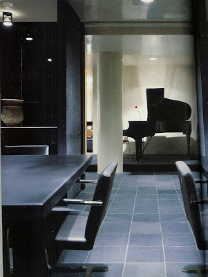 In the slate-tiled dining room (no mention of shoe polish here) the walls are upholstered in gray flannel. The chairs are Mies’s “Brno” chairs, circa 1930.
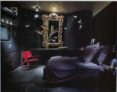 This is the wife’s sitting area. Her chic cashmere throw has jazzy red leather piping to highlight the original aniline red of the Eames chair. Notice how the television is placed in the built-in so it’s flush with the wall.
These rooms are dark, but not dreary; sleek, but not scary. No tricks, just treats.

I’m still riffing on Thomas O’Brien, as I dig his New York digs. The ceiling height here is nothing to sneeze at – the chest itself is significant and the mirror atop it substantial as well. But the mullions deliver the drama. The only thing keeping me from painting my mullions is cowardice and fear. In my “curtains and windows” folder there are no fewer than a dozen images with black mullions. Some are metal and some are painted, but I love them all the same.
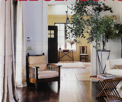 Victoria Hagan in Town and Country.
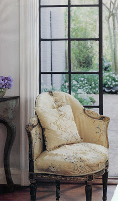 Veranda, I think.
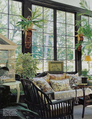
and modern as well.
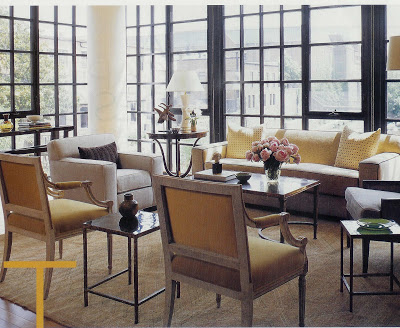 Nestor Santa-Cruz of SKB Architecture, Met Home, Nov. 2006.
Pretty on the inside and the outside.
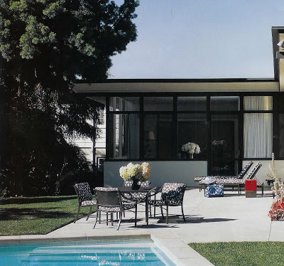
Trina Turk and Jonathan Skow’s LA home, designed by J.R. Davidson.
In one of my first apartments, I had a shower with a window in it. My landlord did not apply this jazzy treatment, but, oh, how I wish he had. (I wish he’d installed air conditioning as well.)
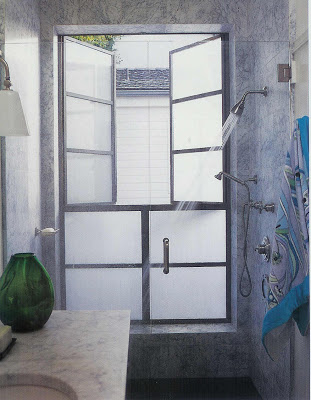
And then, by way of House Beautiful this month, Jeffery Bilhuber gained entrance to the file. There are rooms that make you want to rip out everything you have with your bare hands and start over on Monday. This is one of those rooms for me. Wow.
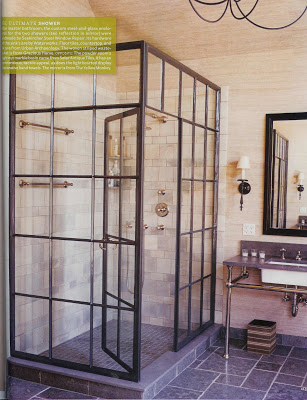
Jeffrey Bilhuber, House Beautiful, Nov. 2007.
I wonder where the boys put my sledgehammer?
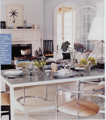
Thomas O’Brien, Veranda, 2006.
One of the things that struck me about Thomas O’Brien’s apartment in House and Garden this month, was the mass of black and white art on one wall. Not one big Serra, which would also appeal, but many subtle pieces in artful array.
I like this approach; I’m drawn to black and white art myself, and I think it works particularly well if the room is dressed in bold colors.
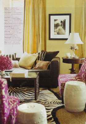
Lillian Bassman gelatin silver print, Domino.
It seems to work equally well en masse….
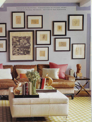 Ah, Mr. Gambrel, how I am itching to post that new spread. Above, House and Garden.
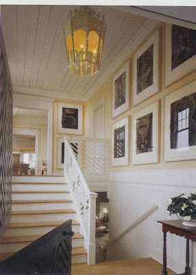
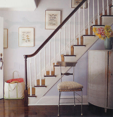 Elena and Doug Adkins’s home in Sag Harbor, Elle Decor.
or used as a solitary focal point.
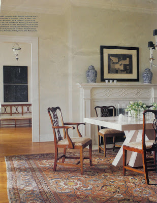 I believe this is Darryl Carter in Elle Decor. Georges Braque cubist print in the foreground; Joseph Beuys works in the back.
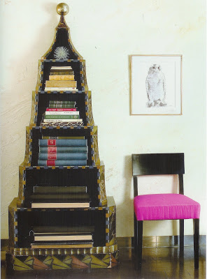 Albert Hadley, his own home, drawing by Van Day Truex, Albert Hadley by Adam Lewis.
Not big and bold, not loud and flashy, many of these pieces beg you to move in, look closer. As in the image, above, it requires you to accept the vignette as a whole while respecting the individual pieces. Because rooms, like people, are complex; there are often shades of gray.
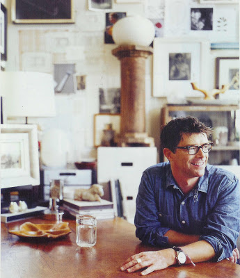
OK. I think I’m back on track. Fortunately for me, you can’t see that my house is a disaster, but somethings are under control.
While everyone was fawning over the cover girl and her cool Hamptons hide away I was flipping back and forth through a much smaller layout on Thomas O’Brien. (He’s just darling, isn’t he? He must be nice. He has his glasses custom-made; I appreciate things like that.)
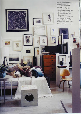
I’m not sure why House and Garden ran this spread. We’ve seen his apartment before and I don’t think much has changed. And I don’t think I care. I had already given him ample points for making the largest room in the apartment his bedroom, the ultimate modern salon.
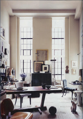
I guess that is where I was focusing on first glance. This time all the detail of the apartment unfolded for me. I certainly would not pretend to know how Mr. O’Brien chooses his things, but while this home is stylish, it doesn’t appear styled to me.
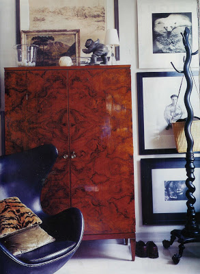
I am a sucker for black and white art so his wacky gallery wall is so alluring. I also love that the egg chair is in black leather. I feel like I’ve seen it in every zany color and pattern. Isn’t he chic and cool in his smooth, black silhouette?
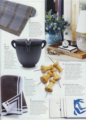 I like Tom. And, I owe him, right? He inspired yesterday’s post, and today’s and, guess what, tomorrow’s as well. He introduced me to Gio Ponti pottery which is so interesting. And he told me he gives his friends Matisse paper cutout books. He didn’t just open his door, he opened his soul a bit. I see it all over his home.