I approved the cutting for office chair’s reupholstery yesterday. Even when things are in stock, it all just seems to take too long. I guess if it takes you months to choose a fabric you shouldn’t be too impatient when your fabric house takes ten days to ship.
In the meantime, while working on another post, I started coming across all these great rooms that have that soft aqua and sharp red. I can’t believe it took me so long to see the light.
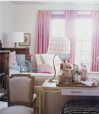 This image and the one top, Courtney Haas’s home by Joe Nye, House Beautiful, Oct. 07.
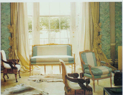
The upholstery on this day bed is spot on what I am after for office chair. I was almost bummed when I saw it here; I wanted to be the first on my block.
Elle Decor, Oct. 07.
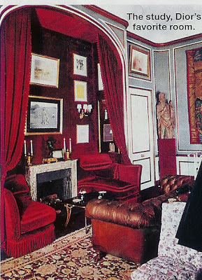
As it turns out, this combo has been around a while. Here it is used in “Dior’s favorite room.” I love the way the architectural elements are highlighted in the different colors.
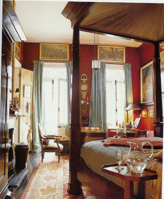 From Southern Accents on Color, Frances MacDougall.
Many of these rooms have gold accents, which might have been my sub-conscience’s inspiration for the nail head trim.
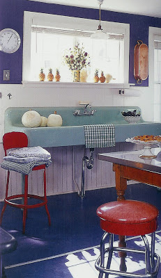 Alexandra Champalimaud’s kitchen, Rooms to Inspire, Annie Kelly.
Admit it, you want that sink. Well, I do. I always imagine these folks finding things behind a gas station or something and saying, “We found it on the way back from Santa Fe and just tossed it in the trunk.”
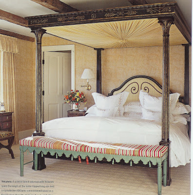 Decor, Fall/Winter 07.
These are the kind of details that always surprise me in their wrong rightness. Were there ever tassels on each notch? And the red ones, were they added later? But it doesn’t matter. In fact, it’s better. It all works so beautifully.
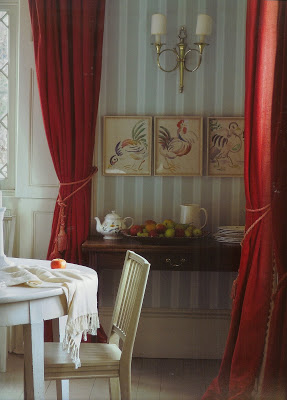 From Farrow and Ball: The Art of Color
This Farrow and Ball paper is so classic and lovely. Those rooster watercolors make me want to get out my paints.
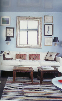 Miles Redd in Rooms to Inspire, Annie Kelly.
There is something so appealing to me in the chalkiness of the blue and the richness of the red.
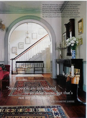 Elizabeth Locke’s entry, House and Garden, Oct. 97.
We’ve been here before; this whole setting makes me swoon.
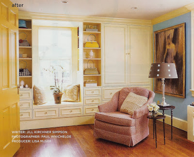 Kenleigh and Michael Larock’s Connecticut farmhouse, publication unknown.
Um, yes, I did notice the yellow. I’m not sure, but the fabric on the chair might be a particularly yummy velvet by Etienne. This is a bedroom-turned-dressing-room. Lucky girl.
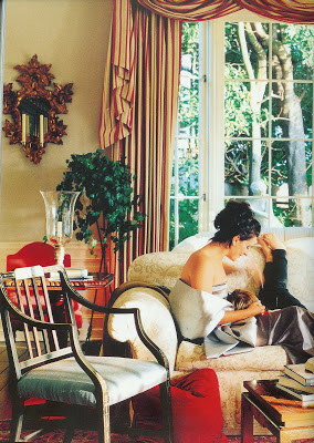
Michel Arnaud’s 1996 photo of Marie Gersh and her son, HG, 1996.
See how she’s shoved aside that red velvet pillow to have a tickle contest with her son just before she jets off to the ballet? Bother the peanut butter and jelly on his face, she knows all is well because she has him – and the fabulous striped curtains with the lovely robins egg blue chairs. Heaven.



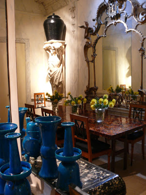
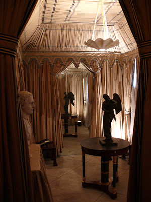 A tented room always appeals – as does the snappy black and white stripped ribbon trim.
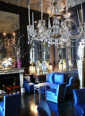 The blue satin upholstery reminds me of the Paley’s brown satin in their drawing room by Parish Hadley.
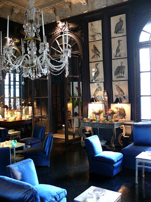 These birds, I love.
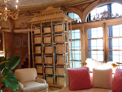 This room was inspired by the Royal Pavilion at Brighton; it feels like one of the ivory pagodas all grown up.
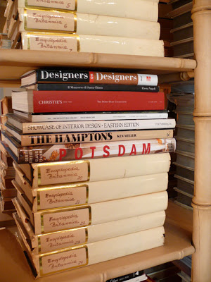 Parchment covers most of the books. Quite charming to own a set of Encyclopedia Britannica.
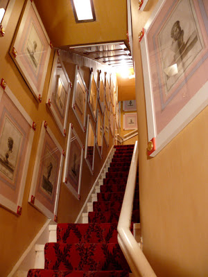

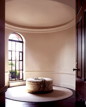 I know we are all pouring over Domino. Fresh, young, hip, exciting. I love it because it’s bright and cheerful and exciting.
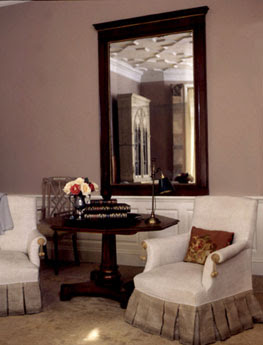 There’s another magazine. I don’t think you’re reading it. It’s old, staid, and, I’ll say it, out of touch. Unfortunately, this doyenne of the design tomes carries the work of a few designers you would love.
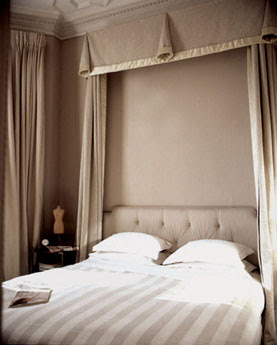
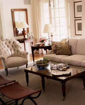
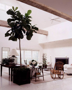 Clean and crisp they give you room to breathe. While these rooms are super stars, they allow their owners to be the focus of the attention.
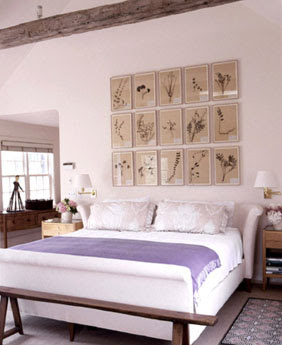
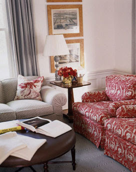 And while many of Gomez’s interiors are neutral, she uses color with aplomb.
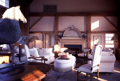 Deep and rich with an enviable attention to detail.
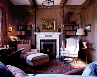

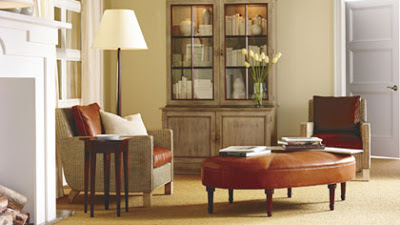 I love this ottoman; Gomez uses this egg shaped work horse in many of her projects. It’s so much more interesting that a rectangle, graceful and chic.
 This image and the one top, Courtney Haas’s home by Joe Nye, House Beautiful, Oct. 07.
 From Southern Accents on Color, Frances MacDougall.
 Alexandra Champalimaud’s kitchen, Rooms to Inspire, Annie Kelly.
 Decor, Fall/Winter 07.
 From Farrow and Ball: The Art of Color
 Miles Redd in Rooms to Inspire, Annie Kelly.
 Elizabeth Locke’s entry, House and Garden, Oct. 97.
 Kenleigh and Michael Larock’s Connecticut farmhouse, publication unknown.
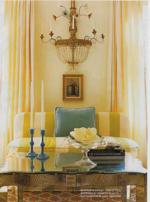 Stripes on the settee, again, this time designer John Oetgen, House Beautiful, Aug. ’07.
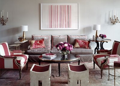
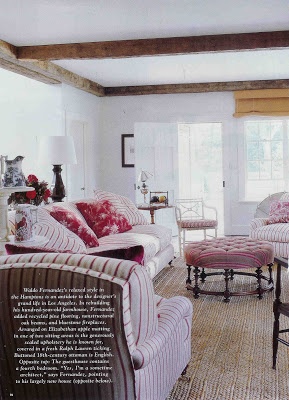 While this image isn’t technically vintage, I’ve definitely had it around a while. Here Waldo Fernandez uses three different stripes, again of the same color family, in his Hamptons home. This look may seem a bit “Pottery Barn” now, but at the time I thought it was off the charts. Actually, I still do. (Mr. Fernandez visited the antique shop where I work a few months ago and he is lovely. And not just because he antiques in Kansas City.)