Tag Archives: Designers

Comeau to My House

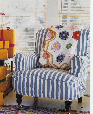
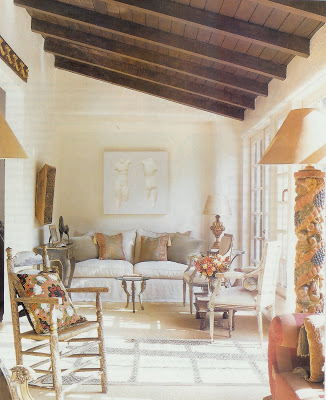
Chuck and Shirley Comeau’s living room, Cottage Living, Nov./Dec. 04
This is the kind of “local boy does good” story that I like to hear. Oh, sure there are plenty of stories of folks who have left the Midwest and found fame and fortune on the coasts. And then there are folks like Chuck Comeau.

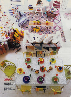
A view of the living room from the loft.
Mr. Comeau grew up in Plainville, Kansas. If you grow up in Plainville, (pop. 2,200) my guess is when you go “to town” its Hays. While these towns lack some of the attractions of a big city, if you’ve never seen the Midwestern plains or the Kansas Flint Hills you are missing epic beauty.

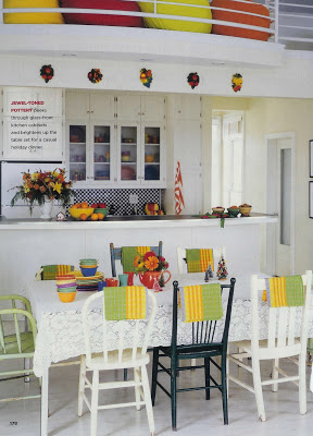
Kitchen and dining area.

Which is why Chuck and Shirley Comeau decided to raise their three boys there. And his company. Comeau built Dessin Fournir, a high end furniture company, from Plainville while manufacturing in California. He soon made the commitment to move the manufacturing to Plainville as well.

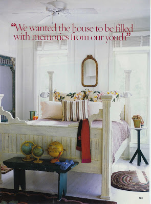
Master Bedroom

While Comeau is creating jobs and opportunity in western Kansas, he is also sending a message about what he values.

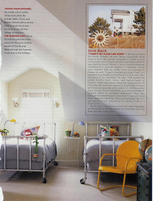
The loft bedroom

Although the Comeau’s home is just-right, casual chic, the furniture he is making is impeccably gorgeous. And I bet you’ve seen it here and there.

In addition to Dessin Fournir, there are five other companies under it’s umbrella, Gerard, Classic Cloth, Palmer-Hargrave, Kerry Joyce and Rose Cummings. Comeau has also started a jazzy sort-of general store, C.S. Post, in nearby Hays (and on-line.)

Like I said, local boy does good. So, don’t fly over, stop on in.

rssrss      FacebooktwitterpinterestlinkedinmailFacebooktwitterpinterestlinkedinmail

First Impressions

It’s a bit of a cliche that your entry makes the first impression of what’s to come in your home. But, sometimes cliches are cliches because they are true. I’m feeling mine needs a bit of attention. In that vein, here are a few of my favorites from over the years.

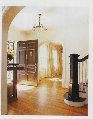
Traditional Home, 2002

I’ve got a little of this going on now, you know, if my house were on steroids. This looks so clean and fresh – I love the darker stairs and balustrade.

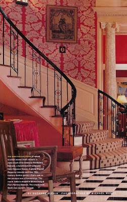
I love a red room, and while a red dining room is always yummy, isn’t it great in the entry? I have a friend who has a very gracious entry hall in which she used this B&F Harrow Damask paper in one of the neutral color ways – so sophisticated.
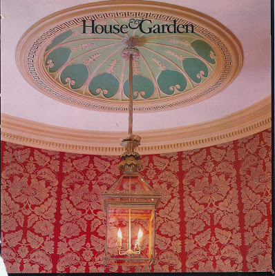
House and Garden, 1998
Ceiling of the same home – this lantern is gorgeous. Check out Charles Edwards if you really want a little lantern-envy.
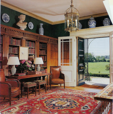

Architectural Digest
The entry as library would be particularly cozy if you had the space. Don’t miss the needlepoint benches under the table. Greek key on the sides, floral on the top, nailhead trim. Devine.
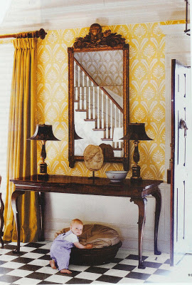

I believe this room is Suzanne Reinstein.
Since yellow seems to make my heart sing, I fell in love with this room at first sight. The black and white floor is so graphic and classic. I don’t think the appeal is just the little boy, although I’ve had a few of those around as well.
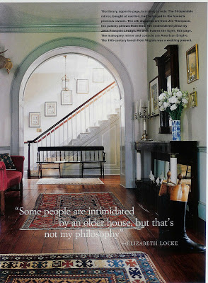

Elizabeth Locke’s home, House and Garden, October 1997
Ok, here we go. This is in my top two. The floorboards, the gracious curve of the arched doorway and the duck egg color of the wall present the home and it’s owner as a package you would like to know a little – or a lot- more about.
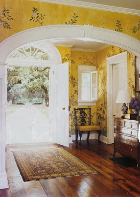
Gracie Wallpaper is special where ever you choose to hang it. It seems to me that we see it most often in dining rooms and bedrooms. And then there is this. I might never want to leave it, “Oh, I’d love some tea. No, no sugar. No, here’s fine.” Notice that there is no wainscoting; could you ever let your children go over there to play? This might be perfection. Yellow, I know. I can’t stop looking at it.
Ok, and for the beach house…I never mentioned a beach house? Oh, well I don’t have one, but I might. I mean, you have to be prepared for these things.
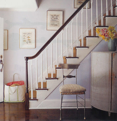

Elena and Doug Atkins home, Sag Harbor, NY, Elle Decor
Clean, fresh, L.L. Bean tote at the ready. I like these sea creature prints, in fact, I gave a friend one with eels for his Sag Harbor home after seeing an eel in the water by his house.
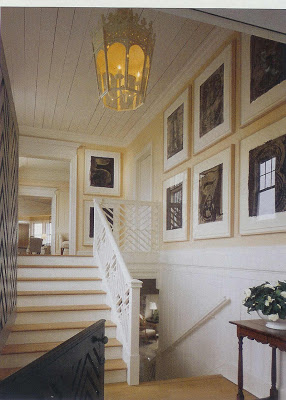

Southhampton, NY home, architecture John Mayfield, design Mariette Himes Gomez, Architectural Digest
I was captivated that this homeowner had a full Numbers series by Jasper Johns in his beach house. There’s a good reason to get out of the city.

rssrss      FacebooktwitterpinterestlinkedinmailFacebooktwitterpinterestlinkedinmail

Civilized Graffiti

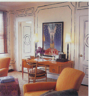
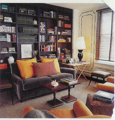
When I was little, I drew on the walls. Not once. A lot. An entire mural up the stairs. Many drawings on the walls of my room. An entire garden on Krissie Livengood’s parents’ bedroom wall – right over the bed. It was a masterpiece. Or so I thought, but my unknowing clients didn’t always agree. As it turns out, I was ahead of my time.

This image and above, Traditional Home, March 2000
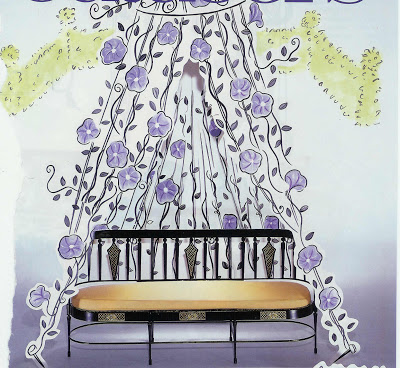
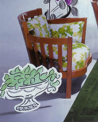
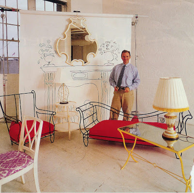
I don’t know if this technique has a particular name, but it appeals to me so much. I’ve imagined doing it in a room, but also think it would be fabulous as decoration for a party.

It looks like you could accomplish this with one quart of paint and 30 minutes before carpool pick-up. These are the kinds of projects that get me in trouble.

Greg Jordan, who drew the back drop, promoting his Cartoon Collection, HB year unknown.
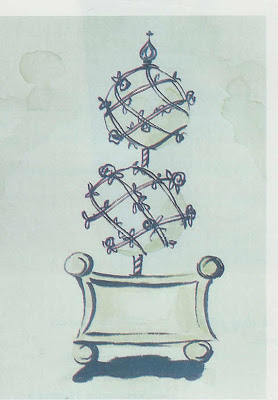
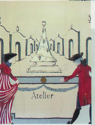
I have always wondered about gouache. It looks and sounds as if it would be dreamy to work with.

These drawings from the owners of “Atelier” in Hudson, NY.

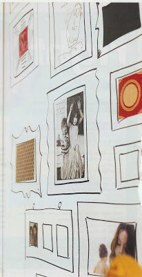
If it seems daunting, there is a really great wallpaper available that would eliminate the risk.

“Frames” wallpaper, Graham and Brown.

On the other hand, when unable to find this fabulous paper, New Orleans designer Jill Dupre took matters – and marker – into her own hands.

Metropolitan Home, December 2006/January 2007.

My parents finally resigned themselves to my passion. They gave me a cup of pencils and told me I could draw whatever I wanted on the walls of my closet. What can I say? It was the 70’s.
rssrss      FacebooktwitterpinterestlinkedinmailFacebooktwitterpinterestlinkedinmail

Details II

I have a mad passion for ribbon. I think I should buy a crate of black grosgrain ribbon now to have on hand over the next 40 years or so. I’ve trimmed my entry walls, my living room curtains and a few tablecloths with black ribbon over the last few years. Too much? Well, I don’t think so, yet, but it might be time to hold up.

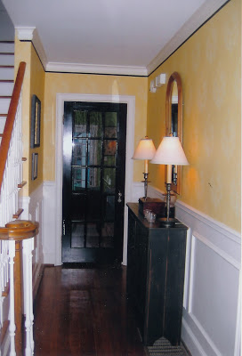
Mrs. Blandings’s entry hall. Why no trim above the wainscoting? Did I mention my three boys? Pick, pick, pick.
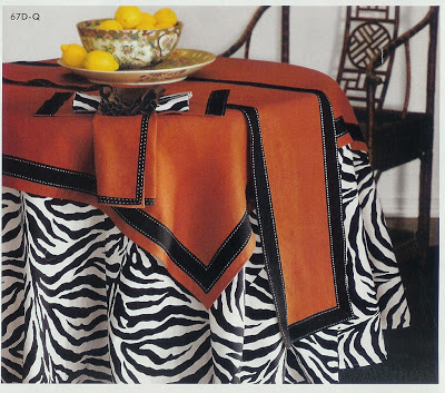
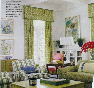
Ribbon is a great, inexpensive trim. I buy mine at the Dime Store, a Kansas City tradition, Michael’s, Hyman Hendler and Sons and M and J Trimmings. Here are a few great examples of ribbon as trim:


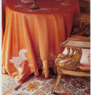
These cloths, from the Neiman-Marcus catalogue in ’04, would be so easy to replicate. The contrast stitching is so snappy.


Heidi Friedler’s New Orleans home in Southern Accents.

This room is so fresh; does it owe it’s charm to the ribbon detailing on the sofa pillow? Partly so, I think.

Osborne and Little ad circa 1998.
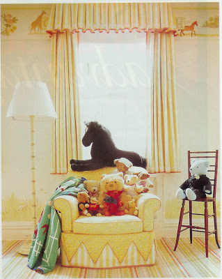
The pleated trim on this pillow is a nice accent, but can be a head ache for your workroom and costly for you. M and J offers a pleated ribbon trim that is available in grosgrain, velvet and satin.

Post script: In looking through the September issue of Domino tonight, Cynthia King reports New York designer Markham Roberts is a fan of M and J’s grosgrain ribbon as well. We are so simpatico! But then again, Roberts is a Midwestern boy himself.

rssrss      FacebooktwitterpinterestlinkedinmailFacebooktwitterpinterestlinkedinmail

It’s All in the Details

Recently, Jennifer at BiblioStyle posted about one of my favorite design books, Colefax & Fowler, The Best in English Decorating. It was the first design book I purchased, and the thing that struck me was the amount of detailing in the rooms. It can be over-done, of course, but the thing is, it makes every room so special. All those details become discovered treasure.


Sela Ward’s Beverly Hills home circa 1999.
Notice the one tassel on each pillow.


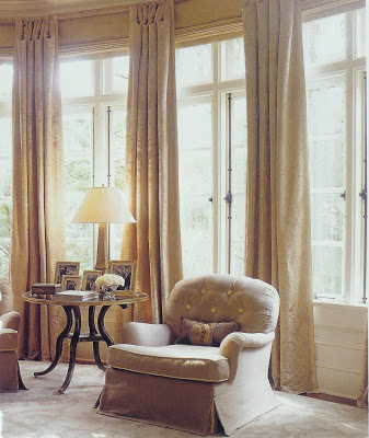
This chair is a symphony of details, yet none of them are screaming. Tufted buttons, contrast welt on only the cushion, waterfall skirt. Lovely.


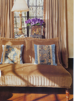
The pleating on this settee is a great detail, especially as the room is predominantly neutral. I also think the antique fabric on the pillows and the addition of that hint of blue is very sophisticated.


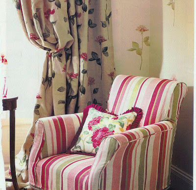
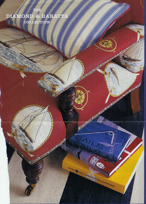
This is from a Diamond & Baratta Collection for Lee Jofa ad from 2005. I adore the trim on this chair and hadn’t seen anything quite like it before. It’s tape, then cord, then nail head. Those D&B guys are always more is more – it works great here.


Are you surprised this charming girl’s room (well, the room is charming; let’s assume it’s mistress was, too.) was the work of Mario Buatta? I love the detail of the chair skirt. Oh, and short curtains. I think Mrs. Parish would have thought that very “appropriate.”
Top photo: Manhattan home by designer Ronald Bricke, House & Garden 1999.

rssrss      FacebooktwitterpinterestlinkedinmailFacebooktwitterpinterestlinkedinmail