Tag Archives: Designers

Harmonious Convergence

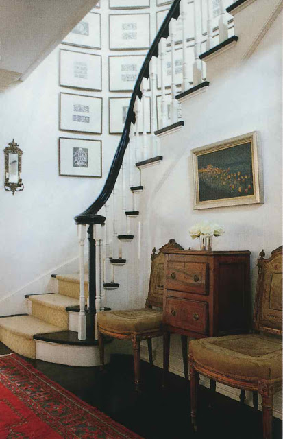
I met Heidi Palmer a few years ago and was immediately impressed by her style.

I was fortunate to be assigned to write the article on her house in Sunset Hill for the April issue of Spaces.

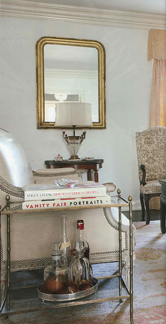
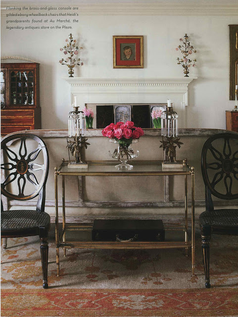
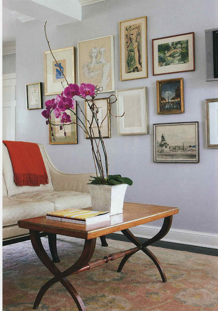
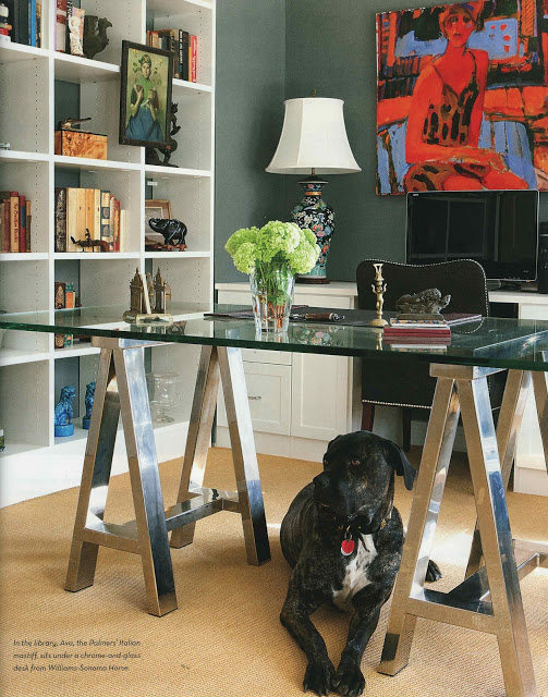
Palmer has decorated her house with a lovely collection of her grandmother’s and great-grandmother’s things along with art from her father and her own finds.

It is a terrific mix and an excellent example of how to live with antiques; there is nothing fussy or fancy here, though it is incredibly grounded and personal.

More images in the issue (plus words, if you like words.)  On sale now – pick it up today.

All images Spaces, Kansas City, April 2012; photography Aaron Leimkuehler.

rssrss      FacebooktwitterpinterestlinkedinmailFacebooktwitterpinterestlinkedinmail

Oh, To Be She

“Why do a house in just one style? Being narrow-minded is not the message you want to pass on to your children.”

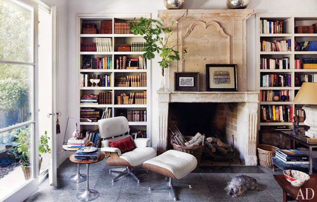
I owe a lot to the esteemed Aesthete (Mr. Lament to some) not the least of which was an introduction to Isabel Lopez-Quesada.  At the time he mentioned her to me I could hardly find an image of her work on-line.  Fortunately for blogland, her site has been up for a while and is a treasure trove of beautiful work.  Her home in Madrid appears in Architectural Digest this month.  You can find it on-line here.  She does this really great thing, this combination of old and new and neutral and color and symmetry and not, and it leaves me, well, as the blogger himself would say, “gobsmacked.”  I hope this is just the beginning of what we see on our pages stateside.

Do pick up the issue if you haven’t as it focuses on designers’ own homes which tend to be my favorites.  Suzanne Kasler in Atlanta.  David Easton, a long-time favorite, in Tulsa, my hometown.  The issue would only have been better had it come wrapped in a red bow.

Image, Architectural Digest, April 2012, produced by Howard Christian; photography Simon Watson.

By the way, AD pays me for what I do there, but not for what I do here.  What I do here is of my own accord.  In case you were wondering.

rssrss      FacebooktwitterpinterestlinkedinmailFacebooktwitterpinterestlinkedinmail

The Joy of Mrs. Howard

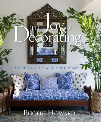
Other than Brooke Shields and Phoebe Cates, I was never aware of models by name.  Not until I lived with three cheerleaders in college was I introduced to the concept of “super model.”  I came into decorating the same way.  I read and I tore and I saved, but it took a while for me to begin to recognize designers.  That mirror, above, did it for me with Phoebe Howard.

From a long ago Southern Accents feature, that mirror introduced me to the world of Mrs. Howard, Phoebe’s shop, and the amazing work that she and her husband, Jim, both do.

It’s a world of casual elegance, of relaxed refinement.  Many people seem to be yearning for pretty rooms, uncomplicated beautiful spaces.

Phoebe’s work combines a traditional foundation with an understanding that we have evolved; mid-century tables, fresh fabrics and contemporary art co-exist beautifully in her spaces.

And now we don’t have to wait and hope for a magazine feature.  Phoebe has published a new book, The Joy of Decorating; Southern Style with Mrs. Howard and she is offering Mrs. Blandings’s readers a discount.

If you buy the book from her site HERE and enter the code MBJOD you will receive the book, normally $50 at 20% off (that’s $40 for the math-challenged.)

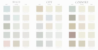
Another bonus for ordering from the site is that you will receive a prize.  Included with the book will be Mrs. Howard’s Favorite Paint Colors, which is a handy little supplement organized by palette for wall, ceiling and trim.

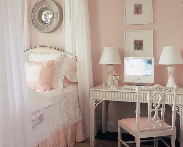
All images courtesy of Mrs. Howard.

rssrss      FacebooktwitterpinterestlinkedinmailFacebooktwitterpinterestlinkedinmail

Friend of a Friend

I don’t have facials very often, in fact, I’ve probably had fewer than a dozen.

But last week I went to slough off some winter doldrums and laid myself flat for a Russian woman with whom I was not acquainted.

A recent astrological foray revealed that I don’t care much for pampering and I agree that this is true; vanity, however, sometimes rules the day.

With fingers like sausages, Natasha* began her ministrations.  Dropped towels, later re-used in their chilly, limp economy and blaring pop music were the least of it.

I imagine that it was like being with a virgin when you’re not one.  I could not begrudge her her lack of experience; neither did I care to be a partner to it.

Such experiences make me value all the more being in good hands.

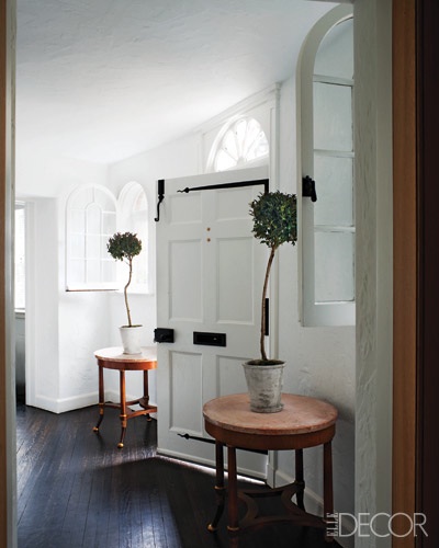
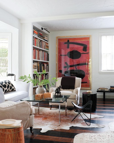
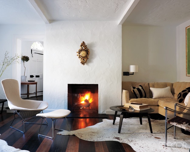
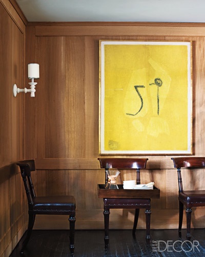
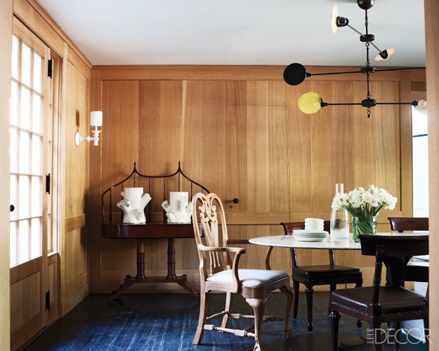
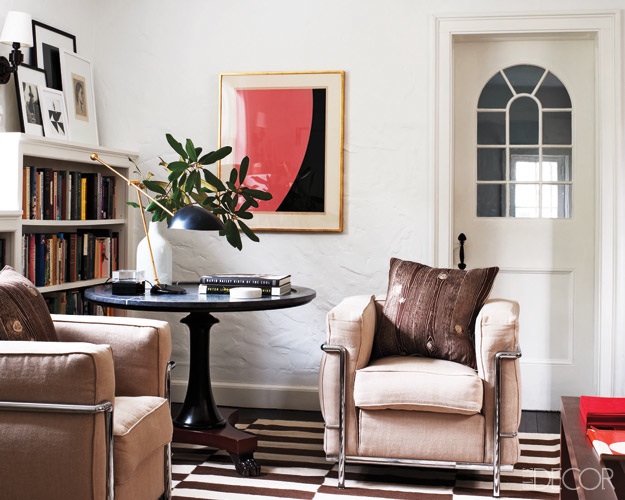
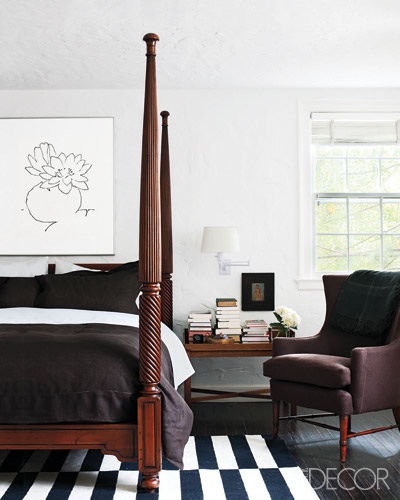
Which is why I was delighted that Temo Callahan took the time to let me know that his charming lampshade was decorated by James Shearron of Bories and Shearron.

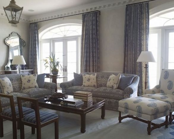
Strong, assured and lacking unnecessary flourishes, the firm’s work is a delight.  This is the home of Doug Turshen, who applies his aesthetic prowess to some of the best design books around.  You can find the images, and the overwhelmingly romantic story of his marriage to Rochelle Udell, here.  Indulge yourself further at Bories and Shearron here.

All images William Waldron, Elle Decor, November 2010.  *Named changed to protect the, if not innocent, ineffective.

rssrss      FacebooktwitterpinterestlinkedinmailFacebooktwitterpinterestlinkedinmail

Idol Worship

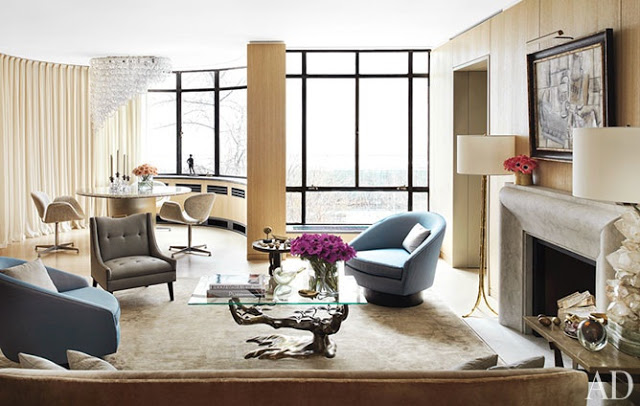
I have an issue with my mailman.  Or I have no issues with my mailman, depending on how you look at it.  I think that I have mentioned before the rarity of my big mail delivery.  Perhaps he feels this 1950 ranch should have 1950-size mail; for most days letter size is my only prize.  About once a week my mail slot is crammed, stuffed, smushed with catalogues and magazines.  Except for February’s.  No February magazines at all.

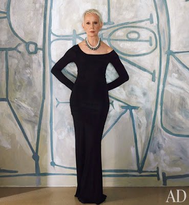
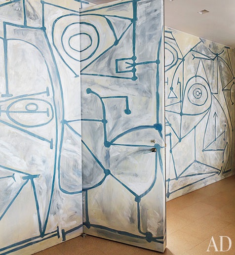
So I bought them.  (This annoys Bill and when they eventually arrive he will say, sadly lifting them from the kitchen island, “Oh.  That’s too bad.”  It’s as if he thinks they have died in vain.)  Worth the double dip as I found Claire Weiss awaiting me on the pages of AD in that remarkable vintage Azzedine Alaia dress.  And those pearls.  In front of that mural.

Speechless.

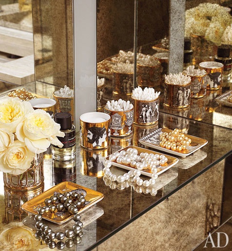
The Cartier pearls are “the only jewelry she wears.”  (They rest atop vintage Fornasetti trays, which is, well, perfect.)  The grandness of this overwhelms me.  It is the kind of thing that I would proclaim and then find myself a week later mouthing “liar” in the mirror.  Still, I wish I were a little more Weiss-like. Read the whole article here.

Images, Architectural Digest, February 2012; architecture, Steven Harris; design, Lucian Rees Roberts; photography, Thomas Loof; produced by Robert Rufino and the balance of the number of small object in the piece is nothing short of miraculous.

rssrss      FacebooktwitterpinterestlinkedinmailFacebooktwitterpinterestlinkedinmail