Tag Archives: Designers

Hang Time

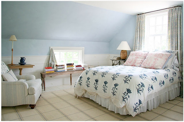
This has always been a jumbly stream of consciousness, so I am sure that you will understand that in the midst of cleaning up paper and breaking down boxes I stopped to look at Carrier and Company’s portfolio.  You can’t convince me that everyone doesn’t do this sort of thing.

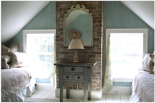
Loads of pretty things there, but I was charmed by these hangers on.  Quick and easy curtains – you could make them while your children are playing X Box (or Wii or PS3 or Chinese Checkers if there are still children who play such things) – two small knobs, a finished square and a couple of loops.  No fuss, no muss, but it has the same casual elegance as Astaire’s handkerchief.

Images courtesy of Carrier and Company.

rssrss      FacebooktwitterpinterestlinkedinmailFacebooktwitterpinterestlinkedinmail

Catching Up

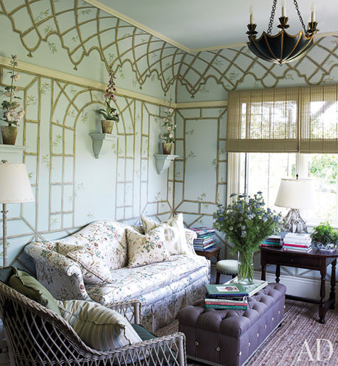
It’s always a treat to see a new Suzanne Rheinstein project and there is a particularly lovely one in December’s Architectural Digest.  You may remember the beautiful mural in Rheinstein’s New York apartment painted by Bob Christian; he struts his stuff again here with great results.  That Rheinstein used a Pottery Barn sisal in this room confirms my impression that she is both charming and down-to-earth.  Knowing where to put the low in high-low is quite a knack.

Image Architectural Digest, December 2010, design by Suzanne Rheinstein, produced by Robert Rufino; photography by Francesco Lagnese.

rssrss      FacebooktwitterpinterestlinkedinmailFacebooktwitterpinterestlinkedinmail

411

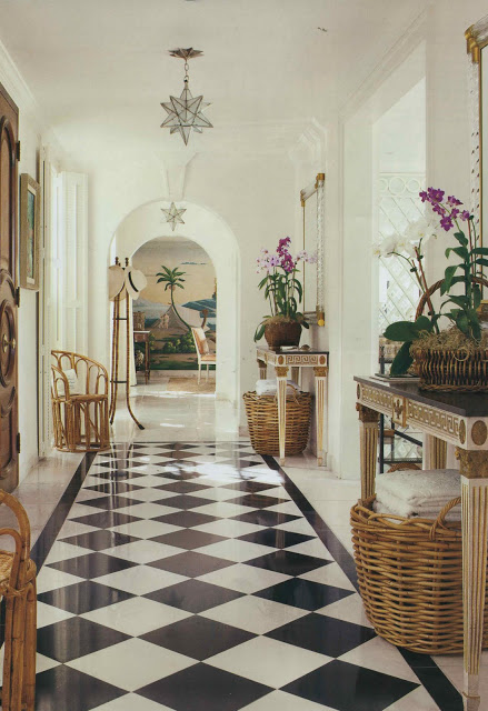
Sometimes the things we need seem 911 when they are really only 411.  I am trying to take the emergency out of the situation by starting here first.

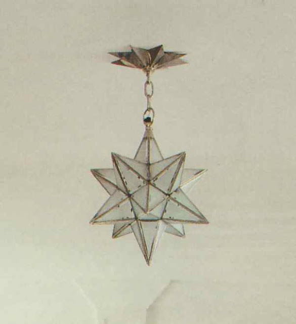
I have not so much as googled as I am avoiding what could be hours of clicking and checking.  I was thinking my designer friends just might have a resource that could help.  I bought a vintage star lantern like this a week or so ago.  What I need, the emergency, is the canopy.  That piece that fits against the ceiling.  Anyone?

Image, Veranda, July/August 2011, design by Andrew Raquet; photography Max Kim-Bee.  The fixture pictured here is Charles Edwards.

rssrss      FacebooktwitterpinterestlinkedinmailFacebooktwitterpinterestlinkedinmail

Oh, Nicky You’re So Fine

Alternately titled, “Whoa Nelly, Olsen!”
I had a crazy day yesterday (such days call for my writing my schedule down on a separate piece of paper which I carry around like a security blanket) and still made time to sit down and enjoy the apartment designed by Nick Olsen in the July/August House Beautiful.  And if eight pages of Olsen aren’t enough, you can watch an on-line interview where he shares his secrets of decorating big in a small space.

Image, House Beautiful, July/August 2011; photography Bjorn Wallander.

rssrss      FacebooktwitterpinterestlinkedinmailFacebooktwitterpinterestlinkedinmail