Tag Archives: Designers

Intoxicating

I don’t mean to imply that you should collect (hoard) old design magazines as I do.  I can’t recommend that you fill shelves and drawers with images and ideas.  It’s perverse.  I mean, wonderful new magazines are published each and every month chocked full of wonderful, wonderful pictures.
But, if you do, you might want to keep an eye out for House & Garden, September 2004.
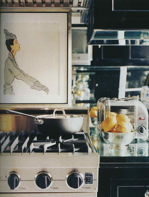
This particular issue is an out-of-the-park home run.  To begin, it opens with that fabulous shot of Miles Redd leaping in his mirrored bathroom and offers pages of his insight into the process of decorating his own home.  I offer here the close-up of his kitchen and its mirrored backsplash.

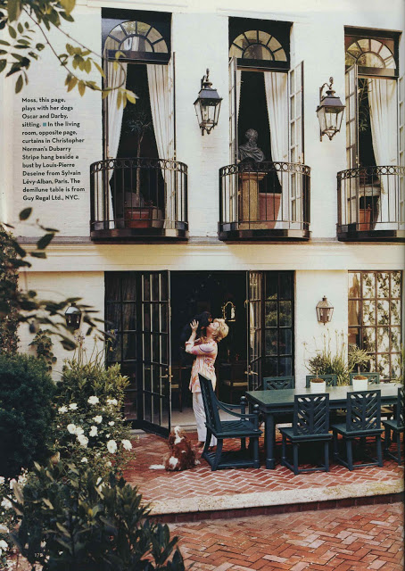
The issue focuses on designers’ own homes (always favorite fodder) and includes Charlotte Moss’s townhouse.

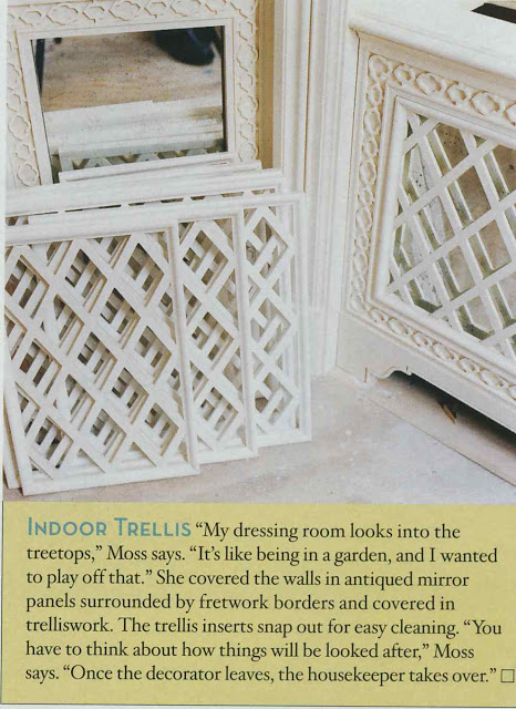
One of the things I enjoyed about HG was the tidbits that it offered on process and resource.  Naturally, this little gem on mirrored trellis and its maintenance caught my eye.  (I might have mentioned that the new house likes mirror.)

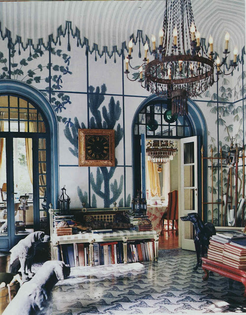
On to Piero Castellini’s Milan palazzo and finishing up with

Paul Fortune’s Hollywood home, which is one of my all-time favorites.

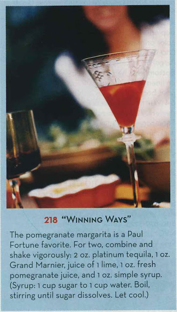
Snuggled in the credits in the back is Fortune’s recipe for pomegranate margaritas, long before pomegranate was known as a “super-food.”  The first shot I ever took was at the bar at the Mad Hatter in 1986.  It was Mr. Blandings’s idea (he was a drinking buddy then.)  Being a gentleman he allowed me to pick my poison.  “Tequila!”  “Are you sure you don’t want a watermelon shot or something?”  “Watermelon shots are for sissies,” I declared as I licked that tender spot between my thumb and forefinger, sprinkling it with salt.

I still believe this, but now we know that pomegranate is full of anti-oxidants.  So these are good for you.

Enjoy the 4th.

rssrss      FacebooktwitterpinterestlinkedinmailFacebooktwitterpinterestlinkedinmail

Design Therapy

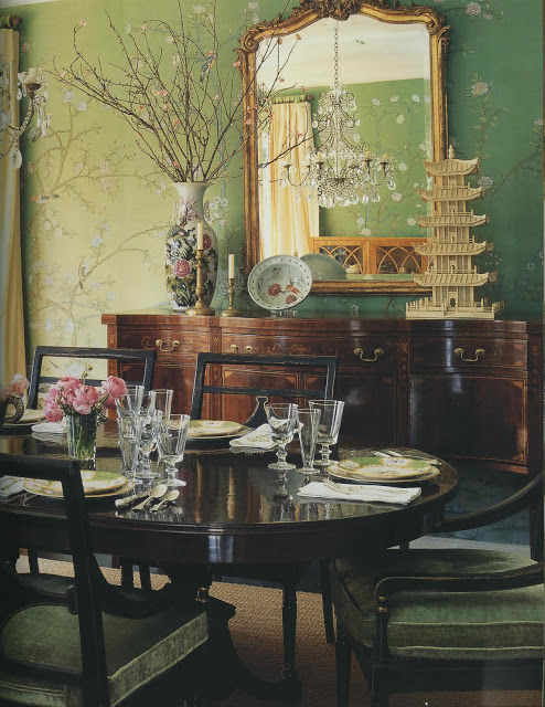
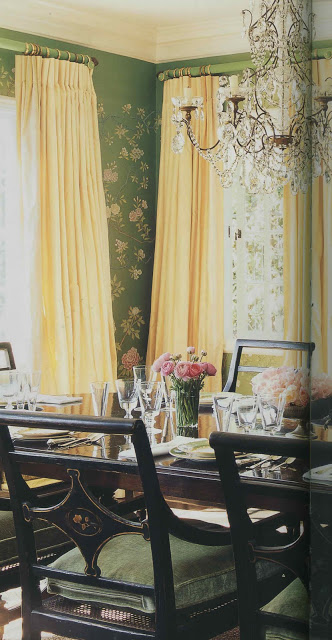
I hadn’t realized that I was unconsciously mining this image for inspiration until last week’s episode of Million Dollar Decorators. When Mary McDonald walked through (by? I can’t remember) this dining room, my conscious mind went, “Oh, yes, of course.  That has been it all along.”

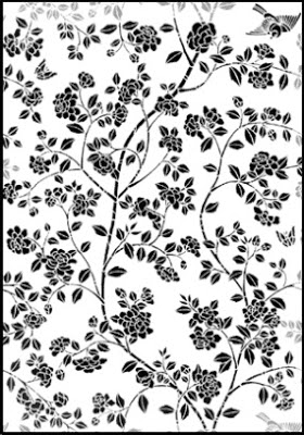
I wish this little nugget had slid into the conscious side of my brain a little sooner.   I’d been holding off on ordering the stencil for my dining room project as something about it seemed not quite right.  It wasn’t working with the rest of the house and I couldn’t put my finger on why.

When I saw the dining room (again, fully conscious) I realized that the stencil, above, was too bold for my space.  Too heavy.  Too much.

So, I’m ordering this all-over pattern instead and am going to use it in pieces to create an airier silhouette similar to the wall above.  It wasn’t my first foray into analysis, but it was most certainly the most fun. 
Top two images, Mary McDonald Interiors, Rizzoli, photography by Melanie Acevedo.  Remaining images via Stencil Library.
rssrss      FacebooktwitterpinterestlinkedinmailFacebooktwitterpinterestlinkedinmail

Cross My Heart

A very thoughtful reader sent me the image, above, scanned from her tear sheet file.

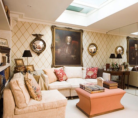
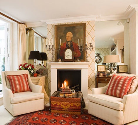
This is exactly what I was thinking for the front hall.  The paper, St. James Trellis, was manufactured by Cole & Son (I believe it is discontinued) and I have another of their flawless diamonds taped to a wall as we speak.  (Write.  Read.)  I am waiting for one more and then I will pull the trigger.  It finally feels like things are coming together.

Images, Traditional Home, originally published April 2007, the home of Valerie and Anthony Evans, managing director of Cole & Son.  Currently on their site here.  Photography credit unavailable.
rssrss      FacebooktwitterpinterestlinkedinmailFacebooktwitterpinterestlinkedinmail

Wall to Wall

I’m still on walls.  It may be a week of walls.  Anyway, I ran into Thomas Jayne when I was in New York.  I like running in to Thomas for two reasons: 1) he’s both charming and interesting, and, 2) he makes me feel petite.  At least for a few minutes.

He mentioned that he moved his blog to his own site.  He had been blogging for Interior Design.  When I went to track down the new stuff, I ran across the old stuff and was enchanted by this old post on his project jackets.  I think you might be, too, and you can find it here.

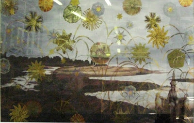
But really, bookmark or add to your reader or do whatever it is you do to find your favorites, for his current blog on his site here.  If you do, you’ll find the most wonderful eglomise, above, and the tale of its creation. Win/win.

All images courtesy (without his prior knowledge, forgive me) Thomas Jayne.

rssrss      FacebooktwitterpinterestlinkedinmailFacebooktwitterpinterestlinkedinmail

Redd-y or Not

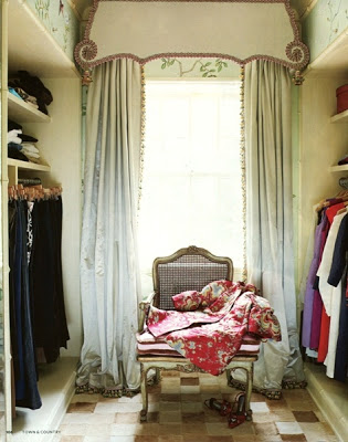
I need to get out and start looking at wallpaper books (the olfactory sensation being nearly as good as the visual; what is it about the smell of paint and wallpaper?)  The Blandings’s budget does not allow for Gracie or de Gournay so some other something must be found.  Mr. Redd, thank you so much; I’m quite grateful for the inspiration.

Image, Town and Country, photography by Francesco Lagnese; via Post and Grant.

rssrss      FacebooktwitterpinterestlinkedinmailFacebooktwitterpinterestlinkedinmail