Tag Archives: Enduring Style

Enduring Style – Suzanne Rheinstein

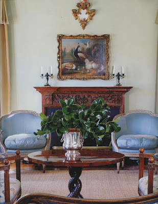
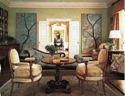
I checked in with Suzanne Rheinstein after Courtney’s selection of her living room as a space with enduring style.  I wondered what she thought made the room a classic.  She graciously replied as follows:

“The combination of furniture from different eras: Louis XVI, Regency and Italian Directoire is arranged in a somewhat 18th century manner.  Yet, it is not too precious and there is not too much furniture in the room.

The colors are soft, in the café au lait family and different blues.  In the summer, most of the furniture wears blue and cream striped slipcovers.  As you examine the room, you’ll see a lot of details and layers, yet it is not fussy in any way.

The overall feeling is one of serenity.  You can be in the room any number of times and you will notice something surprising about it every time.  Yet, it doesn’t scream “decorated” at you!
What really helps make this room classic is that it is used.  We use it all of the time for aperitifs with a few friends or as a place to eat for big buffets.  The furniture adapts itself to the occasion; no one is afraid to move a chair to a more comfortable spot for conversation.” 
And what were Rheinstein’s picks for classic, enduring style? 
Bunny Williams’ Living Room in Punta Cana


John Saladino’s Villa in Montecito


Roger Lussier in Boston


And just in case you thought I would make it through this whole series with no hometown mention?  John Saladino is from Kansas City.
Thanks to all the bloggers, readers, commenters and designers who weighed in and helped me out.
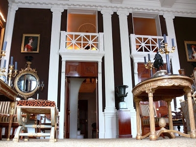
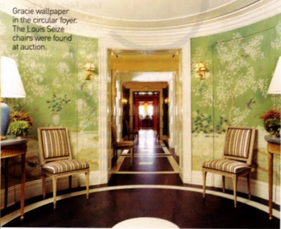
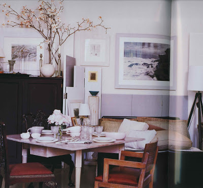
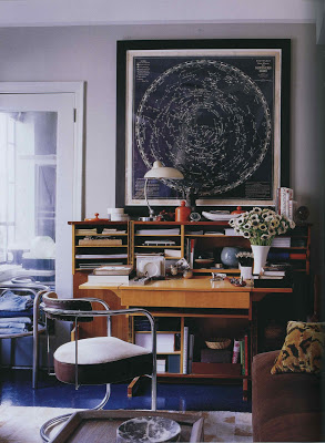
Images 1, 3 and 5 from Inspired Styles, 2 and 4 via Style Court; both images of William’s home from her book, Point of View; images of Saladino from Velvet & Linen here, and Lussier’s home from House & Garden, December of 1989, photos by Oberto Gili (this may not be the “version” Rheinstein intended.)
rssrss      FacebooktwitterpinterestlinkedinmailFacebooktwitterpinterestlinkedinmail

Enduring Style – Miles Redd

“Please, call me Miles,” began the exchange and already I could tell that we were off and running.  I must admit, before I began this series I had a limited view of Redd’s work.  My view was limited; his work is not.

I had that blog-saturated word association thing going between “Redd” and pink and red – his own home that I had seen again and again.  Then Jennifer, Courtney, HOBAC put him on their lists and Aesthete’s Lament declared his work, “has legs,” and, well, I had to look again.

And when I looked again I found a much broader scope of work than I expected.  And I was entranced by the country houses.

We began our acquaintance over email, but at the end of our first exchange Redd queried, “Perhaps a phone conversation…Let me know.”  You forget, you know, how the sound of someone’s voice changes the whole thing and you can hear where his energy lies as he speaks.

Redd was appreciative of the recognition without being the least bit cloying or false in its acceptance.   “Why do you think your rooms have timeless appeal?” I wondered.
“I’m guessing my rooms have a timeless quality because I study ‘the Greats’ and do my best to emulate their lessons.  I take their ideas and build on them – I think that is what all art forms are doing.

I studied all the great decorators at Parish-Hadley and created a reinterpreted version playing with scale, color and a mixture of classical and modern.  I give Bunny (Williams) credit for teaching me to push things out from the wall – to ignore the fireplace in a weird way.  I learned how to combine upholstery and frame pieces, squishy and tight, leggy and mass, brown and painted that seems second nature now.”

House of Beauty and Culture referenced the significance of Redd having “the right clients” to leave a lasting mark.  I asked Redd how he would define “the right clients” and he paused and chuckled nervously, “Well…resources, but beyond that imagination and a sense of humor. A lot of my clients seem to have southern backgrounds and are either living in New York or have had a New York experience.  They have a clear understanding of the importance of layers.  I like strong clients and enjoy the collaboration as long as they trust me to let them know when they are making a mistake.”

Redd had a few picks of his own for enduring spaces.  “Pretty much everything the de la Rentas touch is masterful in its room arrangement, color palette and collection of objects and furniture.

Look at the bedroom/ballroom in Kent, recently in Vogue.”

And of the “now” generation, who inspires?

“Gil Schafer, with whom I work from time to time, because he’s an architect who thinks like a decorator.  He likes rules, but knows when to break them.”

David Netto’s apartment is a study in modernism and classicism.

Markham Roberts whose diagonally striped entrance hall is one of my favorites.  I think Thomas O’Brien has done some beautiful things and same goes for Bill Sofield, Theirry Despont, Peter Marino, Bunny Williams, Steven Gambrel, Haynes Roberts, Jeffrey Bilhuber, Tom Scherrer.  I could go on and on….”  Let’s hope he does.
Do click over tomorrow if you have a chance to catch Suzanne Rheinstein’s thoughts as well.
The images of Miles Redd’s work (1 – 7) are available on his site here, though I had some from previous publications;  the de la Rentas’ homes, top two from Vogue Living Houses Gardens People, the last from Vogue, December, 2008; Gil Schafer’s bedroom from his site, David Netto’s home from his site, originally Elle Decor October 2005; Markham Roberts via his site as well.  I know that Redd was speaking off of the top of his head; any oversight or omission was purely due to time and circumstance.  A personal aside – Nick Olson picked up when I called.  I was nervous as a school girl; he is a long-time blog-crush of mine.
rssrss      FacebooktwitterpinterestlinkedinmailFacebooktwitterpinterestlinkedinmail

Enduring Style – Emily Evans Eerdmans

Emily Evans Eerdmans is a design historian and author of Regency Redux and Classic English Design and Antiques.  While working on her latest book on Madeleine Castaing her editor suggested she start blogging to keep her writing muscles in shape; lucky for us.  Here she weighs in on what will last:

Breaking down “The Money Room”
 
When Mrs. Blandings asked for my thoughts on which rooms will be tomorrow’s “Garden in Hell” or “Money Room” and which young(er) decorators will be tomorrow’s Billy Baldwin, my brain started whirling in overtime.
 
 I started thinking about these iconic rooms and what they all had in common:
 
1. the owner is generally a style-setter herself (Pauline de R, Diana Vreeland, Babe Paley)
2. and has the big bucks for a room done to the nth
3. which means the designer is usually someone already established and already has a track record
4. and lastly, don’t discount the importance of the photographer.  If Derry Moore shoots your room, for example, you increase the odds of reaching icon status.  Photographs that are atmospheric and evocative rather than the overlit, impersonal style often seen in Architectural Digest add tremendously to the overall effect.
 
So with these things in mind, here are a few selections which I believe have a good shot of being tomorrow’s touchstones:
 
Annette de La Renta’s Bedroom in Connecticut
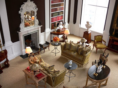

Susan Gutfreund’s Winter Garden Room, NYC, by Henri Samuel


Carolyne Roehm’s Double-Height Sitting Room, NYC


I also love the homes of younger fashion-socialites Tory Burch (by architect Daniel Romualdez) and Aerin Lauder (by Jacques Grange).
 And if I had to nominate a few additional names that we’ll be talking about in 2049, I would cast my vote for Miles Redd and Kelly Wearstler.

For more information on Emily, do check Ronda Carman’s profile here.  And, as we seem to be awash in a sea of Redd, check back to see why he thinks his rooms “have legs” and which designers inspire his work.
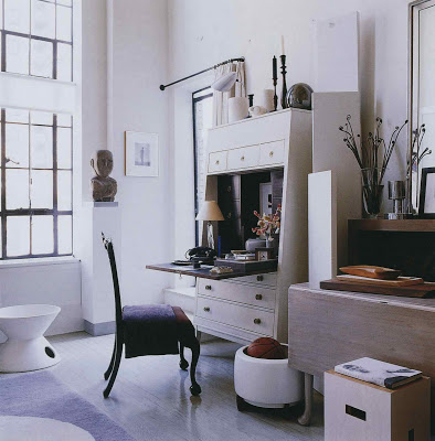
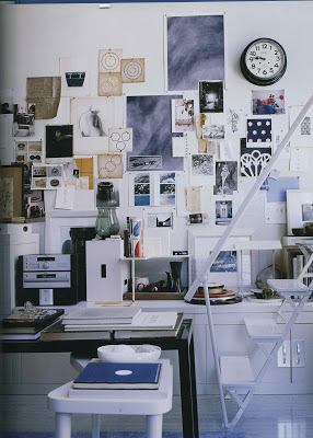
Images from top, Annette and Oscar de la Renta’s bedroom with architect Ernesto Buch, Vogue, December 2008, photograph by Francois Halard, two images of Gutfreund’s Garden Room courtesy of NYSD, photography Jeffrey Hirsch; two images of Roehm’s living room also NYSD, photography again by Jeffrey Hirsch; Tory Burch’s entry via the Peak of Chic from Vogue, photography by Francois Halard.
rssrss      FacebooktwitterpinterestlinkedinmailFacebooktwitterpinterestlinkedinmail

Enduring Style – Magnaverde

If you blog on design and you are very lucky, you might receive a comment from Magnaverde.  He should be blogging himself (are you listening Magna?)  With a wealth of knowledge and an exacting eye, I couldn’t help but include him in my focus group.


“I don’t know whether, objectively speaking, there are really more talented designers working in the field than ever before, or whether that’s just an illusion fostered by our 24/7 media. These days, all it takes is one memorable room in a charity showhouse to become the darling of half the design blogs out there, and if the creator also happens to be hot, he or she will land a spot on TV for sure.


But being good-looking & charismatic on camera doesn’t mean you’re a good designer (or even that you’re a designer at all) and just being an incredibly gifted designer doesn’t mean you’ll even make it past the first cut on any of the popular “design” shows. I can see the casting director’s audition notes now:


‘M. Hampton–too patrician. B. Baldwin–too fey. deWolfe–ugly & old. J. Fowler–wound too tight (also, English). Robsjohn-Gibbings–talking head. Rose Cumming–cuckoo for Coco Puffs. Next group!’


Anyway, I don’t know whose entire body of work will come to define the taste of our our times, but I can already think of a room that comes close and it’s one that–just like the chastely elegant salon that Jean-Michel Frank did seventy years ago for the Vicomte de Noailles–has already evolved from the elegant & pristine purity that it had when I first saw it 15 years ago (was it on the cover of HB? Met Home? I can’t remember) into a richer & much more fascinating look, one that now reflects less the discipline of the designer’s original concept than it does the inhabitant’s personality, broad interests & well-lived life, even though, in this case, the designer & inhabitant happen to be the same person:


Thomas O’Brien, who, these days, seems to have his hand in everything.


Ralph Waldo Emerson said “A foolish consistency is the hobgoblin of little minds” and O’Brien didn’t let the apartment’s original clean-lined look–handsome as it was–call the shots, but, instead, used its crisp white geometries to ground a casual-looking (and, apparently, ever-growing) assemblage of artworks in various media & furniture in various styles.


But he’s no slave to change, either. In fact, like the Noailles’ place in Paris, this is a home designed for the long haul. In fact, O’Brien long ago announced that he’ll never move again, which, in an industry based on the assumption (and desirability) of constant change, is not only rare, it’s almost revolutionary.
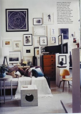
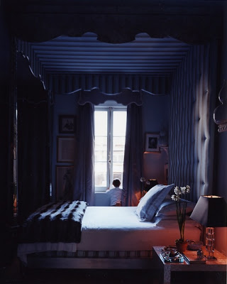
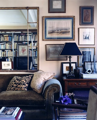
And if he’s as serious as he sounds about staying in one place, this apartment may end up acting as a sort of aesthetic weather-glass, forecasting changes in public tastes long before they become apparent to the rest of us.”

Images, top seven, Elle Decor, July/August 2006, bottom three, House & Garden, November 2007.
rssrss      FacebooktwitterpinterestlinkedinmailFacebooktwitterpinterestlinkedinmail

Enduring Style – House of Beauty and Culture

Every day I stop into the House of Beauty and Culture for both his sense of design and his sense of humor.  HOBAC has a very sophisticated aesthetic.  And a jaded point of view.  He defines himself in his profile as being, “In search of the unusual in a world that is becoming increasingly and frighteningly homogenised.”  Searching.  Becoming, but not done.  That seems optimistic to me.  


“Unless there is a cataclysmic shift in the collective consciousness, I don’t think that legendary rooms are any longer possible.


People now are too transitory and conformist, and readily influenced by the culture of the mass market.
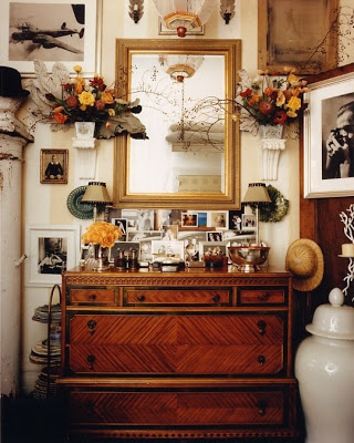

However, if one had to choose a legendary decorator I would choose Miles Redd. Given the right clients, he will be his generation’s equivalent of Parish Hadley.”


This response made me go back to Redd’s portfolio and look again.  And again.  
Pop back in this afternoon for thoughts from Magnaverde.
All images courtesy of Miles Redd.  Facade of Redd’s townhouse, top, designed in conjunction with Gil Schafer.
rssrss      FacebooktwitterpinterestlinkedinmailFacebooktwitterpinterestlinkedinmail