Tag Archives: Mrs. B at Home

Fall Reruns

Oh, yes, Fall is supposed to be about new shows and new shoes, but a couple of folks have asked to see pictures of the house before we move. While I feel like it is all out there already, it is not all in one place. In fact, just putting this together required hunting and pecking through files and blog posts.
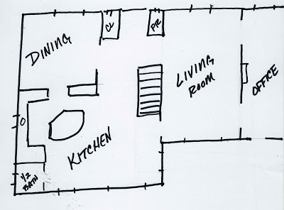
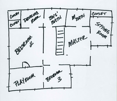
Here is my hand-drawn-not-to-scale and likely-inaccurate floor plan. I can’t really visualize houses based on floor plans, but I know some people can (like my husband) so I am including it to provide a little perspective for those who think that way. (What? You were expecting 1/4″ = 1′ and that super-cool architect’s handwriting? Honestly, I wish I worked like that.)

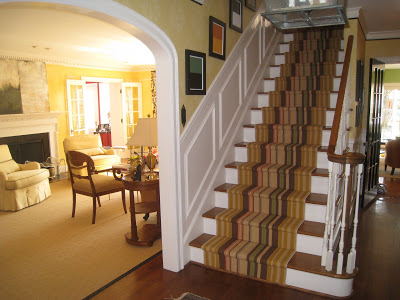
Front hall – Dash and Albert runner, do-it-yourself color blocks and the rug that Rosie wrecks every single day.

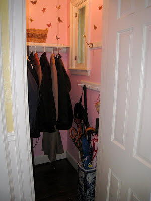
Coat closet – channeling Dorothy Draper. A tiny, little bit.

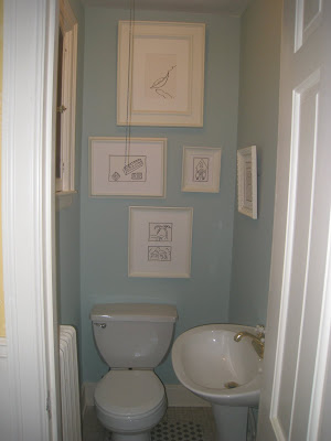
Powder room – this was a last minute spif.

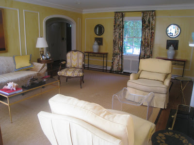
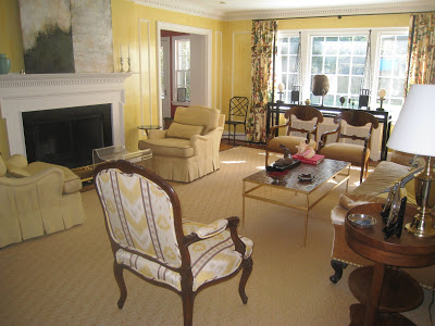
Living room – I did a little shifting in the last few weeks. We purchased a new TV and the chest that was formerly here seemed like a better fit than what we had in the kitchen. Then the dominos began to fall. Dining room tables and mirrors moved here and the dining room was once again (always) barren and sad.

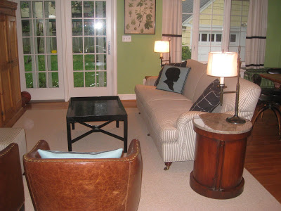
South view – and my favorite of the three configurations over ten years. Also, the briefest.
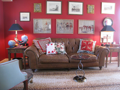

Office – Sorry, Toad, the rug is coming with.
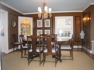
The National Disaster that is my Dining Room.

Sitting area in the kitchen. That armoire is now upstairs holding books in the boys’ room. Was. The books are all packed. Mr. Blandings, in a move that rivals his rants about how many apples the boys eat, had groused a bit about the number of boxes of books that have been loaded into the container.

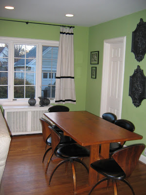
Kitchen eating area – with beloved Cherner chairs. They swivel. They are a bevy of gals with the nipped waists and the full skirts doing the twist. I adore them.
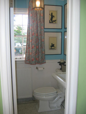
Kitchen bath – behind the door is a make-shift mudroom with cubbies and hooks. (Margaret Russell said once, somewhere, in relation to Steven Gambrel’s powder room in the last Sag Harbor house, that it is tricky to photograph bathrooms without showcasing the toilet. Clearly, I didn’t manage it; I’ve done it twice in one post.)


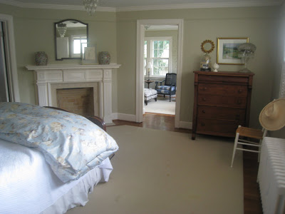
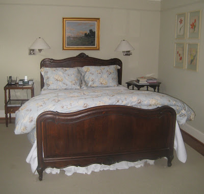
Our bedroom is sort of where furniture goes to die. It was always the step-child of the house.

These pictures were taken once we readied it for the buyers to see, so, per all how-to-sell-your-house tips, we had removed all personal pictures and items. It looks incredibly spare to me.

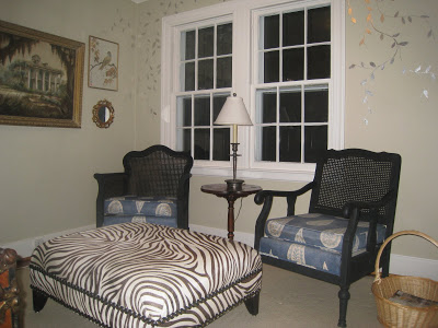
The sitting room – these chairs are basically staging. There were other, shabbier, more comfortable chairs in here to facilitate TV viewing that are now in the basement. I inherited these from a friend and this is the original upholstery. They will be recovered, someday, when we land in a new spot.
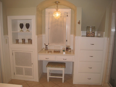
Master bath
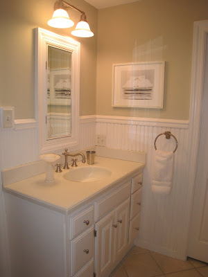
with one sink. This was the only drawback that Mr. Blandings could find the first time he saw the house. Just this week, ten years later, he said, “It really wasn’t that big of a deal.”
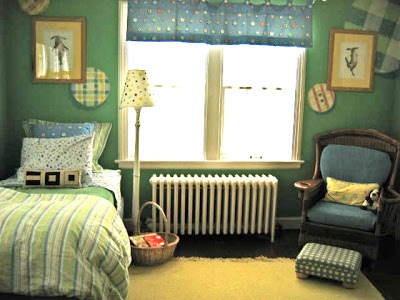
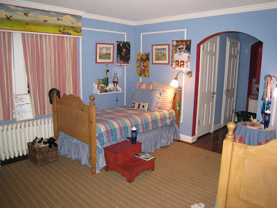
This room has changed, as you may know, from nursery to teen-ager room. Unfortunately, I did not get a picture of the new set up before tear down.
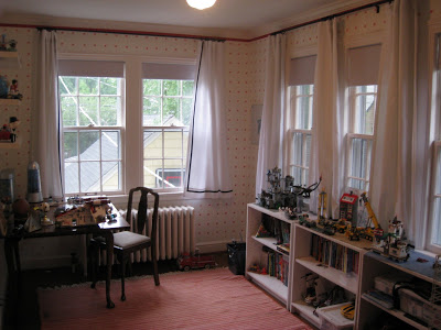
Play room – I may live to stamp again. I loved this project.

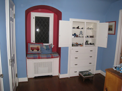
The littler boys’ room,

dressing area
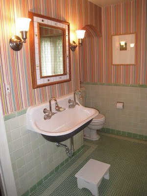
and bath.

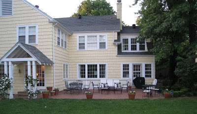
Normally this is where we would start, out back, for drinks and snacks. The whole lot is a jumbly mess right now, so it is nice to see each room when it was at its best. We have not confirmed where we are going. Through the power of the universe and the internet we will be held at a friend’s who is on an adventure of her own. No better place to be on-hold than a spot where she coaxed me through the first stages of my oldest putting his toe outside the nest.
From there we will see what comes next.
rssrss      FacebooktwitterpinterestlinkedinmailFacebooktwitterpinterestlinkedinmail

It’s Rude to Stare

I have gone back to look at this image a dozen times. And saved it. And, finally, printed it because I need paper inspiration files. That giant Greek key has me hunting for a yard stick and a paint brush. The flowers! That green! I can’t get enough.

This Steven Meisel image appeared in Vogue in May, 2007; the layout was produced by Grace Coddington, set design by Mary Howard and panels by Sarah Oliphant. My hat is off to all of them. You can see the slideshow here.

From the incomparable Little Augury and her award-winning (well, it should be) post here. The image is
rssrss      FacebooktwitterpinterestlinkedinmailFacebooktwitterpinterestlinkedinmail

Glutton for Punishment

I’m in choppy waters here.  The few times I have thrown this room open for suggestions it’s brought an incredible amount of opinions, information and criticism.  With a little help from a friend I decided to move the painting to the living room, move the living room prints here, paint the picture frame moldings black and recover the chairs.  I picked up an incredibly inexpensive ticking at Nell Hill’s which may or may not remain depending on the sure-to-never-be-ordered curtains.  (You can see the “before” here.)

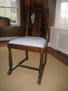
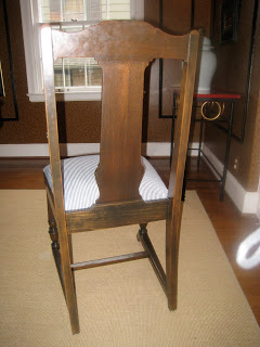
I love the paper, still, but this room is a whole lotta brown.  Never a fan of brown table and brown chairs, I’m lucky to have this hand-me-down set.  

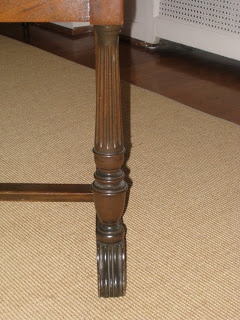
I do like the table, but it’s oval top is constraining.  The room is nearly square and round would be a million times better.  The front legs of the chairs are appealing.  You can’t see them, of course, because they are pushed under the table.

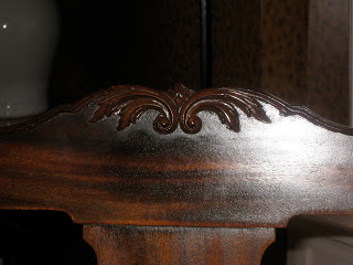
This really bothers me.  A lot.  It is not carved into the wood, but applied, and I think I could easily remove it.

Which would make the front look more like this.  Which would be better.  Assuming I don’t jack up the chairs.  My latest idea is to paint them black.  The only thing that stopped me Sunday was two other paint projects that I had started and not completed.  And, please, don’t advise the purchase of either table or chairs as my budget will not allow the purchase of as much as a picture of either a table or chairs.
Also, if you are going to say something unkind, at least preface it with “Bless your heart.”  All good Southern women do it and, oddly, it takes the sting out.  For example, “Bless her heart, I don’t know why she wears sleeveless tops when her arms are so heavy.  Sweet thing, maybe it helps keep her cool in this heat because she’s so big.”  Something like that.
rssrss      FacebooktwitterpinterestlinkedinmailFacebooktwitterpinterestlinkedinmail

Slippery Slope

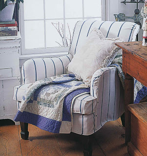
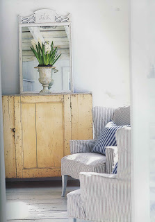
I’ve been noodling around with the idea of what to do with my dining room chairs.  Courtney Barnes, at Style Court, is always a good sounding board and patient with my paragraph upon paragraph of indecision.  The thought of painting eight chairs is daunting as I don’t even like them.  Then another friend presented the idea of slip covers.

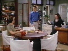
I hemmed and hawed with Courtney.  Would they be too kitchy?  Too 80’s?  And she emailed back, “Well, the dining room chairs in Will’s apartment on Will & Grace were not country.  They were tailored and chic.”  Or something like that.  Then she did that great slip cover on her own chair.

Which is why I like Courtney.  Because she has a great eye and she remembers the slip covers on dining room chairs in a sit com that hasn’t been on the air for four years.  So I’m reconsidering slip covers.  But not really doing anything.  For the record.

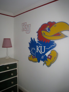
In other Dream House decorating news, a friend recently asked how much input the eldest Blandings boy is getting on his new room.  You tell me.  And, no, I didn’t paint it.  It’s a Fathead; based on my ability to bring my dining room to closure, some would say we both are.

Image from Will & Grace from here.  Slip cover images from New Farmhouse Style; photography by Kindra Clineff.  Drawer-painting is on the list this weekend.

rssrss      FacebooktwitterpinterestlinkedinmailFacebooktwitterpinterestlinkedinmail

Snow Day 2 of 3

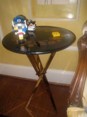
When Megan and I had first reconnected through blogging, I emailed her an image of these Fornasetti tables and said, “Don’t you want these for that beach bungalow?” And she emailed back, “Someone would just be playing Polly Pockets on them.” To which I replied, “That’s why I’m not getting them; at my house it would be Legos.” The fact that here they sit (as I said they would not) covered in Legos (as I said they would) shows that I know my children better than I know myself.

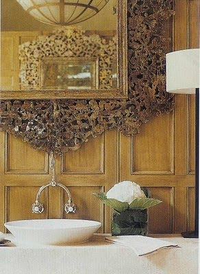
In other news, this Waterworks faucet is discontinued. However, the Chicago showroom was incredibly helpful and sent three other options for my powder room that will likely flounder for another year. (Are you noticing the twin reflected in the mirror above? Why didn’t I keep the whole feature? We’ll never know.*)
I’m quite sure today will be equally scintillating. Perhaps more so as the boys are insisting we leave the house. Had I not watched the last of the six Thin Man movies that I recorded New Year’s Eve I might put up a fight. As it is, we may indeed have to head out. For Piero’s sake if for no others’.
* Great thanks to Things That Inspire who let me know that this home, which was featured in Veranda in the July/August issue of 2007, is on the McAlpine Tankersley website here. The photo is by Peter Vitale.
Post Script: Mr. Blandings informed me, while never taking his eyes from the football game, that William Powell grew up in Kansas City (he was born in Pittsburgh.) Apparently the elder Mr. Blandings met him at a golf tournament and declares, “He was a very nice guy.” Do you think he saves these things? I mean, we’ve been married eighteen years and nary a peep about William Powell. Who knew?
rssrss      FacebooktwitterpinterestlinkedinmailFacebooktwitterpinterestlinkedinmail