Tag Archives: Mrs. B at Home

Design Therapy

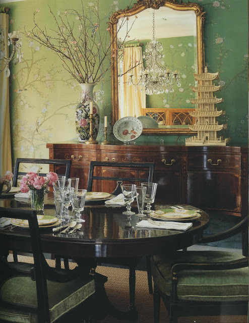
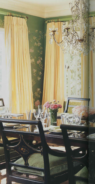
I hadn’t realized that I was unconsciously mining this image for inspiration until last week’s episode of Million Dollar Decorators. When Mary McDonald walked through (by? I can’t remember) this dining room, my conscious mind went, “Oh, yes, of course.  That has been it all along.”

I wish this little nugget had slid into the conscious side of my brain a little sooner.   I’d been holding off on ordering the stencil for my dining room project as something about it seemed not quite right.  It wasn’t working with the rest of the house and I couldn’t put my finger on why.

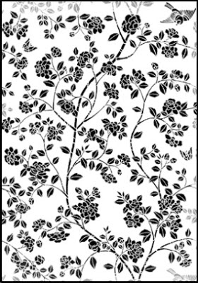
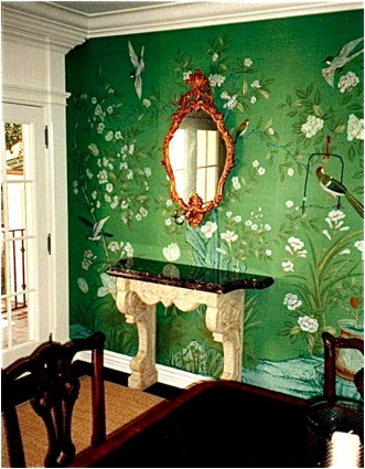
When I saw the dining room (again, fully conscious) I realized that the stencil, above, was too bold for my space.  Too heavy.  Too much.

So, I’m ordering this all-over pattern instead and am going to use it in pieces to create an airier silhouette similar to the wall above.  It wasn’t my first foray into analysis, but it was most certainly the most fun. 
Top two images, Mary McDonald Interiors, Rizzoli, photography by Melanie Acevedo.  Remaining images via Stencil Library.
rssrss      FacebooktwitterpinterestlinkedinmailFacebooktwitterpinterestlinkedinmail

Emerald City

The paint has arrived for my dining room.  The final two choices still remain, side-by-side, on the East wall and occasionally I wonder if I selected well.  Selected best, I suppose, as they are both fine shades of green.  The universe keeps handing me gumdrops of reassurance, not the least of which was this wonderful image from Matthew White and Frank Webb.  They are partners in the firm White Webb and produce a lovely design log which you can find here.  This issue they are exploring the glory of green and make reference to Oz in the nicest way; I couldn’t resist.

Today the electrician comes to scoot the sconces out a bit.  I think Mr. Blandings would advise to play it where it lays, but he is keeping it to himself.  By the weekend I am hoping the room will be ready for the wizard himself.

Image courtesy of White Webb and is used with their permission.

rssrss      FacebooktwitterpinterestlinkedinmailFacebooktwitterpinterestlinkedinmail

The Greens of Summer

When my babies were little Mrs. Green told me, “You can’t put sleep in the bank.”  When I had toddlers Mrs. Green told me, “Put the oxygen mask on yourself first.”  And a few years later, when summer shifted from splashing in shallow pools and long naps on hot afternoons to swim practice and baseball and two loads of laundry a day, Mrs. Green told me, “Lower the bar.”

She didn’t mean to parent less or lazily.  She just realized that it’s better to focus on what must get finished, to be bothered less by the mess and to slow the heck down.  So, there are dishes in the sink and likely a wet swimsuit (or two) on the floor, but there is also a final green paint swatch on the wall of the dining room.  We all have our own priorities.

Books, clockwise from top, Walls, Florence de Dampierre; The Colonial Revival House, Richard Guy Wilson; A Flair for Living, Charlotte Moss; Interiors, Mary McDonald; Elements of Style, Michael Smith; Vogue Living: Houses, Gardens, People; Regency Redux, Emily Evans Eerdmans; Wallpaper, Carole Thibaut-Pomerantz.

rssrss      FacebooktwitterpinterestlinkedinmailFacebooktwitterpinterestlinkedinmail

Backing Up

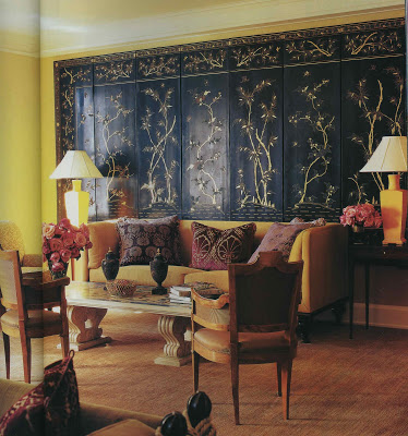
Hey.  Quick question.  (How many forty-minute phone calls begin this way?)  I have an empty and awkward corner in my living room (we try not to discuss it in front of her, poor dear) where I’d like to have a Chinese screen.  Except.  Well, except that I tend to like the backs of Chinese screens better than the fronts.  That’s the wrong side, right?  Or were both sides displayed and those of us who have a quieter bent can just stand where there’s less show?  The screen pictured above seems perfect (even outside of the eight-paneled 1840-ness of it.)  Would you guess that that is the back?  And, can I just appreciate it like a Pilates-toned matron?  Or do I need to come to grips with the face-to-face?

Image, House and Garden, April 2003, design, Maxine Harrison; photography, Melanie Acevedo.

rssrss      FacebooktwitterpinterestlinkedinmailFacebooktwitterpinterestlinkedinmail

Cross My Heart

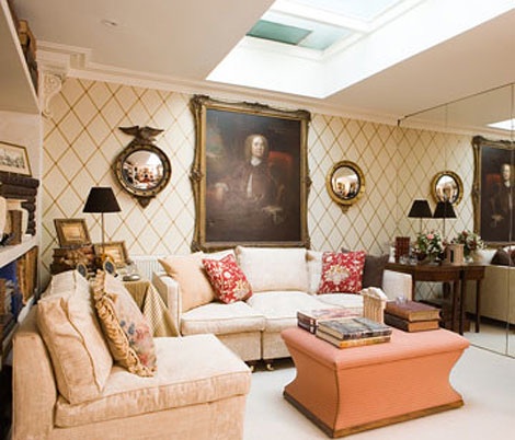
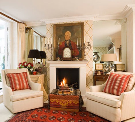
A very thoughtful reader sent me the image, above, scanned from her tear sheet file.

This is exactly what I was thinking for the front hall.  The paper, St. James Trellis, was manufactured by Cole & Son (I believe it is discontinued) and I have another of their flawless diamonds taped to a wall as we speak.  (Write.  Read.)  I am waiting for one more and then I will pull the trigger.  It finally feels like things are coming together.

Images, Traditional Home, originally published April 2007, the home of Valerie and Anthony Evans, managing director of Cole & Son.  Currently on their site here.  Photography credit unavailable.
rssrss      FacebooktwitterpinterestlinkedinmailFacebooktwitterpinterestlinkedinmail