Tag Archives: Mrs. B at Home

Climbing the Walls

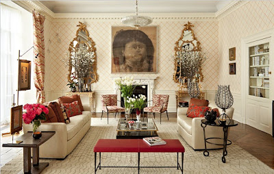
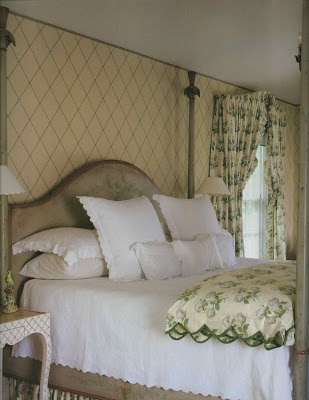
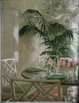
You can’t, you know, decorate in isolation.  This room this and that room that.  So as I piece together the living room and plan the dining room, the downstairs hall and family room must be considered.  The image, top, in the May issue of  House Beautiful, caused one of the tumblers to fall into place offering up the answer for the hall.  “Trellis.  Of course.”

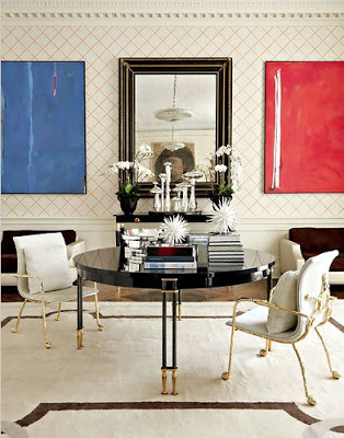
Then, while visiting the Kips Bay Showhouse, I lingered long in this room.  Captivated by the paper, delighted by the furniture.  When my dining partner said, “What was your favorite room?” I replied, “Those mirrors!”

A classic room with unnoticeably unconventional choices, I adored Richard Mishaan’s use of Philip Jeffries embroidered grass cloth for the walls.  Trellis.

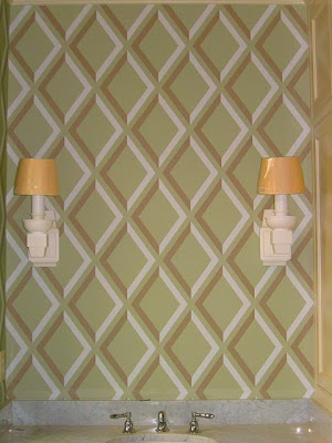
Which reminded me of Little Augury’s project.  Trellis.  With an edge.

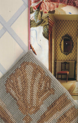
Then, while pulling out Influential Interiors to see if it was right for a friend, I was reminded of this image using Colefax Trellis.

And then this.  But my first leg of the hunt (on-line or in the showroom) has not been a success.  (Try searching “trellis wallpaper:” A bazillion images of Imperial Trellis pop up.)  By this time I was planning on two or three samples taped to the hall wall.  Nada.  
I could paint it.  But then there’s the math.  You know I hate math.
Images from top, House Beautiful, May, 2011, design by Meg Braff; photography Thibault Jeanson.  Paper, Sea Island Trellis by Brunschwig & Fils; New York Times, design by Richard Mishaan, photography Trevor Tondro.  Paper, Philip Jeffries; via Little Augury; Influential Interiors; photography James Merrell; Farrow and Ball: The Art of Color; photography, Edward Addeo.
rssrss      FacebooktwitterpinterestlinkedinmailFacebooktwitterpinterestlinkedinmail

Evolution of a Living Room – Version 2.0

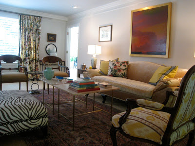
I abandoned the strie.  The choice was repaint the entire room white then glaze or just paint the solid color throughout.  I painted a solid coat with the glaze, so this is three coats of 1:1 Slipper Satin and glaze.

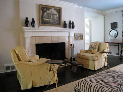
I tried these chairs flanking the sofa, but the room nearly tipped.  Their scale is a little large – 10-20% too big I’d say – no matter where they are, but they are great for reading the paper on Sunday.  The painting was my mother’s and I love it, but Mr. B thinks it is “spooky.”  It’s place holding.  Maybe for this.

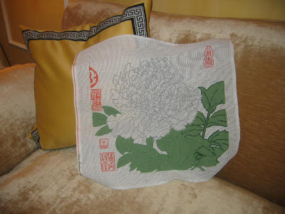
I tossed that needlepoint pillow, above, onto one of the chairs and realized I have a completed canvas at the Studio just waiting for fabric to back it.  I think I’ll reconstruct the tulip as well and leave them here.
These chairs need recovering badly so I will soon begin the hunt for fabric.  Expect slips for the Biedermeier chairs as well.  And pillows for the sofa.  Sakes.

Rather than focusing on what is not, let’s instead enjoy what is.  Slipper Satin has taken the edge off of the walls while still leaving a sense of “white.”  (Which is what Mr. Blandings would tell you it is anyway.)

So, now, go ahead, twist my arm – make me look at fabric.  Shucks, I guess I will.
rssrss      FacebooktwitterpinterestlinkedinmailFacebooktwitterpinterestlinkedinmail

Evolution of a Living Room – Versions 1 – 1.1

 
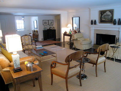
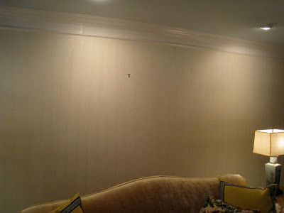
This is our living room as it was when we first moved in.  We can call this Version 1.  See?  Same old stuff, new space.  

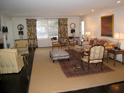
Slightly tweaked.  The sisal rug is going.  The old rug that is currently atop will shift over to live under the yellow chairs, which will hopefully not be yellow.  An as-yet-undiscovered rug will live under the other group leaving more of the floor to show.  Also, I picked up a pair of Paul McCobb tables that replaced the one that I made.  (He is not abandoned, but residing in Mr. B’s study.)

The white was beginning to feel less fresh and more Mastercraft apartment.  (Many of you will be scratching your heads, but if you lived in Lawrence, Kansas in the late 80’s you will have a vivid mental image.)  I sought the counsel of a few friends and, with their thoughtful guidance, settled on paint.  (I am respectfully allowing them to remain anonymous so as not to be inundated with requests for help.  Mine are annoying enough.)

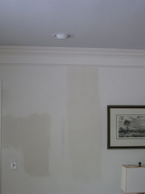
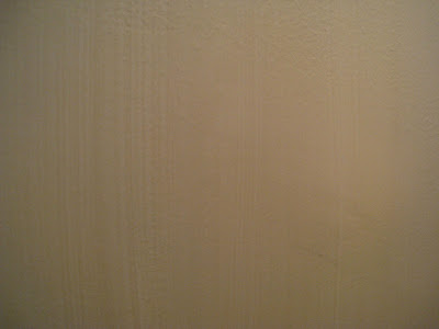
The plan was Farrow & Ball Borrowed Light on the ceiling and a strie of Slipper Satin on the walls.  Borrowed Light is a home run in every way.  I adore it.  I could write poems about it.  I dream of it in my sleep and spring from my bed in the morning so I can see it. The strie was tricky.  (The swatch image is accurate; these are not.)  I couldn’t figure out why I couldn’t figure it out.

I tried varying combinations of paint and glaze, hunted for different glazes and brushes, all with little success.  It was time-consuming and annoying.  One evening my middle son, who is not overly interested in aesthetic endeavors but has a good eye and a strong opinion, cruised through the room.  I paused, brush in hand and asked, “Whaddya think?”  He glanced and offered, “I like the color.”

The concise clarity of this statement was all I needed.  Like design, his communication often takes place in the negative space.  The message was clear: abandon the strie – though he would not have known to call it that.  Within ten minutes I was to a spot on the wall that had been painted with Ben Moore and not Sherwin Williams and I realized the entire problem was with the existing “base” coat.  Bother.
Part 2, the resolution, tomorrow. (What?  You think I’m Joni and I’m going to lay the whole thing out in one post?  No way.  I’m milking it.  And I think I used “lay” correctly.)
rssrss      FacebooktwitterpinterestlinkedinmailFacebooktwitterpinterestlinkedinmail

Volley

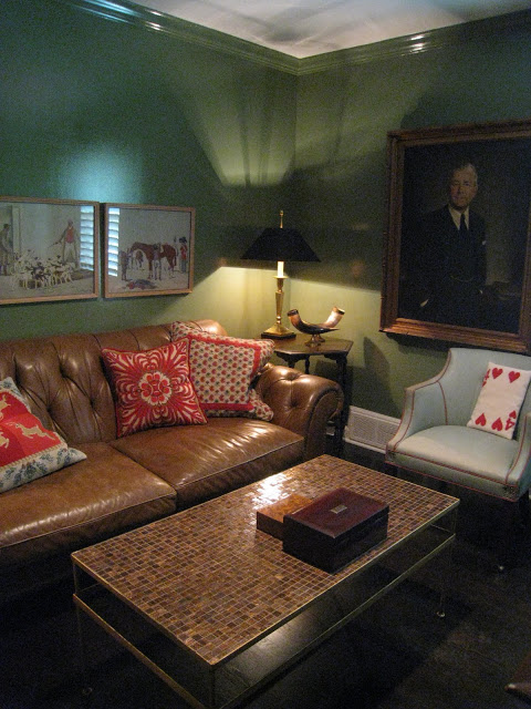
“I think we should paint it glossy.  And the crown moldings.”

“The crown moldings green?”

“Yep.”

“I want it flat with white crown molding.”

Simmering silence ensues.

“Why don’t I start by painting it flat, no crowns, and see how it goes?”

Paint ordered; paint applied.

“I like it.”

“I really think it needs to be glossy.  And the crowns painted.”

Imagine verbal scuffle. Later the same day:

“You painted the crown molding.”

“Well.  Not all of it.  Just a little to show you that it really does look better.”

Conjure images of a tense Sunday afternoon.  Without nearly enough time to heal:

“So what do you think about glossy?”

“Do.  Whatever.  You.  Want.”

If you think this little bit of passive aggression would have held me off, you’re wrong.  I immediately emailed a p.o. to Farrow & Ball for the Calke Green Full Gloss.  It arrived a week later with twin friends (Borrowed Light for the living room ceiling) and I painted the study again.  In a day.  So, basically, Mr. Blandings left for work in the morning with a matte office and returned home to a glossy office.  Glowing, gleaming, goosebumpy gorgeousness, truly.  He walked in to set his briefcase down and I could hear him pause.  I braced myself.

“You painted my office.”

“I did.”

“I thought only the crown moldings were going to be glossy.”

“No.”

Pause

“You said I should do whatever I wanted.”

Pause.

“I love it.”

In return for his generous approval, I neither gloated nor said, “I told you so.”  At least I don’t think I did.

I have now painted with Farrow & Ball Dead Flat, Estate Emulsion and Full Gloss and I could do a commercial.  As one reader said, “It is like painting with creme fraiche.”  It is.  It’s glorious.  And the colors are such a beautiful complexity; who wouldn’t want that?

This was not a sponsored post; I have paid for all the paint and received no compensation from Farrow & Ball.

rssrss      FacebooktwitterpinterestlinkedinmailFacebooktwitterpinterestlinkedinmail

Redd-y or Not

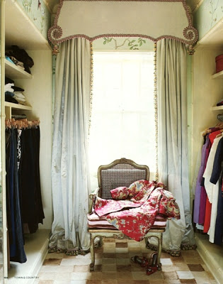
I need to get out and start looking at wallpaper books (the olfactory sensation being nearly as good as the visual; what is it about the smell of paint and wallpaper?)  The Blandings’s budget does not allow for Gracie or de Gournay so some other something must be found.  Mr. Redd, thank you so much; I’m quite grateful for the inspiration.

Image, Town and Country, photography by Francesco Lagnese; via Post and Grant.

rssrss      FacebooktwitterpinterestlinkedinmailFacebooktwitterpinterestlinkedinmail