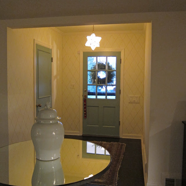
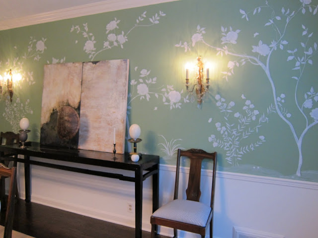
Thank you so much for your nice comments on the dining room walls. The base color is Farrow & Ball’s Folly Green. It took me about a week from start to finish, but in my world start to finish includes a few fits and starts.
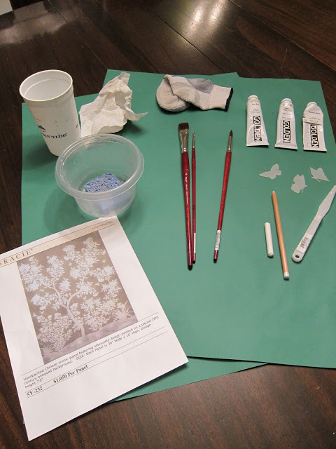
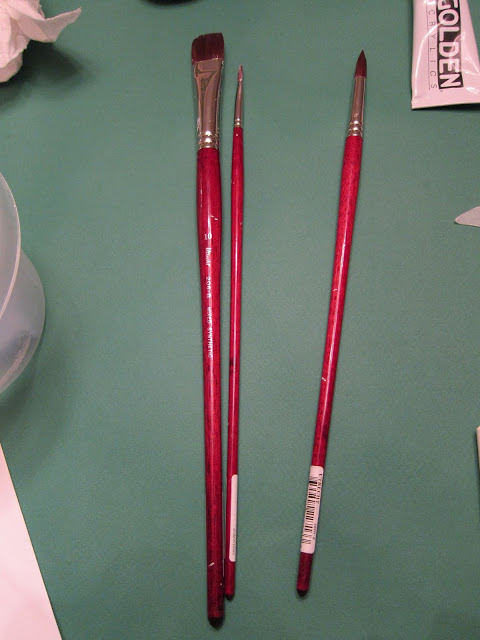
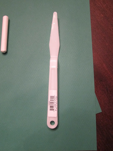
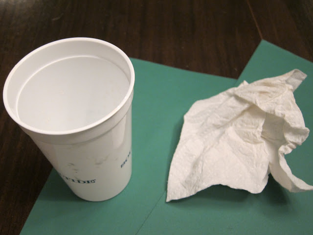
To complete the project you will need: (clockwise from top left) A plastic cup resembling a party favor, a crumpled paper towel, a clean sock, paint, tracing paper, a palette knife, a white graphite pencil, a piece of chalk, brushes, a Gladware bowl that is missing its top, a used kitchen sponge and inspiration.
I had ordered stencils from Stencil Library and they are lovely. I gave them a go a few weeks ago and they were not for me. It sort of turned the project from something creative into a job. That said, they are very nice and if you are not confident enough in your drawing skills, they are a fine way to go.
Instead, I regressed to an old favorite past time of drawing on the wall.
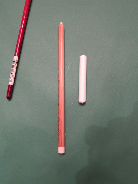
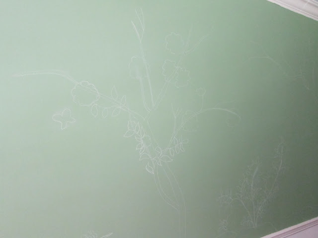
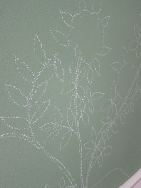
As the walls are green, I used chalk to outline the design. It wiped away very easily and did not leave a mark when corrections were needed.
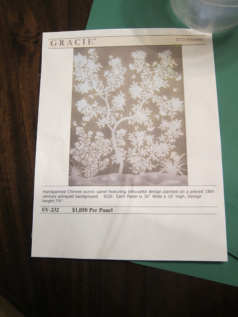
I alternated between holding images from Michael Smith, Mary McDonald and Gracie to create the design. The Smith room had a paper very similar to this Gracie panel, though it was a little denser than what I wanted for the room. The McDonald walls had the right feel, but different flowers.
I drew the entire project before I started painting. (This is unlike me, as painting is the fun part.) Sketching in the design easily took twice as long as painting. Prep is always longer and a little less fun.
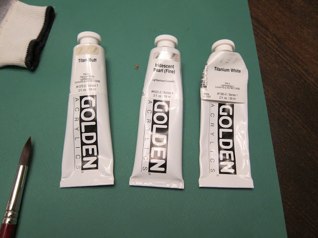
But then I got to go to the art supply store, which is almost as good as jewelry shopping. I explained to the lovely woman working at Utrecht that I was trying to avoid having to go over the design twice. She suggested Golden paint in a dense opacity. We chose Titanium White and then she suggested Titan Buff to take the edge off; Iridescent Pearl (Fine) (and it was) was added for a little luminosity.
I chose the brushes myself and developed a deep and lasting love for both the large #10 and the smaller #2. #6 and I took an immediate dislike to one another and will never be friends. Beyond that, we cannot see what anyone would see in the other, though we stopped short of become enemies. We will smile and nod, but will be unable to move beyond social pleasantries.
I’d like to give you a formula here, but basically you squeeze a big blob of white, about a third smaller blob of buff and a dollop of iridescence and mix. When you run out, do basically the same thing again. I started my stirring with a kitchen spoon, but it was inefficient; palette knives exist for a reason.
Then I thinned it out with a little water and, when I made a mess, I cleaned up with a paper towel.
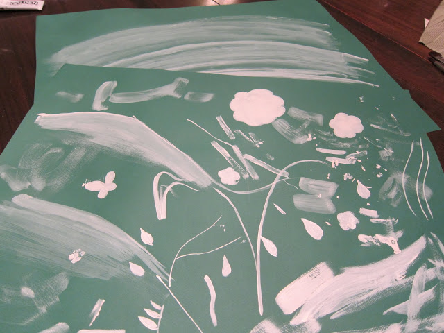
I did pick up a couple of pieces of green poster board to test color and consistency. And, yes, I agree, based on the testing it appears that I made a rather large leap of faith.
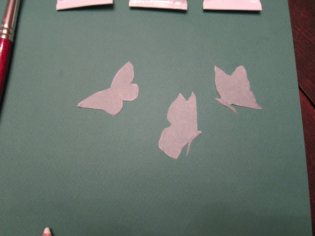
I could not manage to draw a good butterfly. Eventually, I created a template from the stencil and traced around these with the graphite pencil (chalk would have been too thick.) The butterflies were the best part.
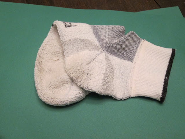
Once the paint was dry I rubbed off the chalk with a clean and coincidentally-inside-out sock that was sitting in the laundry basket that I had just brought up from the basement. I imagine a clean, soft cloth would do.
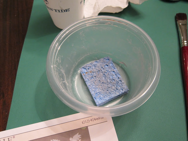
Somewhere along the way I’ve heard the last shall be first and the first shall be last and I don’t think it was related to puberty, though it worked out that way in my experience. Also with the mural. I should have painted the “ground” first and then the trees and bushes, but I didn’t quite know how to go about the ground so I skipped to the good stuff. As it turned out, it was pretty easy. I used the same paint combination, but thinned it until it was very watery. I then looked for my sponge brushes for twenty minutes, gave up, and used half of a sponge from under my kitchen sink instead; it worked fine.
Onward and upward. Or downward as I think a rug may be next.


