Tag Archives: Mrs. B DIY

Pleased as Punch

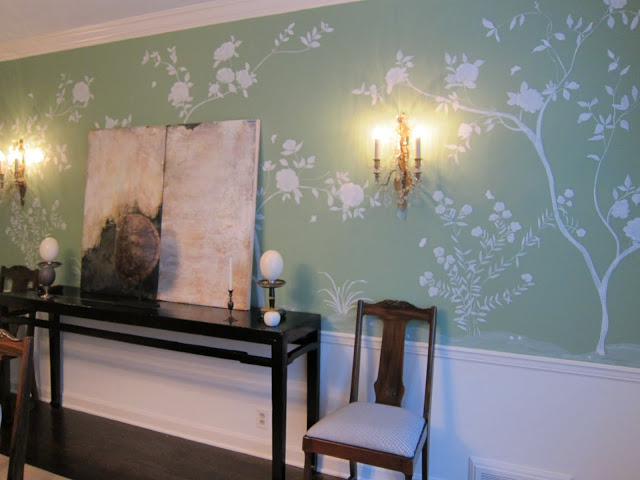
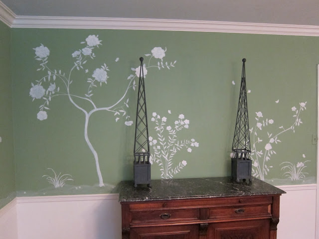
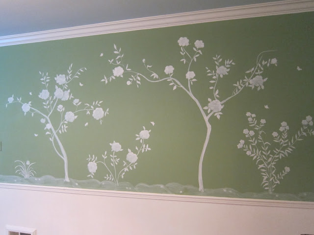
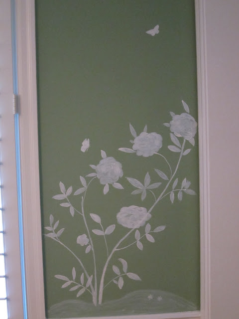
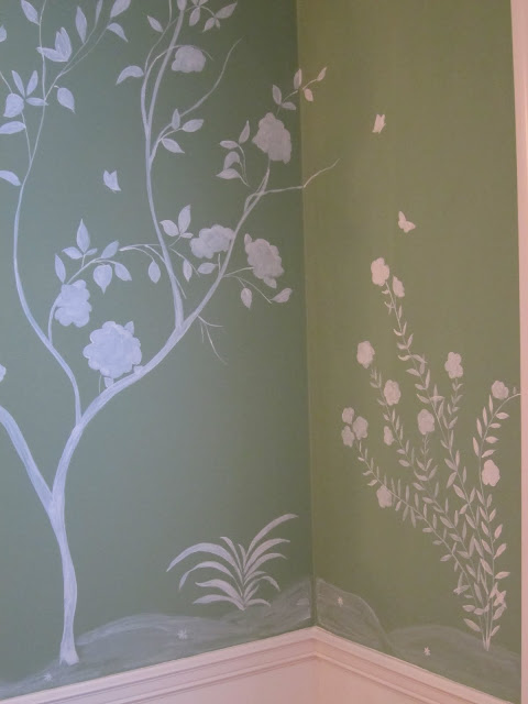
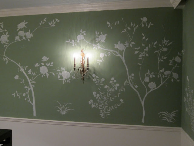
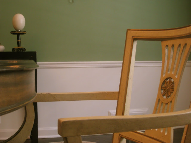
The dining room walls are (mostly) finished.

There is a blank spot here just the to left of the door that you cannot see. (Also, out of range, is the pile of paint and paper and nonsense that is atop my dining room table.)

The butterflies were an unexpected delight, and as you have no before and after you cannot tell, but they really added something.  Movement maybe.  Whimsy.

I will be back on Tuesday to post colors and materials and process.

Promise.

rssrss      FacebooktwitterpinterestlinkedinmailFacebooktwitterpinterestlinkedinmail

Please Stand By

I really did expect to be posting by now.  I got the boys back to school, did a fair amount of work in the basement, then I got a wild hair to paint the dining room.  I told Mr. Blandings yesterday that next to marrying him, this project has offered more immediate satisfaction than any other.  I hope to finish Tuesday and should be back on track by the end of the week.  Details to follow.

rssrss      FacebooktwitterpinterestlinkedinmailFacebooktwitterpinterestlinkedinmail

Too Much is Never Enough

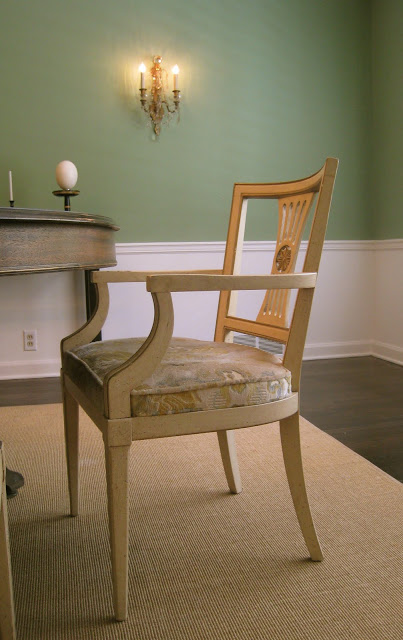
In other dining room news, I bought more chairs.

At first I wondered if they were better than, or just different from, my current chairs.  Also, there is the issue of my chair addiction.  Further, I am now captivated by the idea of the bamboo dining chairs in the Reed house.  Still, the long and short of it is, I am usually long on ideas and short on funds and it is likely that it would take me a while to a) find better chairs and b) afford better chairs.

So when these literally landed in my lap it seemed wise to snap them up.  (I have two pieces of art on my wish list as well and they are taking priority.)  I was originally thinking I would paint these black, but this pale yellow is so cheerful I wonder if it should be the “new” color as well as the old.  They have, literally, lifted the spirit of the room.
I haven’t the heart to count my chairs again, but whatever the last horrendous number was, it is now that + 6.  Sakes.
The wall color is Farrow & Ball Folly Green.
rssrss      FacebooktwitterpinterestlinkedinmailFacebooktwitterpinterestlinkedinmail

Design Therapy

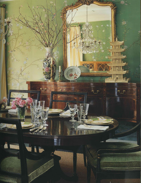
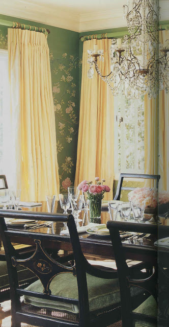
I hadn’t realized that I was unconsciously mining this image for inspiration until last week’s episode of Million Dollar Decorators. When Mary McDonald walked through (by? I can’t remember) this dining room, my conscious mind went, “Oh, yes, of course.  That has been it all along.”

I wish this little nugget had slid into the conscious side of my brain a little sooner.   I’d been holding off on ordering the stencil for my dining room project as something about it seemed not quite right.  It wasn’t working with the rest of the house and I couldn’t put my finger on why.

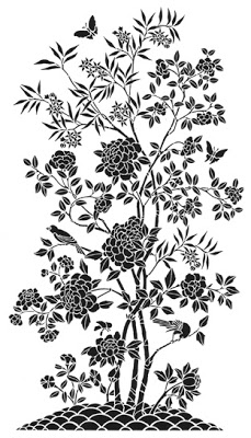
When I saw the dining room (again, fully conscious) I realized that the stencil, above, was too bold for my space.  Too heavy.  Too much.

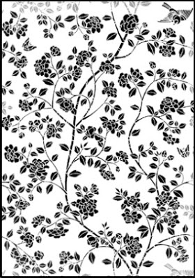
So, I’m ordering this all-over pattern instead and am going to use it in pieces to create an airier silhouette similar to the wall above.  It wasn’t my first foray into analysis, but it was most certainly the most fun. 
Top two images, Mary McDonald Interiors, Rizzoli, photography by Melanie Acevedo.  Remaining images via Stencil Library.
rssrss      FacebooktwitterpinterestlinkedinmailFacebooktwitterpinterestlinkedinmail

Evolution of a Living Room – Versions 1 – 1.1

 
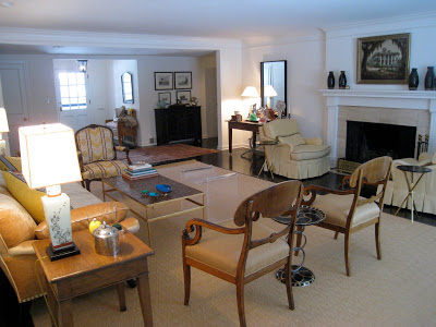
This is our living room as it was when we first moved in.  We can call this Version 1.  See?  Same old stuff, new space.  

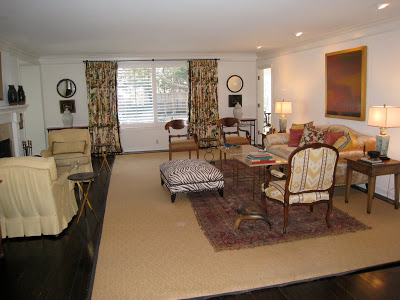
Slightly tweaked.  The sisal rug is going.  The old rug that is currently atop will shift over to live under the yellow chairs, which will hopefully not be yellow.  An as-yet-undiscovered rug will live under the other group leaving more of the floor to show.  Also, I picked up a pair of Paul McCobb tables that replaced the one that I made.  (He is not abandoned, but residing in Mr. B’s study.)

The white was beginning to feel less fresh and more Mastercraft apartment.  (Many of you will be scratching your heads, but if you lived in Lawrence, Kansas in the late 80’s you will have a vivid mental image.)  I sought the counsel of a few friends and, with their thoughtful guidance, settled on paint.  (I am respectfully allowing them to remain anonymous so as not to be inundated with requests for help.  Mine are annoying enough.)

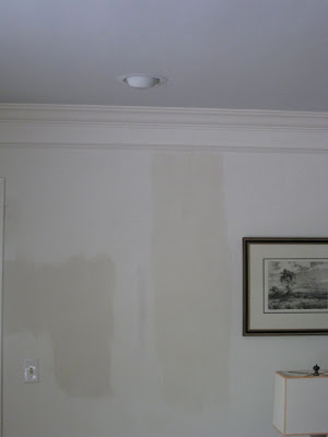
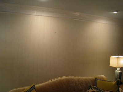
The plan was Farrow & Ball Borrowed Light on the ceiling and a strie of Slipper Satin on the walls.  Borrowed Light is a home run in every way.  I adore it.  I could write poems about it.  I dream of it in my sleep and spring from my bed in the morning so I can see it. The strie was tricky.  (The swatch image is accurate; these are not.)  I couldn’t figure out why I couldn’t figure it out.

I tried varying combinations of paint and glaze, hunted for different glazes and brushes, all with little success.  It was time-consuming and annoying.  One evening my middle son, who is not overly interested in aesthetic endeavors but has a good eye and a strong opinion, cruised through the room.  I paused, brush in hand and asked, “Whaddya think?”  He glanced and offered, “I like the color.”

The concise clarity of this statement was all I needed.  Like design, his communication often takes place in the negative space.  The message was clear: abandon the strie – though he would not have known to call it that.  Within ten minutes I was to a spot on the wall that had been painted with Ben Moore and not Sherwin Williams and I realized the entire problem was with the existing “base” coat.  Bother.
Part 2, the resolution, tomorrow. (What?  You think I’m Joni and I’m going to lay the whole thing out in one post?  No way.  I’m milking it.  And I think I used “lay” correctly.)
rssrss      FacebooktwitterpinterestlinkedinmailFacebooktwitterpinterestlinkedinmail