Tag Archives: pop quiz

Pop Quiz – Axel Vervoordt

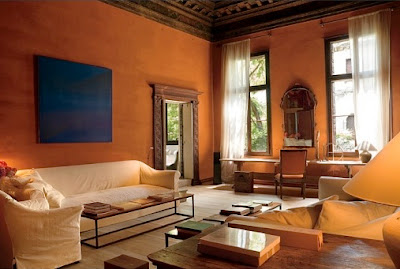
I have to say, I thought this was a tough one. Still, Voice Talk chimed in at 10:20 a.m. to say, “Axel Vervoordt, that is, if the lamp shades are a clue. He was one of the first to start using them, no?”

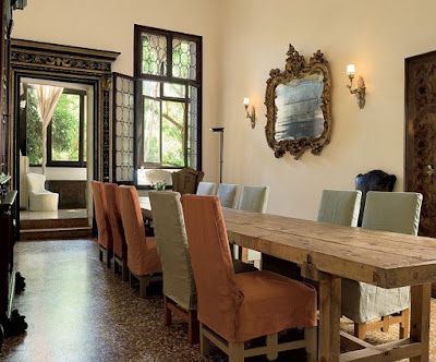
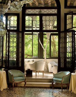
I did not recognize the designer on sight, but once I knew who it was I could see the clues. The long, low footless sofa with the upholstered apron. The not too tight, but not too loose, slipcovers.

The remarkable floor. And there is, in the first image of the last post, a most beautifully draped throw that reminds me of later work.

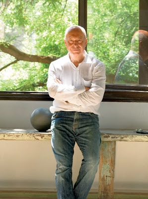
Kudos to Mr. Furth who emailed me to capture 2nd Place and Sean and Michele who quickly followed. You are all design crazies extraordinaire.
Images, previous post, Architectural Digest, November 1993. Which, as an aside, was a great issue. You might remember that it had that great red dining room with the botanical prints on the cover. Photography by Kees Hageman. Images, this post, Architectural Digest, September 2008, photography by Mario Ciampi.
rssrss      FacebooktwitterpinterestlinkedinmailFacebooktwitterpinterestlinkedinmail

Pop Quiz 12

We may have picked up a few new readers, so I’ll go over the rules quickly.  This is a Pop Quiz.

Pop quizzes show past rooms of a currently popular designer (You can see past pop quizzes here.)  I’ve shown the layout in its entirety so as not to edit out any telltale elements.

The first reader to guess the correct designer wins.  Nothing.  Wins nothing, but can walk around all day feeling quite superior to, well, probably to someone.

I’ll be back with the answer and a few examples of current work tomorrow.

Begin.

rssrss      FacebooktwitterpinterestlinkedinmailFacebooktwitterpinterestlinkedinmail

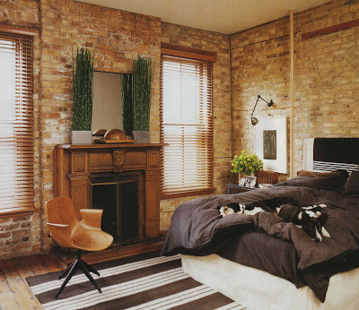
Pop Quiz – Nate Berkus

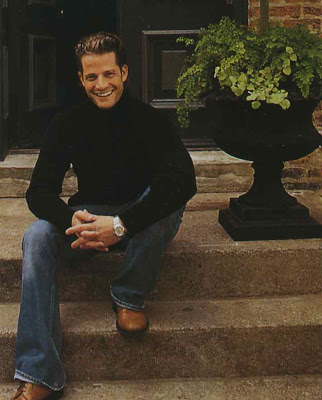
Yes, indeed, Nate Berkus. “Judi” was the first to guess at 10:58 last night.

Did you know I really post the night before? I do.

Lots of design savvy folks followed. The previous post was Berkus’s Chicago apartment featured in Veranda, May/June 2003, photographed by Casey Sills.

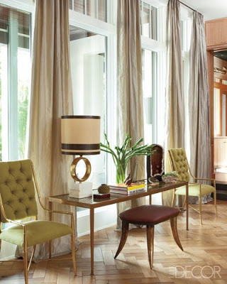
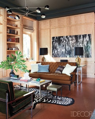
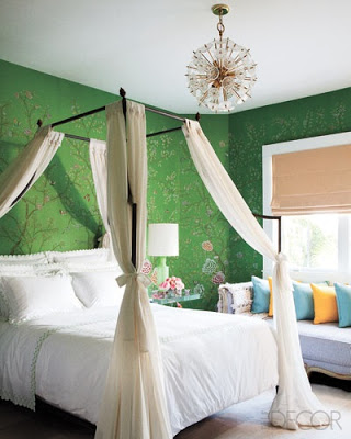
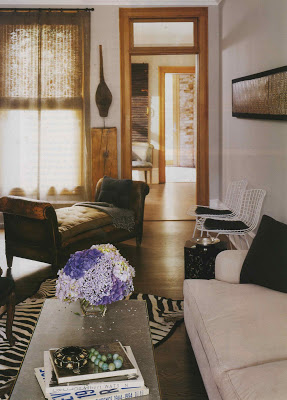
You can see a newer Nate project in this month’s Elle Decor. Which is where I nabbed these images by Roger Davies.
rssrss      FacebooktwitterpinterestlinkedinmailFacebooktwitterpinterestlinkedinmail

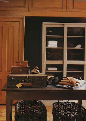
Pop Quiz 11

There are, I imagine, a few folks, hopefully ambulatory, who have been around since the Blandings blog beginning. Way back in August 2007.
If you have, or you’ve stumbled in somewhere in the middle, you know all about the pop quizzes.

But, for the new kids, every now and again I post a vintage layout by a designer working today. Then you can test the depth of your knowledge as design crazy and see if you can name him or her.

Usually hims, frankly. And, now that I’ve typed it out loud I realize that with designers I am usually hetrostylistic. Though certainly not homostylephobic. Huh. Another topic for another day.

So, make your best guess and I’ll be back sometime this afternoon, hands slightly tacky from sunscreen, for the reveal of both designer and good guesser/sage design crazy.

And, as an aside, isn’t all this honey colored wood sort of yummy and refreshing?

To get the idea you can see past pop quizzes here.
rssrss      FacebooktwitterpinterestlinkedinmailFacebooktwitterpinterestlinkedinmail

Pop Quiz – Robert Couturier

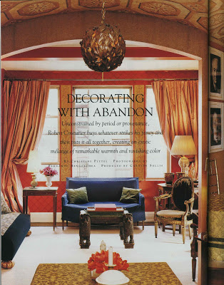
Ah, yes, the esteemed Aesthete did not guess, but rather knew that this was the home of Robert Couturier as it appeared in House Beautiful, February 1998. (I am publishing the answer a bit early as it seems unfair to leave you hanging.) Here is the first page from the story. The lights over the dining table, one of which you can see here, are actually 1940’s Christmas decorations from Macy’s. The lattice on the red walls and the pattern on the dining room ceiling were both achieved with paint.

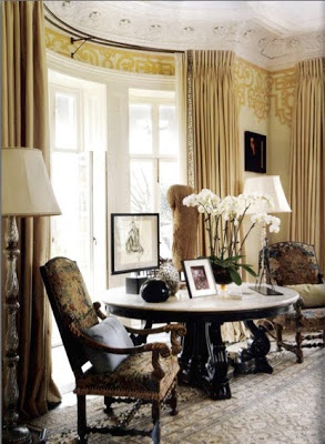
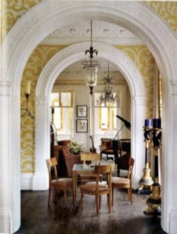
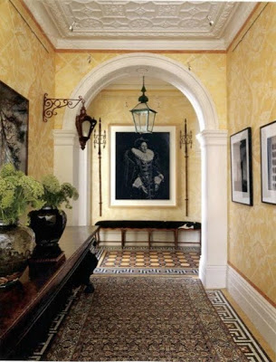
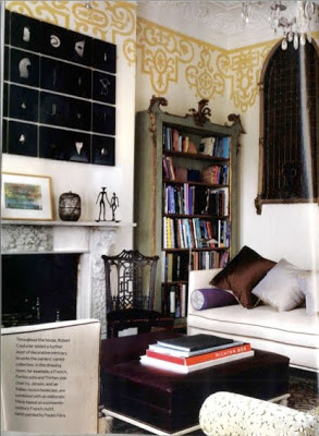
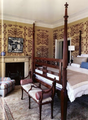
Here is one of Couturier’s projects that was recently featured in the September issue of British House and Garden.

Naturally, I’m loving all this goldy yellow with white trim, dark floors, sure throw in a little gilt and a touch of black.

Delicious, all of it.

Do be sure to check Couturier’s site and this terrific profile in New York Social Diary which will push you straight over the edge to design crush. If you aren’t already there.

Image, top, House Beautiful, February, 1998; photography by Fernando Bengoechea. Remaining images via Couturier’s site by Simon Brown.
rssrss      FacebooktwitterpinterestlinkedinmailFacebooktwitterpinterestlinkedinmail