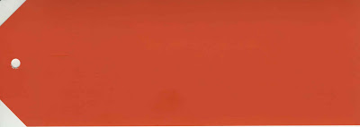
I can give or take orange most days. I know, there are folks who are devoted followers and I like it just fine. In fact, there’s not a color I really don’t like except purple. Orange seems to scream for attention in a way regal red does not. “Look at me! Look at me!” waving its arms and jumping up and down. Or maybe it’s the heavy association with Halloween, a holiday which I’ve grown to fiercely abhor. Still, when this clipping of Charlotte’s Locks from Farrow & Ball slid from the envelope into my hand, well, I crushed. It’s rich, it’s bright, it’s bouncy. Orange you glad they did? (Couldn’t help it.)
Oh. And the purple I don’t really like? Well, it’s not these purples. Not these smoky, complex purples that might be right for reading poetry on a quiet day. Brassica, top, from the “family of vegetables” (do get back to me on that as I will forget to google it) and Calluna, its paler, breathier cousin, are both new colors from Farrow & Ball as well. There are six others, but I won’t spoil your fun – click here to see the rest when the collection is launched.
Why is she posting about paint? What happened to the white wall wonderland?
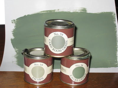
In my own F&B news, I sent off for a few pots of samples myself. Yes, yes, I know, I said white. And I meant it. Butmaybenoteveryroom. I think I told you that I painted the boys’ rooms. In addition, Mr. Blandings’s study is a tiny room. A dark room. Hardly a room at all, in fact, it’s smaller than a Manhattan socialite’s closet. So, light to make it bigger? Nonsense. Dark, dark green to make it better.
“I put up paint samples today, what do you think?” “I like the lighter.” “Oh?” “You don’t.” “I didn’t say that. But I think with a little time you might find you like the darker.”
Don’t worry about Mr. Blandings. He knows better. He’s used to me.

