Tag Archives: Product

I Think it’s a Rug

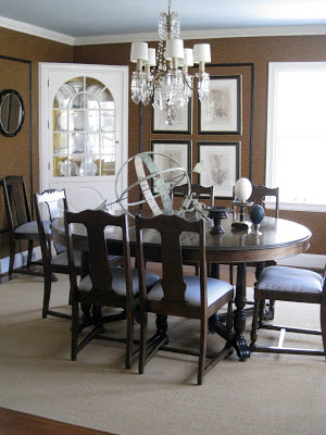
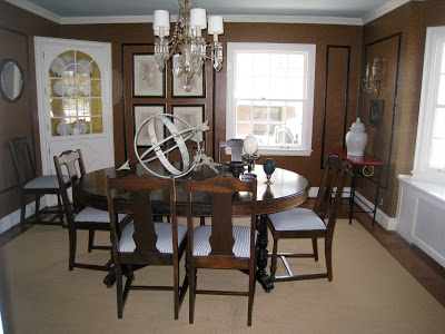
Oh, for heaven’s sake, she must be kidding. Surely we do not have to go through this dining room thing again.

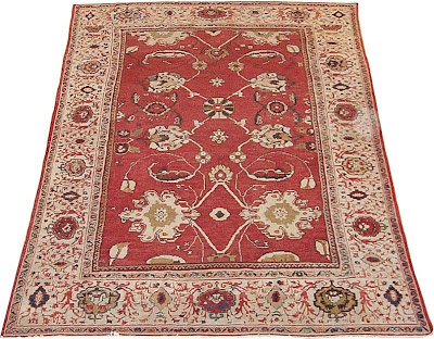
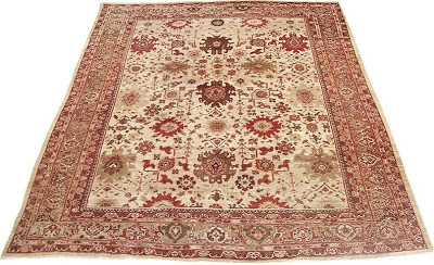
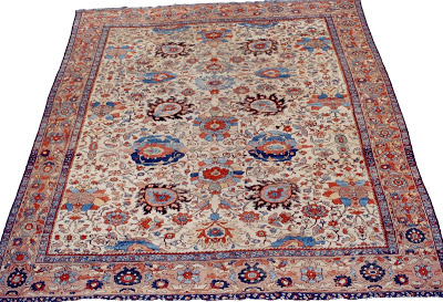
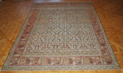
You don’t. Not really. But one of the interesting comments on the last go round was about the rug. Now, I had originally said that I have no budget. And now, I still have no budget. But the idea of the rug sort of took hold, so I asked Ben Soleimani of Mansour if he had any thoughts.

Mr. Blandings and I have a long-held belief that everyone named Ben is a good guy. Every Ben we have met, anyway. We initially had this conversation in a movie theater when we were first married and it has come up several times since.

We are never surprised when we meet yet another very nice Ben as the name seems to be filled with karmic goodness for us.

So no surprise that this new Ben, Mr. Soleimani, was completely willing to pick a few rugs that might jazz up my space.

He said, in a very nice way, that the room seemed a little dark, a little heavy and that some color and pattern might just wake things up.
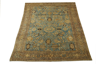
This last Sultanabad is my favorite, though I can see how each one would affect the personality of the room.
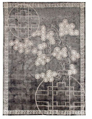
But, Mansour Modern also offers some terrific choices. The rug from the Chinois collection, above, is particularly dreamy.
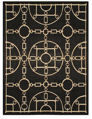
And this piece, the Kelly, designed by Victoria Hagan would add a dramatic punch. The exercise made me go back and think again how each element would affect the feel of the room. Perhaps someday my bank account will catch up to all this wonderful inspiration. In the meantime, a girl can dream, right?

For the record, I received no compensation for this post.
rssrss      FacebooktwitterpinterestlinkedinmailFacebooktwitterpinterestlinkedinmail

Must-ique

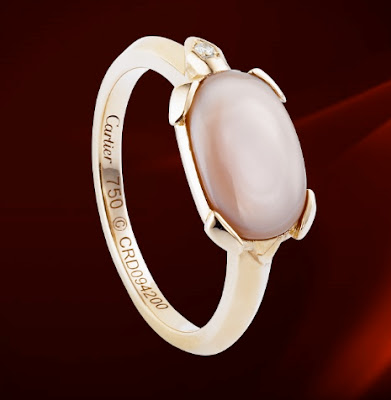
Coming home from LA I noticed a blub in the pile of magazines I purchased to ease the seeming eternity of a three hour flight. Cartier has a new, lower priced line named Les Must. The ring, pictured above, appeared in the piece and I thought it was sweet. A lovely “forget-me-not” or better, forget-me-not-knot. Like a red thread tied around a finger. A reminder of the lover who is coming back after a semester abroad or a brief stint for the company overseas. A promise ring with the dignity to forgo the chip.

So I looked on-line to offer it up here as just that. I was disappointed to find the rest of the collection lacking any charm. To me it seems the dumbing down of yet another luxury brand. Much of it is jewelry fit for little girls, though I loathe seeing the likes of Tiffany and Coach on the playground.

And I’m curious if this works as a strategy. I’m used to seeing the Tiffany heart dangling from the necks and wrists of my children’s classmates, but does it make me pine less for the Sugar Stack rings? The quatrefoil is as ubiquitous as clover itself and Van Cleef & Arpels’s site features nearly nothing but.

The exception for Les Must, which I would say is largely Les Not So Much, would be the watch above. A pretty jazzy piece for two grand.

But knowing it is available, will you still pester for the Tank Louis Cartier at four times its price? I wonder.
rssrss      FacebooktwitterpinterestlinkedinmailFacebooktwitterpinterestlinkedinmail

Propagating Perfection

When the landscape designer came to work up a plan for our back yard, the first thing he said was, “When can the play set go?” “In about twelve years.” That was not the answer he was looking for and when the plan came there was the most lovely parterre where the playset was not going to be twelve years from now.

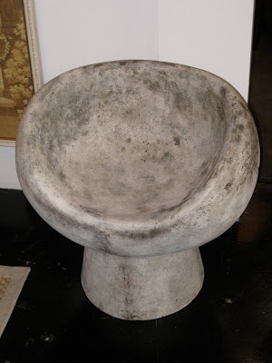
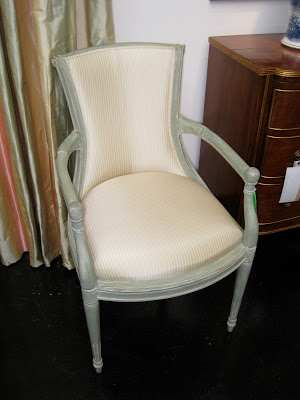
Dessin Fournir’s new line of outdoor furniture includes that groovy little chair, top, that has me wishing for a grotto.

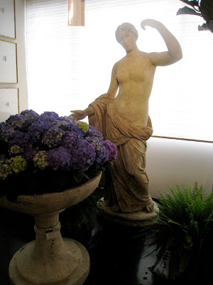
They have used the vintage molds from the MOMA to create these statues. I think this is Diana; there’s a guy to go with. (Am I getting this right, Chuck? I should have been taking notes and talking so much.)

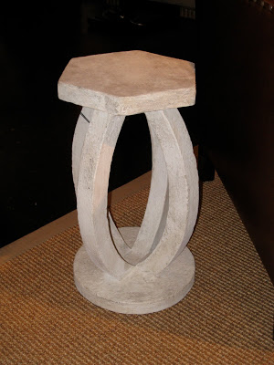
This table would be just as happy inside or out. Maybe, like me, happier in when all is said and done. Maybe quite happy in my kitchen.

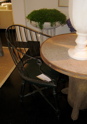
And, yes, a metal Windsor. Not to get too hung up on the chairs.

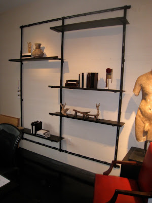
Chic and simple, this bookcase could create a library in the flick of a cordless drill. Naturally, you can order just as many as you need to fill that long wall.

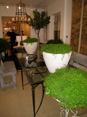
I finally met Chuck Comeau in Los Angeles. He showed me Dessin Fournir’s new pieces for 2010. New pieces. New. Not the same old thing that has been hanging around the showroom since the beginning of this depressing depression. New designs.

I asked him, “What gives?” Rolling out new stuff and all. Bored? Delusional? No, optimistic. “We need inspiration. Designers need new things to look at; we all need new things to look at.” Indeed.
Lots more very beautiful things, including wonderful chairs and case goods with amazing painted finishes are also on hand in the showrooms. 2010 looks like a good year.
rssrss      FacebooktwitterpinterestlinkedinmailFacebooktwitterpinterestlinkedinmail

Less Than a Cup of Coffee

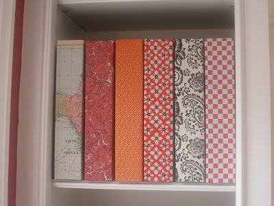
I just received a very nice comment from a fellow at ReBinder about my tear sheet organization. He is offering Mrs. Blandings readers 20% off of their binder orders at ReBinder.com through the end of May. He mentioned the Select line, which is chipboard instead of cardboard, which I am endorsing, though the cardboard is working just fine for me.

Just enter the code word BLANDINGSROCKS at check out. They are already inexpensive, so this could bring you in under your latte tab.
rssrss      FacebooktwitterpinterestlinkedinmailFacebooktwitterpinterestlinkedinmail

It’s All Here in Black and White

I was visiting with a friend recently and she mentioned that she’d like to update a traditional room. Make it a little fresher. A little younger. At the same time, she didn’t want it to look trendy or trying-too-hard.

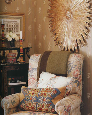
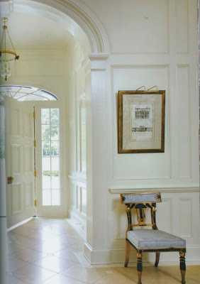
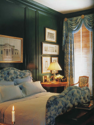
I’ve always like the use of architectural prints.

Clean. Crisp. Graphic.

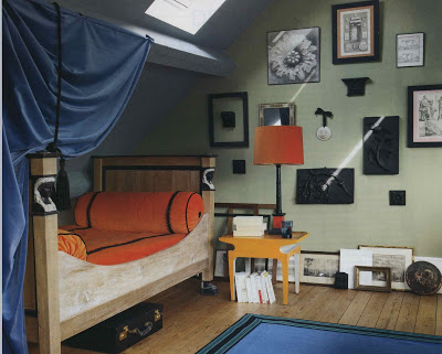
But I suggested using photographs instead. To give it a little bit of an edge. I wonder if that is what Bruno de Caumont has done above. With the rosette? It could be a drawing, of course.

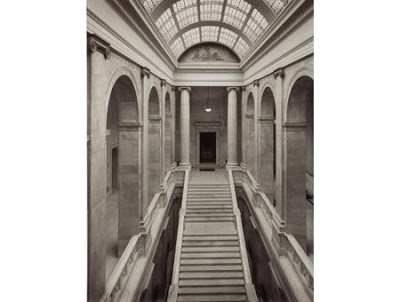
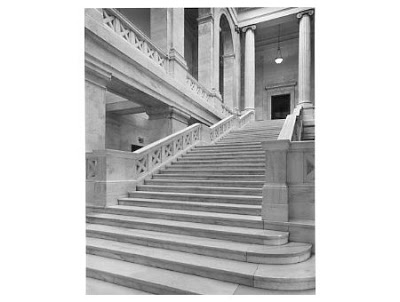
Local photographer, Keith Davis, has stunning pieces capturing the architecture of many state capitals.

I’m not sure he’s photographed them all (and I guess I’m too lazy to find out) but it would be great to choose images from capitals that mean something to you. Or not, because I’m crazy about the first one here and I have absolutely no connection to Arkansas.
Images from top, Michael Smith, Houses, photography uncredited. I’m pretty sure this is right; no photo credit for page 24. Suzanne Kasler, Inspired Interiors, photography Erica George Dines; Albert Hadley, Albert Hadley, the Story of America’s Preeminent Interior Designer, photography by Mary E. Nichols (Megan says I am a Hadley Head – guilty); Bruno de Caumont, Elle Decor, April 2010, photgraphy by Simon Upton; remaining images via Dolphin Gallery by Keith Davis.
rssrss      FacebooktwitterpinterestlinkedinmailFacebooktwitterpinterestlinkedinmail