Tag Archives: Product

Your (Not) Stu pod


My sister is six years younger than I am.  One day we were at a friend’s house and I did some forgotten (by me) unkind big sisterly thing and she wrote me and my friend a note that said, “Your stu  pod.”


When my friend and I recovered she said, “I’ll be stu and you be pod; those are your initials anyway.”  We called each other by the monikers from time to time, but like most things that spring up in seventh grade, they eventually fell away.
High school was an era of monogrammed sweaters and people would note that mine spelled a word, but, again, it was nothing more than a passing comment then on to English Lit.


In college, I worked at a drinking establishment.  College students, being long on need of entertainment but short on cash, had the unfortunate habit of writing bad checks.  To try and control the situation a bit, the owner posted a “Bad Check List.”  Employees had to check the list every time they took a check and initial the corner; if the person was on the bad check list and the just-initialed check bounced, the employee was responsible for covering the check.

“pod” graced the corner of a lot of my friends’ checks.  And then it stuck.  Dozens of folks call me nothing else.  Mr. Blandings calls me pod; if he uses my first name it makes my head jerk up in alarm.  Like the middle and last name of my childhood scoldings, my given name on my husband’s tongue means trouble.

It’s not exactly a pretty name and I’m sure there are folks who have heard it and have wondered its origin.  
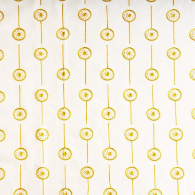
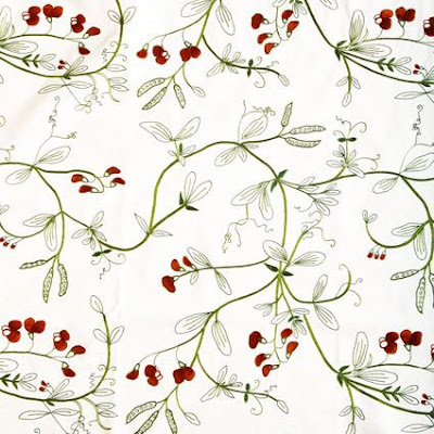
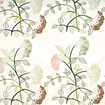
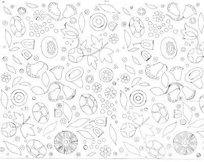
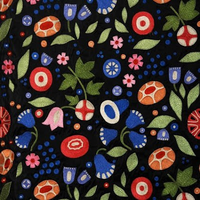
Recently one of my readers emailed that she had seen some of Lost City Products embroidered textiles at the Chicago Merchandise Mart and that they were quite great.  A few of their patterns were inspired by Josef Frank.  Personally, I was thrilled to see one of the patterns contains pea pods.  But what I found most interesting is that on the site they note the inspiration for all of their hand-embroidered designs.  In addition, they tell the story of their company and the evolution of the new line of silks.  And they do it in an incredibly entertaining way.  So rather than recap here, I’m sending you there.

At a dinner party on Saturday which was lively and engaging and relaxing and easy all at the same time, we stood in the kitchen talking forever.  Neither hosts nor guests would be aware of my maiden initials or my alias so I was expecting to see my given name at my spot.  When we sat down to dinner I found my place identified by the graphic black ink on the crisp white card marked clearly, “Mrs. B.”  
rssrss      FacebooktwitterpinterestlinkedinmailFacebooktwitterpinterestlinkedinmail

Up to Something Crafty

Both Style Court and Katiedid posted on Alan Campbell and his amazing fabrics and the wonderful homes in which they have been used.

David Netto wrote an engaging article for domino this month detailing his relationship with Campbell who served as a sort of ad hoc godfather.

Not all of Campbell’s fabrics were batiks, but some of the most graphic and compelling certainly were.

The grade school I attended in Tulsa was progressive for its day; there was one year when we were all lumped together, a jumble of grades, working at our own pace. I know I read a lot, but likely did very little math.  I did make designs with the metric blocks; those were cool.
Lucky for me our art teacher was amazing. One of the best projects was batiking. Making batik. Mr. Blandings does not like it when people make nouns verbs, especially if the noun is golf, which a game. If you say “golfing” you get a very slow blink. And a sigh.

Anyway, while I was in sixth grade, a mere thirty-one years ago, I remember it being a piece of cake. We did do more of a design than an abstract pattern. I think mine was an elephant. Regardless, it seems like it was some fabric, a little wax, some dye and off you go.

Could be a great summer project. The wax is hot. I know, you got that, but I thought it needed to be said. So, be careful if kids are involved. Which you also got, but just in case. I doubt you could do enough for a sofa before school starts. But maybe a pillow. Or a foot stool.

Well, you could.  And I might.  If I do, I’ll show you, but if I don’t show you please don’t bring it up as it will be one of the dozens of things I have said would be fun to do this summer but didn’t.
All images borrowed without permission from Quadrille.  Fabrics, Alan Campbell, bottom image, The Devil Wears Prada.  If you are interested, google “how to batik.”  Dozens of sites are available to show you how.
rssrss      FacebooktwitterpinterestlinkedinmailFacebooktwitterpinterestlinkedinmail

Meet Me at the Gallery


Cottage Living has a jazzy little feature this month on updating a living room.

What really caught my eye was the photo grid system that the magazine’s assistant design editor Anne Turner Carroll used to display family photos.  Courtney is contemplating a gallery wall in her home, and we have often wondered where the hardware for such a system could be procured.  Carroll used a system from Walker Display.
When I went through this mental exercise before, I wondered if it would be possible to use Antique Drapery Rod Company’s pieces to pull it together.  Their Bauhaus line would make a striking backdrop for any display.

The one inch rods would be the place to start, with these brackets to support the endeavor.


You might need a few depending on the number of pieces and the weight of the frames.
Regular drapery rings could hold the chains; hardware stores usually have a pretty broad selection of styles and sizes.  Don’t forget to grab a couple of handfuls of S-hooks that will fit the chain links.

I’d stick with simple finials and voila!  Antique Drapery Rod has a variety of styles and finishes to accommodate nearly any project.  I’ve used them in the past (for curtains) and their customer service has been just dandy as well.   Overnight delivery and you could DIY over the holiday weekend!
Katherine Hobbs home photographed for the July/August ’08 issue of  Cottage Living by Justin Bernhaut.
rssrss      FacebooktwitterpinterestlinkedinmailFacebooktwitterpinterestlinkedinmail

Branksome (not Break-some) China

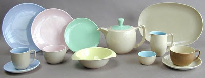
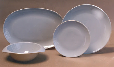
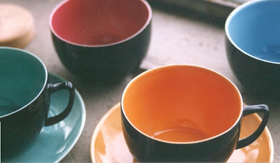
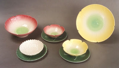
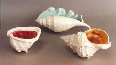
There is a wonderful article in the June issue of World of Interiors that chronicles the history of Branksome China.  The company was founded in 1945 but was facing closure last year.


Husband and wife, Philip and Charlie Johnson, bought the company in October with a passion to rescue and revive it.  It’s hard to believe that it was struggling as the shape is so clean and modern, the glazes so clear and appealing.

The prices are not outlandish, even with the exchange rate, and custom color combinations and personalization are available for a modest up-charge.

I love the graphic nature of the black with the colored glazes.

Art pieces are available as well.

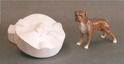
Oddly, as I was clicking around the site I came across a story on their news page.  Seems when they reintroduced the dog line, the boxer’s head was missing and they were unable to reproduce this breed, which was a frustration for collectors.  A bit of luck uncovered the mold and now this dashing breed is back in production.

He even has floppy ears like Rosie.  Could be the birth of a new collection.

rssrss      FacebooktwitterpinterestlinkedinmailFacebooktwitterpinterestlinkedinmail

Friend of a Friend

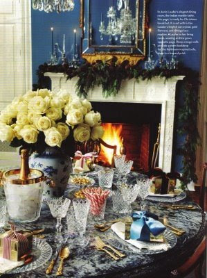
Back in December folks were ohhing and ahhing over Aerin Lauder’s home in the December issue of (the much missed) House and Garden.  I seem to remember a bit of discussion about the choice of blue candles in the dining room.  Hmmm…..blue.  I’m usually an all white girl when it comes to candles, but could see that, for the image at least, white would not be right.

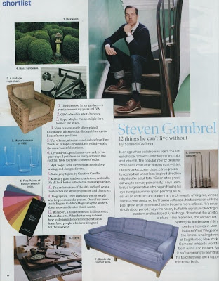
Then, one of the features I always look forward to in Elle Decor, “shortlist” featured Steven Gambrel’s list of things that he cannot live without.


And look.  Number 8 is slate-grey tapers by Creative Candles.  I adore Creative Candles; they are on my list as well.  Unfamiliar with the slate grey I emailed my friend at the company and asked if she could provide an image.  I was expecting a snap of her holding a handful of said shade when she provided a link to the image below.

Courtesy of Grace Ormande Wedding Style, the slate grey tapers preferred by Gambrel.  I have to say, I can see the appeal.  I am drawn to the crispness of the white, but the grey is more subtle.  It does not become the focal point.  Graceful and lovely, it does the job without screaming for attention.  I need to listen to Jennifer; this color deserves a second look.
Lauder image, and style inspiration, courtesy of The Peak of Chic.
rssrss      FacebooktwitterpinterestlinkedinmailFacebooktwitterpinterestlinkedinmail