When I slept in the boys room to accommodate the aforementioned patient, I reacted badly to the clock that seemed fit for a Pink Panther episode. There I was, too tall for my bed, too much on my mind, with a pillow over my head to block out the tock, tock, tock. I finally rose to remove the battery after lying there forever not wanting to get up and praying for sleep.
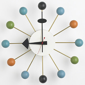
It was down for days, but the inhabitants complained, and now it is back. But I do think there needs to be something new. Better. Possibly the George Nelson Ball Clock. Ubiquitous perhaps, but classic nonetheless.
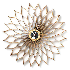
George Nelson graduated with a degree in architecture from Yale in 1928. He traveled extensively in Europe over the next few years and returned to the States, “a convinced modernist.”
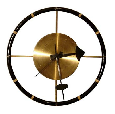
He was an accomplished writer and advocate of the modern movement as well as a designer. His hanging “storagewall” brought him to the attention of, and eventually into business with, the Herman Miller Company.
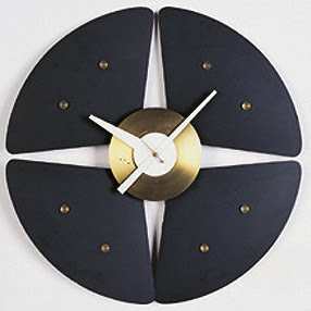
He introduced the ball clock in 1950, though the clocks were only identified by numbers at the time. He designed an estimated 150 clocks during his partnership with Herman Miller. The company produced the clocks into the 1980’s until they were discontinued. Vitra resumed production in the 1990’s.
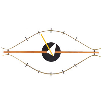
What has become known as the “eye” clock, below, was originally pictured at an angle in the catalogue, not horizontally as it is usually placed today.
We visited one of Mr. Blanding’s friends in Chicago many years ago, certainly before mid-Century was the rage, and her husband had a collection of Nelson ball clocks in nearly every color. She made him hang them in the garage. I remember seeing them on the way out to dinner and thinking, “fabulous.”
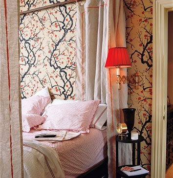
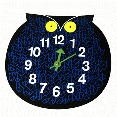
But while I consider the ball clock for boys 1 and 2, and am so tempted by the owl for number 3, it is the desk clocks that have captured my heart. Jennifer at the Peak of Chic posted this picture of domino editor Sara Ruffin Costello’s bedroom last May. The Flowering Quince from Clarence House certainly dominates the shot, but I zeroed in on the bedside clock.
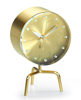
Not exactly the one I had my eye on, though I love the tripod base.
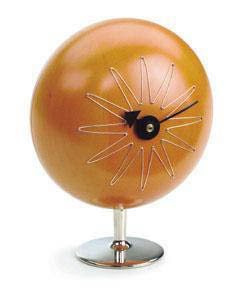
The more I post, the more aware I am becoming of my own taste. These desk clocks are so sculptural.
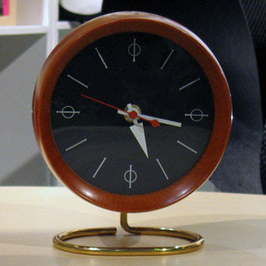
I want one on my desk, but as I’m in the habit of watching the digital clock in the corner of my screen, I might have to place the clock in front of it.
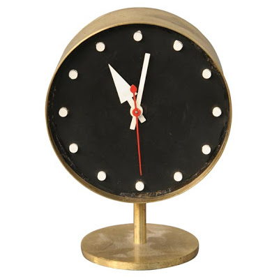
This is the one. Black face, white dots in place of numbers, and red second hand. I couldn’t design it myself as I am not a 20th century icon. But, if I could, this would be the one. As I said, Vitra has reissued many designs and there are dozens of on-line vendors standing by. This handsome number is vintage. He stands patiently, on 1st dibs, waiting for someone, me perhaps, to take him home. Nelson thought a collection should be permanent, not “scrapped for every new trend.” I think he would be satisfied.
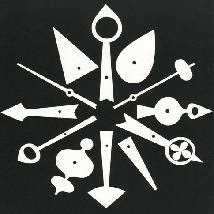
Image top is the logo that appeared on many of the Herman Miller catalogues. The quote that is the title is from Nelson.

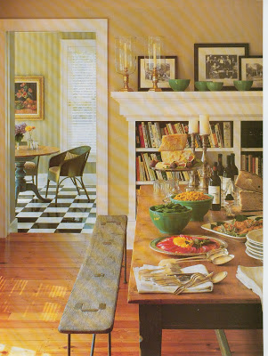
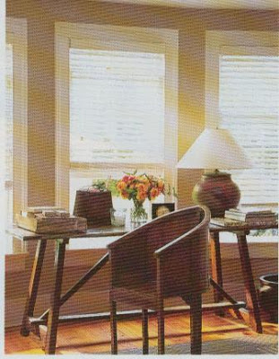
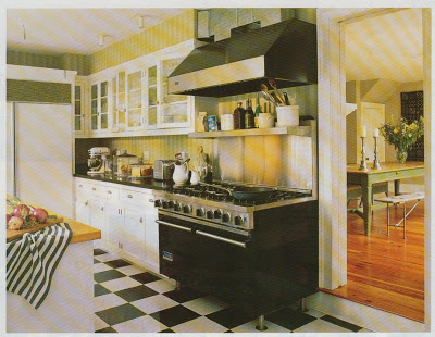
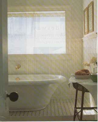
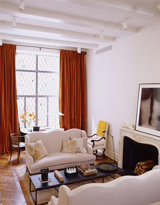
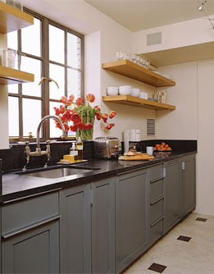
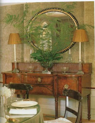
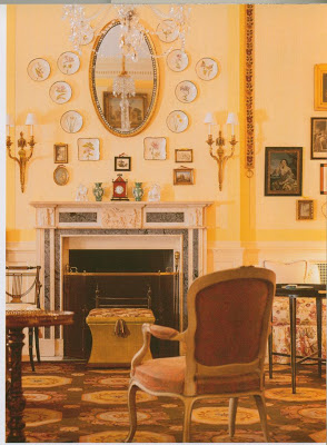 This is close. Keith Irvine from House and Garden, Book of Style.