Tag Archives: Product

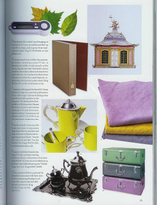
Chinoiseries

In the current issue of World of Interiors (How could I resist? The cover is the most wonderful yellow, black and white.) there is a little mention of Chinoiseries, by Bernd Dams and Andrew Zega.
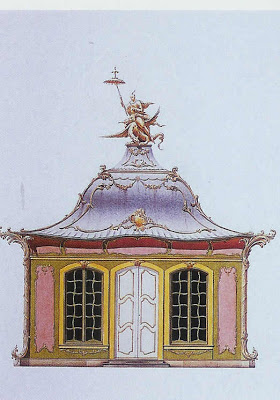
The publisher, Connaissance & Memories has printed a limited edition of 300 copies of the artists’ 50 watercolor portraits of these amazing structures. Not for the light of wallet, these beauties go for over $1,000 (American.)

As I am barely keeping up with Courtney and Joni on their book recommendations, this didn’t seem like a good idea. But, oh my, they are so pretty. So I started clicking around and found these.
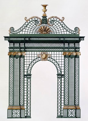
Dams and Zega’s watercolors are available as well. And they are gorgeous. Sadly, there are even more dear than the book. Still, they seem worth their price tag (3,000 – 5,000) if you can swing it. I can’t.
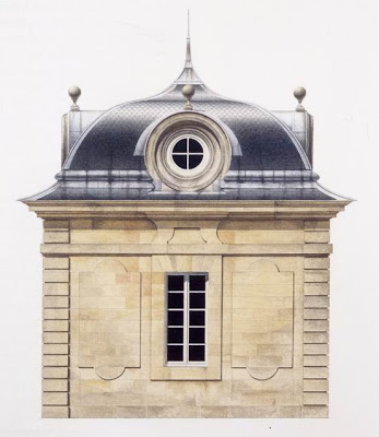

But don’t despair. Two different avenues are a very real possibility if you, like me, just need a little something. Chinoiseries is being printed by Rizzoli and has a scheduled release of April 1, 2008. List price is $60, but you can get it for less through the big box retailers, to whom I won’t link. So sorry, I’m an independent bookseller fanatic.

Can’t wait? Have to have a little Chinoiserie right now, Veruca? Note cards are available for $3/a piece. Collections include Chinoiserie, Chateaus and Pavilions, Vases, Sculpture and Ironwork, and Garden Follies. Seems they might be pretty jazzy framed and hung en masse in a powder room.
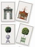
It’s not an indulgence at all. Totally practical. I mean, you will have to write all those thank you notes on something.

rssrss      FacebooktwitterpinterestlinkedinmailFacebooktwitterpinterestlinkedinmail

Make Mine a Cone

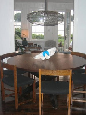
When we were in Sag Harbor this summer, my big city friend was lamenting his dining room light fixture. A vintage eel trap, it seemed like a good idea at the time, but was chafing a bit in the long haul. Problem was, he just can’t seem to find “it.”
So I pulled out my laptop and showed him this:

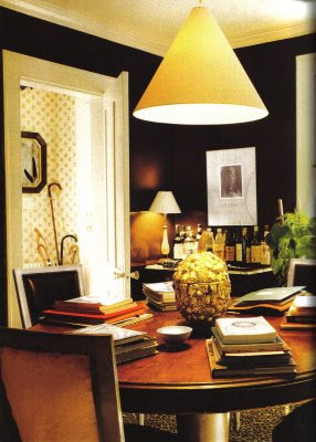
For a while now, this light from Albert Hadley’s dining room in Southport, Connecticut, has been bouncing around in my head. It’s a bit similar to the ubiquitous shades that are here and there and there. But not. It’s sculptural and unobtrusive, but still has impact. You know how things go, once you start to notice something, it turns up everywhere.


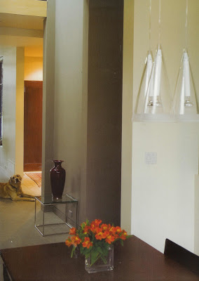
These are Flos in a room by Andre D’Elia, courtesy of Farrow and Ball, The Art of Color. (I am hoping they don’t sue me; I held off as long as I could, but can’t help posting a few images.) I like these in glass, I really do, but it’s the metal that really gets me.

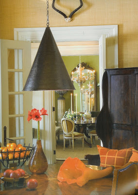
Again, Farrow and Ball, this time Barry Dixon. This is perfect. Well for me, anyway. Again, sculptural, almost industrial; black, or almost, in direct contrast to it’s traditional setting.
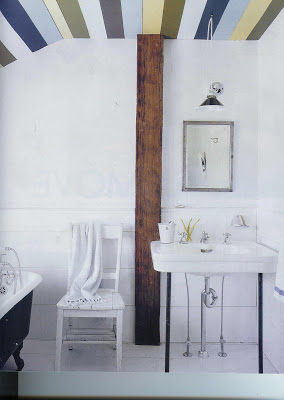
This image is from the December, Elle Decor. Photographer William Waldron and his wife, Malene have done a lot of the work on this New York farmhouse themselves; she designed and painted the ceiling. I do like a girl who will wield a paint brush. The light is from Paula Rubenstein. Crisp, clean black and white that mirrors the tub. Perfect.
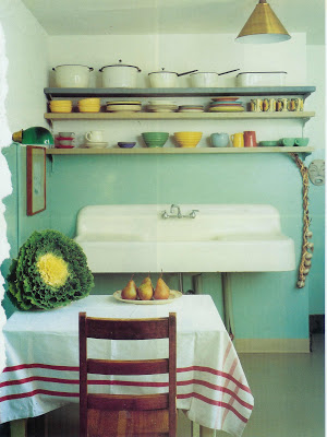


Different altogether from the others, of course I’m attracted to the aqua and red, vintage pottery, that white and black enamel ware and the sink. Is it me or are angels singing? And come-back brass? Yep, on the fixture. Except this is vintage; House and Garden September 1992.

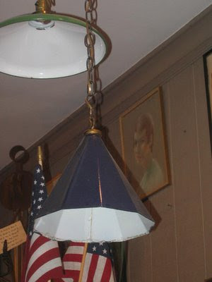
Will he take my advice? Unlikely. He rarely does, though I am always flattered he asks. As for me, I could not stop thinking about this handsome royal blue lantern from Christopher Filley. The youngest Blandings boy has a room just at the top of the stairs. It would be such a treat for me to see it as I’m bringing up the shoes and the books and the Legos. And as for boy number three, you’re never to young for good design.
rssrss      FacebooktwitterpinterestlinkedinmailFacebooktwitterpinterestlinkedinmail

Safe Mode

I was in Hall’s today taking a bit of a respite from my computer woes. Hall’s is a lovely, hometown, department store. It reminds me a bit of Miss Jackson’s, in Tulsa, where I grew up. Gracious and lovely. It always made me feel quite grown-up to go into Miss Jackson’s. There is a bit of a hush.

So here, Hall’s is sometimes the salve on my emotional wounds. I’ve said before, I don’t like to shop. Mostly. Hall’s has clothes and shoes and lipstick, but that is not my gig. I head straight for what once was charmingly known as “housewares.”
I cruised through the vases and frames and such. Straight for china.

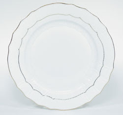
When I got married (I’m clearly a bit nostalgic lately) I registered for Herend Golden Edge.

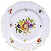
Good girl. Fine. Simple. Timeless. Except. Except I’m a bit of a pattern and color junky. I always thought I’d get some patterned salad plates, but I never have. I just shop for them from time to time. I have always loved Herend’s Fruits and Flowers.

Today, I spotted these, and they did pique my interest.

I’m such a sucker for black and white.

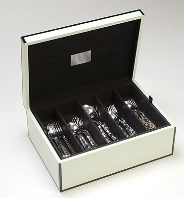
But, wait, what’s that under the display? Oh, heavens, it’s the silver storage box I’ve been stalking since I saw it in some unremembered shelter magazine a month or so ago.

The color of the top box is much more green than this image reflects. Made by Lunt, these boxes are nothing short of wonderful. Heavy and substantial, the lacquer is oh-so-smooth. The colors are oh-so-rich.

The top tray is removable to reveal another divided storage space beneath. Lined in fabric, you know your silver would be so happy resting there, waiting, hopefully not too long, for you to pull her out and let her shine. Mmm-hmm. Definitely Christmas wish list material.

Around the corner to admire the antique silver. It’s quite a collection, though I bet it doesn’t get a lot of notice in it’s glass doored cabinet.

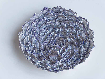
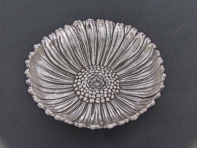
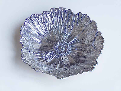
Just behind, the Buccellati. If you are not familiar with this silver, do visit the web site. Hall’s carries their silver and jewelry. I’ve always pined a bit for the flowers.

Got a thing for Chanel? How about the camellia?

Daisies caused a bit of controversy over at The Peak of Chic recently, but everyone can agree, in silver? Chic.

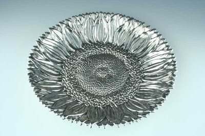
And without making a comment on any particular hobby, the poppy is lovely, too. My favorite? The sunflower, image at top.
Safe Mode forgotten.

rssrss      FacebooktwitterpinterestlinkedinmailFacebooktwitterpinterestlinkedinmail

Chic Redux

This post started as a bit of a valentine to Jennifer at The Peak of Chic. Last May, she posted about one of her top ten fabrics, and while I already admired her eye, with that post, I knew we’d be friends. You see, Le Lac, by Brunschwig and Fils, is one of my favorites, too. In fact, I have a large remnant as the repeat is 81″ and I had to have it for my living room curtains.

So, flipping through the much-mentioned vintage magazines, I ran across this:

Uh-uh, wait for it.

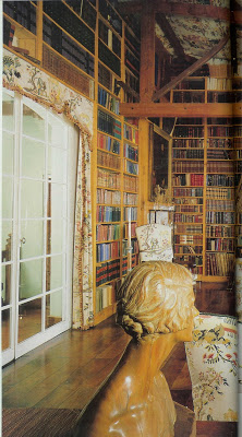
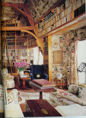
The main library of the Carcano estate, Estancia San Miguel, in Argentina. House and Garden, Jan. ’86.
The chintz, en suite, vaulted ceiling and a library to boot. Note the sisal rug with the antelope skin on top. I mean, stop. But then, and here’s the thing – you have to read the articles, don’t tell me you just look at the pictures, I can’t stand it- the article tells me the fabric is a design of Philippe de Lasalle (1723 – 1804.)

We didn’t cover Philippe de Lasalle in my broadcasting classes. So, to the web. Seems M. de Lasalle was a fabric designer and merchant.
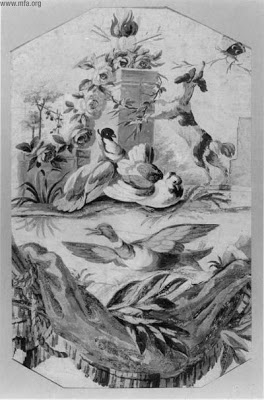
Design for silk weaving, with Alter of Love. 18th c. gouache and watercolor, Museum of Fine Arts, Boston.
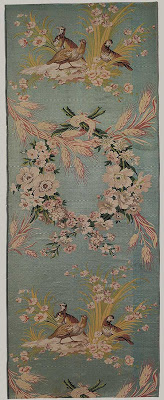
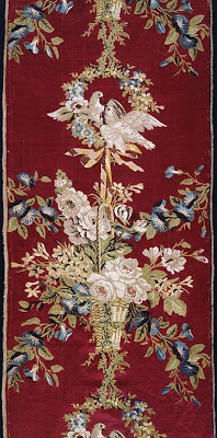
While little is known of his early life, although he was apparently an orphan, he apprenticed under several silk manufacturers and merchants. He was known for his painterly affect, a artist’s eye for space and balance. As was popular in his day, he used a lot of realistic flowers, birds and insects in his designs.


Les Perdrix (The Partridges) Silk, circa 1771, Metropolitan Museum of Art, New York.
It is a special skill to translate the concept of a painting to a loom. de Lasalle was known for perfecting a technique called point rentre, basically, outlining the figures in black. While he did not develop this relief effect, it helped increase his celebrity.


Silk and linen, for the summer palace of Catherine II, Art Institute of Chicago.
And he was a bit of a celebrity. His friend, Voltaire, recommended his work to Catherine the Great; she commissioned several pieces for the Russian Palaces. One critic claims he was a combination of artist and businessman, catering to a very select high-end clientele.
Seems Jennifer and I are in good company.

rssrss      FacebooktwitterpinterestlinkedinmailFacebooktwitterpinterestlinkedinmail

Natural Blond

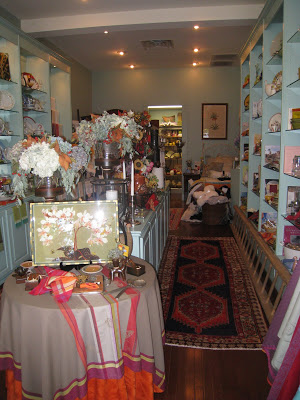
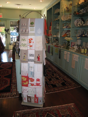
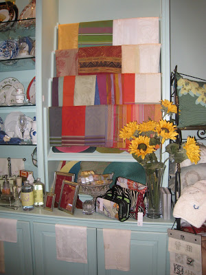
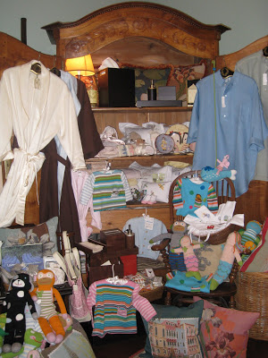
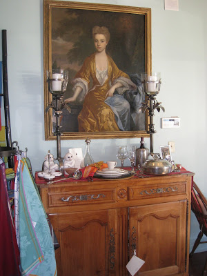
Welcome to Sharyn Blond. A jewel of a shop in Fairway, Kansas, Sharon offers the very best in tabletop and gifts. I love nearly everything she carries, (after fifteen years can you “re-register” for china? Seems one never has enough.) but the real treasure here is her linens.

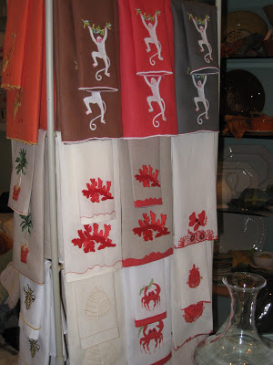
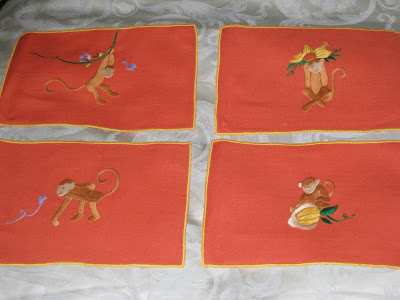
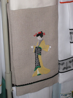
Hand embroidered in Madeira, the pieces are works of art. After recognizing that the styles and colors of truly fine linens had remained static for years, Sharyn began designing new patterns with motifs and colors for the modern gal with exceptional taste.

In addition to table linens, there are wonderful bed linens, fingertip and guest towel and cocktail napkins for the discerning buyer.


Sharyn Blond Linens are now available for purchase on-line. If you are in-town, however, do drop by. She has great gifts for everyone from your favorite girlfriend,

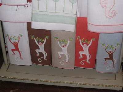
or her new baby,

to your hard-to-please mother-in-law. I said “yours” not mine. Mine is delightful.

I think so many of the designs are charming. I must confess, two of my best girlfriends gave me the “monkeys” for my birthday last year. Next on my list?

Oh, I have to get to work on that powder room.

rssrss      FacebooktwitterpinterestlinkedinmailFacebooktwitterpinterestlinkedinmail