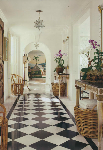
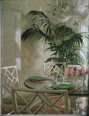
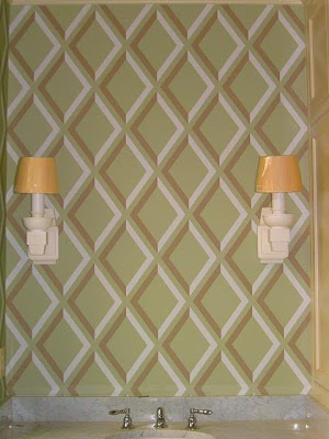
You can’t, you know, decorate in isolation. This room this and that room that. So as I piece together the living room and plan the dining room, the downstairs hall and family room must be considered. The image, top, in the May issue of House Beautiful, caused one of the tumblers to fall into place offering up the answer for the hall. “Trellis. Of course.”
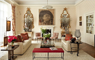
Then, while visiting the Kips Bay Showhouse, I lingered long in this room. Captivated by the paper, delighted by the furniture. When my dining partner said, “What was your favorite room?” I replied, “Those mirrors!”
A classic room with unnoticeably unconventional choices, I adored Richard Mishaan’s use of Philip Jeffries embroidered grass cloth for the walls. Trellis.
Which reminded me of Little Augury’s project. Trellis. With an edge.
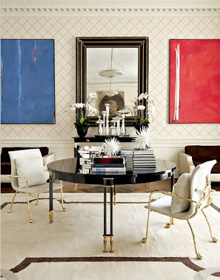
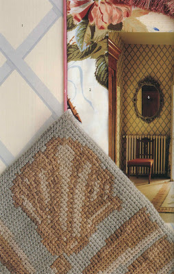
Then, while pulling out Influential Interiors to see if it was right for a friend, I was reminded of this image using Colefax Trellis.
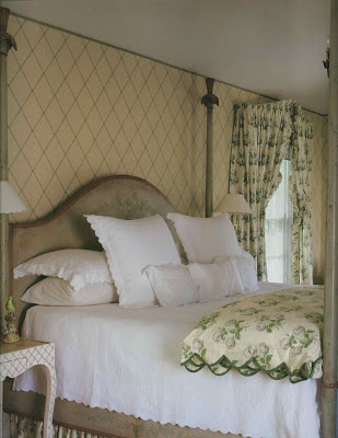
And then this. But my first leg of the hunt (on-line or in the showroom) has not been a success. (Try searching “trellis wallpaper:” A bazillion images of Imperial Trellis pop up.) By this time I was planning on two or three samples taped to the hall wall. Nada.
I could paint it. But then there’s the math. You know I hate math.
Images from top, House Beautiful, May, 2011, design by Meg Braff; photography Thibault Jeanson. Paper, Sea Island Trellis by Brunschwig & Fils; New York Times, design by Richard Mishaan, photography Trevor Tondro. Paper, Philip Jeffries; via Little Augury; Influential Interiors; photography James Merrell; Farrow and Ball: The Art of Color; photography, Edward Addeo.


